Opinion
Paul Rand: The Man Who Moved Ads from Cute to Clever
THE DAILY PIC: Rand's republished 'Designer's Art' is a guide to 50 years of changing graphic design, and the man who changed it.

THE DAILY PIC: Rand's republished 'Designer's Art' is a guide to 50 years of changing graphic design, and the man who changed it.

Blake Gopnik

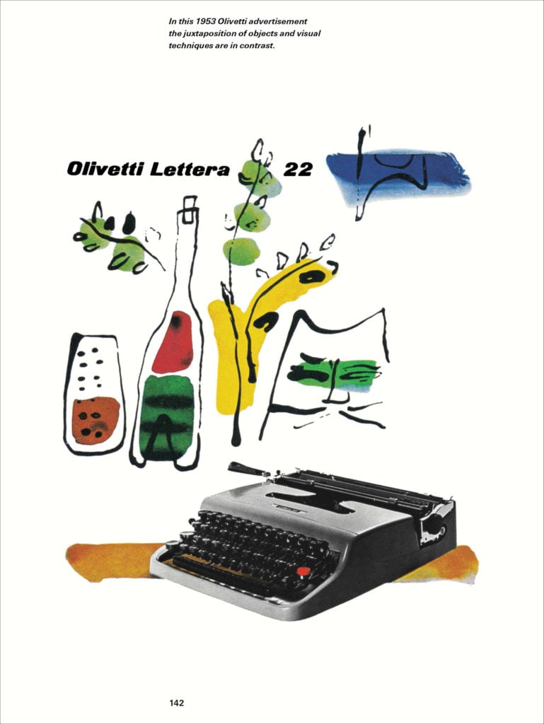
THE DAILY PIC (#1676): This Olivetti ad by Paul Rand, from 1953, gets at a vital hinge moment in American commercial design. It’s the moment when the best graphic design starts to veer away from the sweet, hand-made, outsider-influenced style that rules the painted part of Rand’s ad, with artists Henri Matisse and Raoul Dufy and even Ludwig Bemelmans as important models. And the moment when design moves toward the crisp, hard-contoured, photo-dominated modernism of the typewriter and its image.
You can almost watch the transformation take place in Rand’s book called A Designer’s Art, a guide to his career and ideas that is being republished today by Princeton Architectural Press, after first being released in 1985. That book is where I found today’s Pic, with Rand’s little pedagogical annotation added at the top of his original advertisement.
Rand was one of the guiding lights in the transformation of postwar American graphic design from “soft” to “hard,” and because his book presents images and ideas that evolved over all the decades of that development, it almost acts as a time-lapse that lets us watch the changes unfold. (They are changes, incidentally, that helped end Andy Warhol’s 1950s career as a “soft” illustrator, and pushed him instead toward his second career in “hard” Pop Art.)
For a full survey of past Daily Pics visit blakegopnik.com/archive.