Opinion
What Is the Greatest Vermeer Painting? The 10 Most Iconic Works by the Dutch Master, Ranked
Vermeer is much more than 'Girl With a Pearl Earring.'

Vermeer is much more than 'Girl With a Pearl Earring.'
Margaret Carrigan
 ShareShare This Article
This month, the National Gallery of Art in Washington, DC, will mount “Vermeer and the Masters of Genre Painting: Inspiration and Rivalry.” The show, which runs October 22 through January 21, delves into the work of Vermeer and his contemporaries from 1650 to 1675, when they were at the height of their powers. It also traces the long shadow cast by the Dutch painter, whose output was famously slim—only 35 surviving works are widely attributed to the artist, though a 36th potential canvas is still in private hands—and about whom so little is known that he is sometimes called the “Sphinx of Delft.”
While Vermeer enjoyed decent cash flow from the sale of his art during his life, he worked slowly, and most of his patrons were family, friends, and other locals. After a financial crash in 1672, he was forced to auction off most of his earthly possessions to repay mounting debts. He was all but forgotten by the art world in the years after his death in 1675. His most famous work, Girl With a Pearl Earring, was sold for just two guilders at auction in 1881.
Today, of course, Vermeer is the very definition of Old Master accomplishment. But what is his best work? We examined the artist’s 10 most popular and most searched works (which we narrowed down based on their ranking on Google Images). Below, we’ve offered our subjective take on what makes them great—and why Girl With a Pearl Earring is not, in fact, the best Vermeer of all time.

Johannes Vermeer, The Lacemaker (1669). Image: Wikimedia Commons.
Depicting a woman in deep concentration, bent over her craftwork with bobbins and pins in hand, The Lacemaker is a an oddity in Vermeer’s oeuvre. It is his smallest work, measuring a diminutive nine by eight inches, and only one of two paintings he ever made on wood panel (the other is Girl with a Red Hat).
It is, of course, lovely. But what puts it at the bottom of our ranking is the very odd lighting, unusual for an artist known for command of luminescence.
“[I]n The Lacemaker light organizes itself in conflicting ways, both on the level of its rendering in paint and on the level of perception,” the art historian Kathryn A. Tuma points out in an essay on the painting. “While in the visual realm of the everyday this would not necessarily be a problem since our vision has little trouble accommodating multiple sources of light, in a painted image such ambiguities toy with our ability to recognize a persuasive imitation of an illusionistic space.”

Johannes Vermeer, The Procuress (1656). Image: Wikimedia Commons.
Depicting a scene of so-called “mercenary love,” otherwise known as sex work, this may be Vermeer’s bawdiest painting. In fact, a scene of solicitation was so outside the norm for Vermeer that many doubted he actually painted it, even though scholars suspect the musician on the far left is a possible self-portrait.
It also bears Vermeer’s signature. What it lacks, however, is his signature lighting finesse: Three of the four figures are largely cast in a dark gloom, while the courtesan is bathed in a harsh, bright light grossly illuminating her overly rouged cheeks.
Granted, one can make the case that this uncharacteristic lighting effect has a purpose, as does historian Edward Snow. Speaking of the half-lit man procuring the prostitute, Snow writes in his book A Study of Vermeer: “[H]e works as a transitional figure: mediating between the shrouded figure and the woman, bridging the regions of darkness and light, crossing over from the world of his companions, his face still half-shadowed, to enjoy her bright presence, not an invader but a protective barrier to the dark interest in her.”
Nevertheless, this is one of the least Vermeer-ish of the major Vermeers out there.

Johannes Vermeer, Girl With a Pearl Earring (ca. 1665). Image: Wikimedia Commons.
Girl with a Pearl Earring is one of Vermeer’s most iconic paintings—and one of the most famous paintings in the entire world.
Look, it’s an astounding painting. It’s just not Vermeer’s best, you know?
Indeed, part of the Girl‘s charms, when you abstract from the whole legend around it, is how minor and unencumbered by narrative symbolism it is, resonating with a contemporary snapshot aesthetic. While quite a romance has been built up around the mysterious young woman at its center, Girl with a Pearl Earring was part of a now-forgotten genre called “tronie”—that is, an image not meant as a portrait, but simply to illustrate a stock type.
The casual, over-the-shoulder look of the model that gives the work so much personality is actually a standard pose used by Dutch painters to convey three-dimensional depth. The fanciful hat, which gives such a sense of romance, is deliberate dress-up; the pearl earring is, essentially, costume jewelry.
That bold black background, which chimes nicely with a present-day studio photo aesthetic, was actually a trope that Vermeer customarily avoided. Why? Because the light-obsessed Vermeer was well known for silhouetting figures against white walls, which allowed him the nuanced play of shadows for which he is so revered. (According to National Gallery curator Arthur K. Wheelock Jr., among the foremost scholars of Vermeer, Girl with a Pearl Earring is one of only two works the artist made with a comparably dark background; the other is Portrait of a Young Woman, made around the same time.)

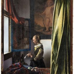
Johannes Vermeer, Woman in Blue Reading a Letter (1663-1664). Image: Wikimedia Commons.
Woman in Blue Reading a Letter is packed with pathos thanks to its moody lighting. Cast in a shadowy gloom resembling the blue silk of her overcoat, a woman stands reading a letter, her lips slightly parted, as if she’s been taken aback by what she’s read. Many believe the map hanging on the wall behind her suggests a distant lover for whom she pines (or grieves). It is a wonderfully suggestive way to open this still image to a larger narrative.
Don’t miss, too, how the lighting of the picture also tells a story, as Wheelock points out: “Light comes from two sources, creating both primary and softly diffused secondary shadows on the wall next to the chair behind the table. With his awareness light’s optical qualities, Vermeer… manipulates the flow of light quite arbitrarily for compositional reasons. For example, while the chair and the map cast shadows, the woman, who appears to stand quite close to the wall, does not. Vermeer thus separates her from the temporal framework of the room, and in the process, enhances the sense of permanence that so pervades the scene.”
The work’s strength is its raw emotional gravitas. But it lacks the bravura symbolism of some of Vermeer’s other interiors, which explains why it is not higher on our list.

Johannes Vermeer, The Little Street (ca. 1657–1661). Image: Wikimedia Commons.
This depiction of the goings-on in a Delft alleyway is decidedly prosaic on the first glance, and probably does not have the kick of human drama that The Procuress or Woman in Blue Reading a Letter have to offer. In fact, its subject is about as unromantic as you can get: chores.
You have to look closely to grasp what has long been lauded about the painting: its intensely rendered detail. Indeed, the crisp intimacy of the architectural details feel so vividly rendered that debate has raged about whether the alley in question is a real place or a composite.
In our mind, it is probably not a coincidence that two of the figures are perfectly framed by doors, as if by actual picture frames, giving a sense of artistic elevation to this everyday subject matter. And as Anthony Bailey has argued in his book on Vermeer, the image of the women doing the daily, routine labor of maintaining their world combines with the architectural detail to add up to a larger message: “Time, halted for this instant and therefore in a sense for eternity, seems to be his essential subject. Its wear and tear is visible in the bricks and mortar, the fabric of fact that bluntly underpins our tenuous and temporary hold on existence with its many unanswerable questions, such as ‘What are we doing here?’”
To be fair, that significance that takes a little time to grasp, so this painting misses our top five. Which brings me to…

Johannes Vermeer, The Milkmaid (ca. 1660). Image: Wikimedia Commons.
The Milkmaid falls smack dab in the middle of our ranking, which is fitting because it’s often considered a turning point between Vermeer’s early and mature styles.
The scene appears almost photographic, and many scholars surmise that it was around this time that Vermeer started incorporating image-capturing technology into his practice in order to better understand the effects of light, as noted by H. Perry Chapman in her essay “Women in Vermeer’s Home: Mimesis and Ideation.” “The handling of paint in the Milkmaid, specifically the glistening light on the crusty bread, and its saturated colors have been taken as evidence of Vermeer’s near scientific study of vision and of the effects of the camera obscura,” she writes.
The effects are great: In a softly lit kitchen, a maid pours milk into a basin; the counter is littered with bread, the crusts of which (along with her glistening brow) are tenderly highlighted by the sunlight. Vermeer no longer relies on a harsh chiaroscuro to create this nuanced luminescence. Instead, this virtuoso orchestration of light and color is achieved through the use of alternating primary colors and zones of light and shadow.

Johannes Vermeer, Woman Holding a Balance (ca. 1664). Image: Wikimedia Commons.
Created well into Vermeer’s mature period, this painting’s composition and lighting is superbly, well, balanced. A woman dressed in a blue jacket with fur trim stands at a table in a corner of a dark room. A soft ray of sunlight from a window to the left diagonally bisects the painting, highlighting her hands, which hold a scale in equilibrium as she weighs her jewelry strewn on the table.
The balance between light and dark in this painting is more than just visually pleasing, though—it means something, which is what truly puts it into our top tier. Vermeer uses contrast here to tell a tale of vanity and virtue, worldly pleasures and divine morality, which is why Woman Holding a Balance clocks in at number four.
In his book, A Study of Vermeer, Edward Snow breaks down the symbolism: “A large baroque painting of the Last Judgment hangs conspicuously on the rear wall of the room, situating the woman within an apocalyptic frame of reference and counterpointing her gesture. The light that illuminates her breaks into the painting from above, surrounding her with what at first glance may seem ominous, encroaching shadows… Against the violent baroque agitation of the painting behind her, the woman asserts a quiet, imperturbable calm, the quintessence of Vermeer’s vision.” Now that’s a balanced assessment!

Johannes Vermeer, Girl With a Red Hat (ca.1665-1667). Image: Wikimedia Commons.
This is another “tronie,” like Girl With a Pearl Earring, and one of Vermeer’s smallest works to boot. Currently in the collection of the National Gallery of Art, it shares a lot with its more famous cousin, from the over-the-shoulder gaze to the fanciful costume. Why is it toward the top of our list, then?
For one thing, all the details—from that dramatic patch of light across the face to the way all the textures play off of one another—really come together. We see Vermeer doing what he does best.
We’ll let Walter Liedtke make the case for the subtle greatness of its setup in his Vermeer: The Complete Paintings: “For a painter who excelled in the observation of light there was hardly a more suitable vehicle than a subject like this one, with its comparisons of skin, silk, and pearls, moist lips (their color enhanced by the hat), soft and smooth fabrics, all shiny surfaces set against the duller tones and rougher texture of the tapestry, which in addition to its complementary colors provides sympathetic shapes such as the curved lines descending from the face to the hand, the curtain-like closure of the upper left corner, and the border framing the right side of the image. Similarly, the lion’s-head finials, in addition to displaying the artist’s talent for describing effects of light, are placed with an eye to their effect on the figure, which is given a zone of space and a stability that it would not have otherwise.”
In other words, Girl with a Red Hat gives you everything that you love about Pearl Earring—the sense of undefinable mystery, the gorgeously observed fabrics, the woozy photographic quality—and then gives you a lot more. For our money, that makes it one of Vermeer’s biggest accomplishments.

Johannes Vermeer, The Art of Painting (1666). Image: Wikimedia Commons.
It’s called The Art of Painting, and it is, indeed, at the pinnacle of any list celebrating the artistry of painting.
The work happens to be one of his larger works (roughly 40 by 47 inches), but it’s also his most intellectually ambitious—the painting where Vermeer fully unfurls the intelligence behind all his other works. The scene depicted is incredibly meta: A woman embodying the muse of history, Clio, models for an artist at his easel, who is just beginning to paint her.
As Eric Jan Sluijter argues, Vermeer’s Art of Painting is meant specifically to display the superiority of its own medium over other art forms:
“Vermeer seems to indicate that the other pictorial arts… are inadequate in their imitation of nature—such products will always look like a piece of crafted stone or clay, a piece of paper with lines, or a woven textile—whereas painting can even imitate those works of art, while the reverse is impossible to achieve. Only painting can create the illusion of a perfectly convincing space filled with light, of all those different kinds of materials, substances, and textiles, and of the human figure in its most beautiful and transient form, that of a young woman.”
The Art of Painting lays it all on the table. It literally draws back the curtain on the artist’s studio. It is one of the greatest artistic balancing acts of all time, perfectly coordinating a sense of artifice with a sense of naturalism.

Johannes Vermeer, View of Delft (1660-1661). Image: Wikimedia Commons.
The Art of Painting may be about the supremacy of painting, where all the intricate parts of Vermeer’s art come together as one potent allegory. But View of Delft is where, on the most elemental level, the artist simply demonstrates this supremacy, stripping away all that intricacy down to its fundamentals.
The image has an almost guileless quality. Much has been made of the artist’s undeniable use of his favorite optical aid—a camera obscura—to render his hometown skyline accurately. Yet what’s most poignant about this view is its idiosyncrasies: The artist seems to have shifted the buildings ever so slightly, most noticeably in the long section of the Rotterdam Gate, to make the city feel less cramped, more welcoming.
On a purely painterly level, in an oeuvre known for intimate dramas of light inside, this painting stands out. In Marcel Proust’s In Search of Lost Time, the narrator describes the painting as “more striking, more different from anything else he knew.” The result is bar none the most memorable cityscape in European art, and, for us, Vermeer’s very best.