How Scottish Artist Robert Montgomery Harnesses the Power of Concrete Poetry for His Newest Works

Katie White

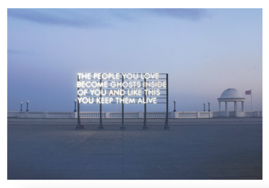
You will know Scottish-born artist Robert Montgomery’s work even if you don’t know his name. For over a decade, he has been creating public light installations of poetic and evocative phrases, some of which have become full-fledged social media sensations. (You’ve likely seen his 2010 work The People You Love Become Ghosts Inside of You on Instagram.) Drawing from a tradition of Concrete poetry that dates back to Guillaume Apollinaire, Montgomery sees his textual evocations as a way to conjure the ineffable into daily life.
Now many of these light works will be on view in London for the first time in “Shiny Colorful Amusements for the Walls of the Bourgeoisie” at JD Malat Gallery. But what makes up the core of this show is Montgomery’s most recent work, an unexpected selection of paintings that look back on the birth of the Modernist experiment more than 100 years ago. Recently, we caught up with Montgomery, who talked to us about why he’s returned to the canvas.
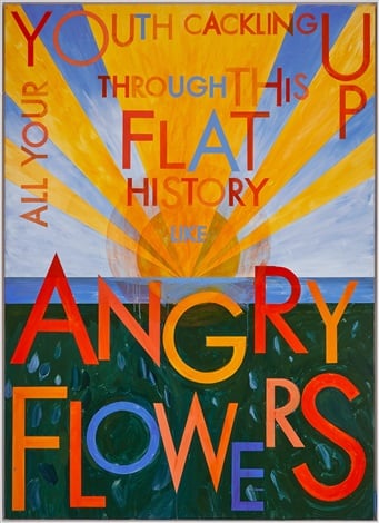
Robert Montgomery, Annunciation Painting (Angry Flowers) (2019). Courtesy of JD Malat.
Your newest show, “Shiny Colorful Amusements for the Walls of the Bourgeoisie,” includes some of your more famous light works.
I guess this show is slightly historical. It’s my first show at the gallery and we went back into the archive a bit. We showed some light works. I’ve had big shows in Los Angeles and Berlin, the Aspen Art Museum and in Ankara. But there’s a lot of light work that hasn’t been shown here in London, which is my home. So it feels like a homecoming to include works going back to 2010, including All Palaces Are Temporary Palaces and The People You Love Become Ghosts Inside of You, along with a big project I did at the Berlin Tempelhof airport in 2012. Honestly though, there’s a whole body of new painting in the show, which is what I’m most excited about
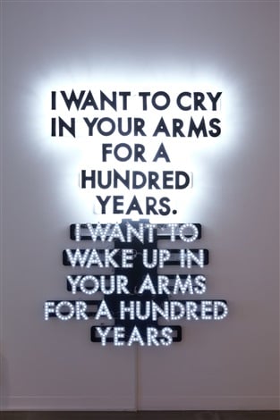
Robert Montgomery, A Hundred Years (2014). Courtesy of JD Malat Gallery.
What are the visual references you’re looking at here?
There are two series of paintings: the “Mantra” paintings and “Annunciation” paintings. The “Annunciation” paintings have more of an ecological tone. Formally, the paintings reference the Modernism of a hundred years ago and early geometric abstraction, but they also reference graphic art from the 1910s. It’s interesting to look back a hundred years and consider what Modernism was. We thought for a long time during my academic training that were were in a Post-modern world. I’m not sure we are.
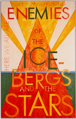
Robert Montgomery, Annunciation Painting (Enemies of the Icebergs and the Stars) (2019). Courtesy of JD Malat Gallery.
What prompted the turn to painting?
I trained as a painter at Edinburgh College of Art, which was very old school about painting when I went there. I was the one person that did well there by rebelling. At the time I made paintings with text, but I couldn’t really make them work. Eventually, I found a way to make work in public that really clicked. As that work became popular and successful, which of course I’m very happy about, I began to want something different. Consider that the public work involves a production team. I began to yearn to be able to make work in a meditative space. To work alone. So, I went back to my first medium, painting, which I did when I was 20. I’ve been working intensely in the studio on my own in a way that hopefully references Concrete poetry but also references early Modernism.
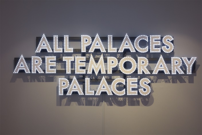
Robert Montgomery, All Palaces (2014). Courtesy of JD Malat.
How are the two series different?
The “Mantra” paintings are little things I need to get through the day. We live in a time when bad news is upon us constantly. The spectacle that used to be on television is on our phones and on our bodies, in a way. I was thinking of positive mantras that I need to protect myself from the spectacle. [Wit a painting like] All Your Youth Cackling Up Through this Flat History Like Angry Flowers, I was thinking of Greta Thunberg and all the students fighting the climate crisis. I was thinking of them as angry flowers. That righteous anger of the youth might somehow stop the crisis.
Does the font you use for these paintings have any special meaning?
Yes, I redrew the font Futura, which a lot of people think is a Bauhaus font, but it’s not. It comes from a lesser-known group called Neue Frankfurt that was around in 1920s in Germany. They were much more socially conscious than Bauhaus and put all their artists and architects to work on the question of social housing. They built some of the best examples of that idealistic Modernist housing of that era. Neue Frankfurt also had a magazine about social housing, and that was the font they used. So the font has that secret cargo for me. I’ve drawn in it a slightly more accentuated way.
What do you hope someone will take away from the show?
Hopefully people will reflect on the last hundred years of modern history and art history and see the ghosts of that in the work, and then reflect on this very difficult point in socio-politcal and ecological history that we’re in now too.
“Robert Montgomery: Shiny Colourful Amusements for the Walls of the Bourgeoisie” is on view through November 2, 2019.