Art World
Unknown Andy Warhol Discovered in Carnegie Mellon Archive by artnet Critic Blake Gopnik
THE DAILY PIC: Warhol's second published work is found in a magazine called Cano.
THE DAILY PIC: Warhol's second published work is found in a magazine called Cano.
Blake Gopnik
 ShareShare This Article
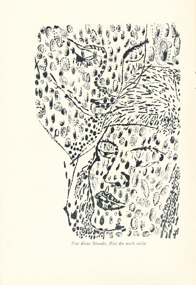
(Image courtesy Carnegie Mellon University Archives)
It didn’t take that much to unearth the new Warhol that I’m revealing today. To find the picture, which turns out to be the second work that Warhol ever published, all I had to do was take a ten-hour train ride from New York to Pittsburgh, head to the archives of Carnegie Mellon University, where Warhol studied art, discover that they have files dedicated to ancient student publications, get the archivist, Julia Corrin, to pull the box with the student magazine called Cano, leaf through every page of every issue of the thing and then, hey presto, on the second page of the last number published, in April of 1949, spot a full-page illustration that could only be by the master. Or rather, the not-quite-master-yet. (Click on my image to see the work in detail.)
Warhol would have been all of 20 when he drew the picture, in his senior year in college but still finding his footing as an artist. He was talented enough to have been named art director of Cano, the students’ literary magazine. (Given what it’s like to work on student publications, this might have been more burden than honor.) But he was also enough of a beginner to produce a work that doesn’t quite know where it’s going.
Warhol executed the illustration in his new “blotted line” technique, which went on to be his signature commercial style for the next decade and more. (The technique is on view everywhere in the amazing catalogue of the “complete” magazine work just released by an obsessive Warholian named Paul Maréchal; I feel guilty having to revise its completeness already.) Warhol had adopted the blotted line, or maybe invented it, sometime in 1948, and its presence in this illustration pretty much guarantees that the image is by him. He’d already used it five months before for the comic orchestra on the cover of issue 7 of Cano, which is well known as his very first published image. (Cano also includes some minor decorative touches that could be by Warhol.)
To make pieces like the one I’ve discovered, Warhol first drew his subject in fine pencil or pen, went over that drawing in goopy wet ink, then laboriously blotted this inked line onto another sheet of paper that would become the finished, more fractured image. All the fussy hand labor of drawing and blotting had the paradoxical effect of producing an image that looked mechanical, as though it were a twentieth-generation print pulled from a lousy press, with an image that had broken down in the pulling. Our blotted-line drawing for Cano shows Warhol faking mass production from the very start of his career, as of course he goes on to do, with a vengeance, through his heyday as a Pop artist. Warhol’s so-called Factory was always much closer to a buzzing Old Master workshop than to a real manufacturing facility. Pretending his production was industrial was an artistic conceit.
In the new Carnegie Mellon illustration, Warhol, not yet sure of himself, mixes his blotted line with a second drawing style that he was also developing around this time: a smooth, swooping pen line, borrowed from Matisse, that evokes a spontaneous virtuosity which is in fact at odds with the pseudo-printed labor of his other, blotted mode. In the 1950s, Warhol mostly keeps his two styles apart, but here he hasn’t figured that out. We have to ignore the breaks and blots in its line to realize that our Cano piece links up nicely with plenty of Warhol’s later, “Matissean” portraits whose faces have the same pursed lips, fine chins and slender eyes and cheekbones as the two figures from 1949.
Time now to deal with those absurd “leopard spots” that spread right across the Cano faces and into the spaces around them. Although those spots certainly look like they show Warhol at his most goofily immature–had his famous acne spread from his own face to his subjects’?– they may actually hint at the deep-thinking artist he went on to be. Warhol’s illustration was made to go with a terribly grim short story, written by a fellow student named Jane E. Harris, that tells the tale of a gorgeous young Austrian couple separated by the horrors of World War II. (Hence the German caption to Warhol’s image, quoting from an obscure Romantic-era poem; like Cano itself, whose Latin title–“I Sing”–comes from the first line of Virgil’s Aeneid, Harris’s story can be a touch pretentious.) When the story’s pair meet again after years of deprivation, their sorrows have eaten away at their beauty; the husband, disgusted by their newfound ugliness, takes off into the night. Warhol’s challenge was to use a single image to depict both the couple’s former grace and their fall from it. To his credit, he forgoes the obvious before-and-after solution in favor of what is basically a conceptual one: The blotches that cover his whole image refer to the idea of ugliness without stooping to a literal, narrative depiction of it in his figures. It’s as though not just those characters but Warhol’s entire vision has been infected by the ugly, with the story’s illustration “catching” the repulsiveness described in its text. This device of an all-over pattern that overlaps a figure survives into some other Warhol pieces from the 1950s, but almost always with the opposite effect and meaning of his Cano illustration: The “pustules” from Cano become butterflies and flowers that flutter all over some splendid beauty, as detachable symbols of loveliness. (See the late ’50s image below.) We don’t really get the return of the mournful Cano effect until around 1962, when Warhol’s photographic images of car crashes and suicides start to disappear behind a mess of badly pulled silkscreen ink. We may need to think of our newfound student illustration as the first of Warhol’s Death and Disaster pictures.
Or maybe it looks even further forward than that, to his gender-bending work of the late 1960s and ’70s. Although the text of the Cano story describes a manly man and elegant woman, Warhol’s illustration almost eliminates the distinction. The picture gets made at just the moment when Warhol would have been coming out, in a city dedicated to persecuting gay people. (I’ll be giving the grim details in the Warhol biography I’m working on.) The courage that the art student showed in messing with gender becomes a driving force behind the mature artist’s work of the ‘50s and beyond.
For a full survey of past Daily Pics visit blakegopnik.com/archive.
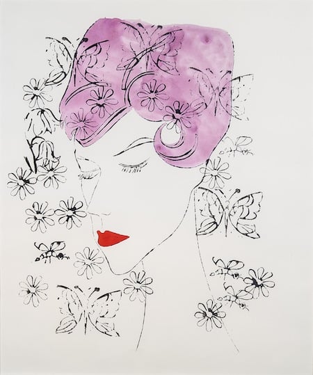 (Courtesy Hirschl & Adler Modern, New York; © 2015 The Andy Warhol Foundation for the Visual Arts, Inc. / Artists Rights Society (ARS), New York)