by
Christie Chu
 Share This Article


Marsala is in and Radiant Orchid is out.
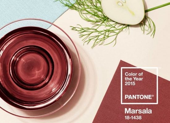
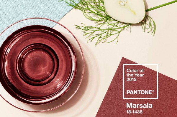
Pantone has chosen the color of 2015 as Marsala, a “naturally robust and earthy wine red…[that] enriches our minds, bodies, and souls,” according the color company’s website.
Each year the color experts at Pantone choose a hue that will strike a visual chord with consumers in the coming year. Fashion, home decor, and graphic design firms keep an eye on Pantone’s choices.
Indeed, mega beauty retailer Sephora has partnered with Pantone in the past for a line of products in the elected color. Brands like A.L.C, Opening Ceremony, and Pringle of Scotland have already incorporated the new shade in their pre-fall collections.
But why did Pantone choose Marsala? Executive director Leatrice Eiseman said, “We felt it was time for something that spoke to people’s real needs—the need of nurturing, the need for something more robust that had a life force that was intrinsic to it. The most interesting thing about Marsala, I think, is that even though it has this grounded influence, this earthy undertone we see in the wine-red, at the same time, it has this sophistication. There is something very versatile about the color.”
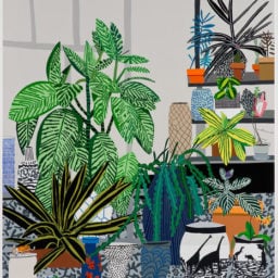
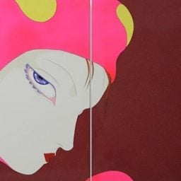
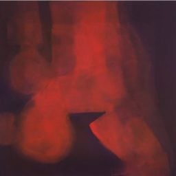
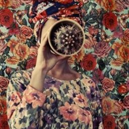
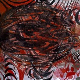
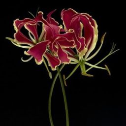
No doubt the color will infiltrate the art world as well. Here are a few works that could be “en vogue” next year.
Follow Artnet News on Facebook:
Want to stay ahead of the art world? Subscribe to our newsletter to get the breaking news, eye-opening interviews, and incisive critical takes that drive the conversation forward.
Share This Article
Article topics

Related Articles
-