The red vibrates softly, almost musically, humming with energy and flowing in every direction the eye travels.
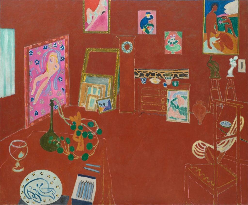
Henri Matisse’s The Red Studio (L’Atelier rouge) (1911) is a unique and contradictory image that has challenged patrons and critics since its creation. The painting shows Matisse’s Issy-les-Moulineaux studio, just outside Paris, which the artist designed for himself just a few years before. The image is, well, very red—a rust hue covers the studio’s ceilings and walls.
Eleven of Matisse’s real-life works make appearances in the composition, lining the walls of the space, along with a chair, a plant, and other personal effects. The artist himself is nowhere to be seen, but while the painting ostensibly lacks action, it overflows with energy.
The Red Studio caused some consternation when it first debuted. Matisse’s devoted patron, Russian collector Sergei Shchukin, commissioned it in 1910 to accompany the artist’s The Red Room (1908), which he also owned. But after seeing The Red Studio in person, Shchukin decided to pass on it.
The work remained in Matisse’s possession until it was purchased in 1927 by aristocrat David Tennant, who displayed it in London’s Gargoyle Club. The Museum of Modern Art in New York acquired it from Tennant in 1949.
Since entering MoMA’s collection, The Red Studio’s influence has steadily grown. Now, the work is the centerpiece of a jewel-box exhibition that attempts to recreate the actual studio within the museum itself. The show presents the titular painting alongside many of the real-life objects and canvases it depicts.
MoMA’s chief curator Ann Temkin described the curatorial process as a “treasure hunt”—one that has some notable prizes. Le Luxe II (1907–8), Nude With a White Scarf (1909), and Nymph and Faun (1911), all featured in the painting, are on display, as well as a never-before-seen terra cotta that appears on the studio table.
To mark the exhibition, we’ve taken a closer look at The Red Studio and pinpointed three details that just might help you see it in a new way.
1) It Marks the End of Matisse’s Fauvist Period and the Beginning of His Pursuit of Simplicity

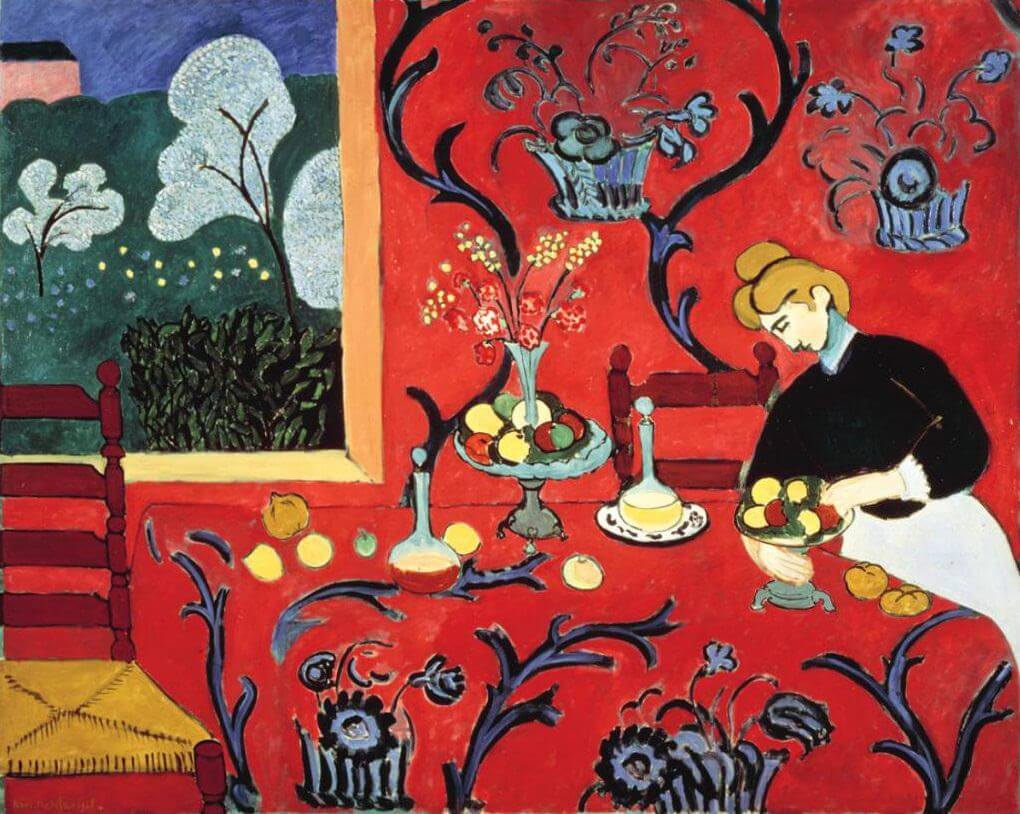
Henri Matisse, The Dessert: Harmony in Red (1908).
Matisse loved red—it was a color that he returned to again and again. Here, he uses it in a subtle and unexpected way. Consider that only a few years before The Red Studio, Matisse deployed a visceral blood red in his Fauvist masterpiece The Dessert: Harmony in Red (1908). While that red, in keeping with Fauvism’s focus on intense color, is a chromatic punch in the eyes, the brick color of The Red Studio, particularly in person, offers the opposite—an almost-soothing viewing experience.
“An actual room of that color would be overpowering, warm, and brash, but this red is none of these,” art historian Robert Reiff writes in the essay “Matisse and ‘The Red Studio.'” While Harmony in Red is an unsettling work, The Red Studio “breathes relaxation and graciousness and sophistication.” Part of this, he notes, is due to the dilution of the paint, which is “brushed in and spotted about in a manner that appears superficially casual and off-hand.”
These adjustments, particularly the thinly applied washes of color, are indicative of the new chapter that The Red Studio begins. Rather than the “wild beast” intensity of the Fauvist period, Matisse here seeks to pare down his compositions to their essential elements, writing his notebook that “the simplest means are those which best enable an artist to express himself.” That he managed to do this with as polarizing a color as red is a testament to his virtuosity.
2) It’s a Perceptual Puzzle

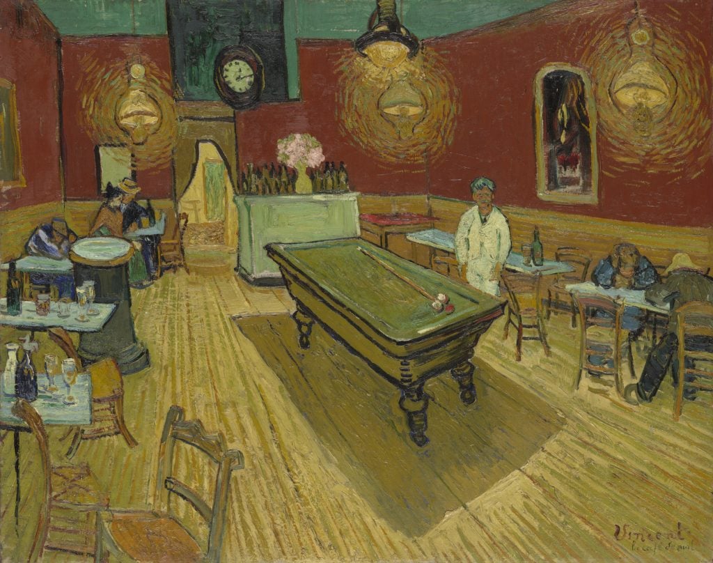
Vincent Van Gogh, The Night Café (1888). Collection of Yale University Art Gallery.
One illuminating comparison for The Red Studio is Van Gogh’s The Night Cafe (1888), a similarly rust-colored room seen from an ostensibly similar perspective. But whereas Van Gogh’s painting is a feverish confrontation of forced perspective with floor, ceiling, and walls visually colliding, Matisse’s painting has a fluid quality thanks to the artist’s playful manipulation of space.
A close look at The Red Studio offers clues to how he did it. Look at the upper left corner of the room—you’ll see the artist has eliminated the corner itself, though the large pink nude resting against the wall implies its presence. The table before us also juts out strangely as it gets closer to the edge of the painting, consuming space in a manner incongruous with the rest of the floor. Meanwhile, the seat of the high-backed chair on the right appears, impossibly, largest at the point furthest from the viewer.
At first glance, The Red Studio reads as though Matisse has painted yellow-white lines onto the red wash of the background in order to outline the forms that occupy the room. When we look closer, we see that these lines are, in fact, subtle combinations of yellow and blue tones, mixed with other hues. And they are not applied on top of the red, but are instead the ground of the painting peeking through.
Matisse has painted up to the point of the lines, leaving these slivers of space bare. The seemingly spontaneous painting is, in actuality, the result of tremendous strategy and cohesive artistic conception. In this way, Matisse’s painting of his studio underscores his own philosophy—that the effect of effortlessness can only be achieved through great effort.
3) It’s an Invitation Into Matisse’s Mind

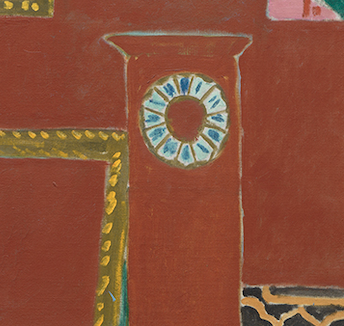
Detail of The Red Studio (1911).
Much more than simply offering a view of his creative space, The Red Studio grants us access to Matisse’s mind.
“Matisse seems to be beckoning us in,” Reiff writes. “He does this by forcing perspective and raising the horizon. We are above, looking down.”

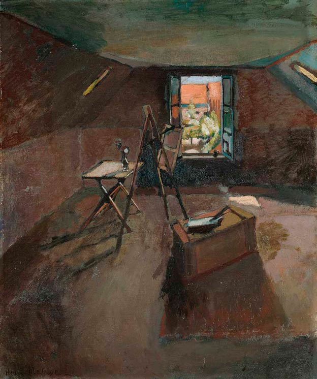
Henri Matisse, Studio under the Eaves (1903). Collection of the Fitzwilliam Museum, Cambridge.
One final comparison helps us understand what Matisse is up to. Consider The Red Studio alongside the earlier work Studio Under the Eaves (1903), made during a difficult time in the artist’s career. The latter is a dreary, claustrophobic image that propels our view out the studio window, seeming to suggest that the beauty of art comes from the world outside.
In The Red Studio, Matisse turns inward. Looking closely at the image, one notices a rectangular clock at the center, which acts as a kind of anchor and creates compositional harmony. Now, zoom in a bit more: you’ll find the clock face has no hands. The studio space, the gesture seems to say, exists outside of time. In contrast to Studio Under the Eaves, The Red Studio delights in being there.
But even the space of the studio itself, with its invisible corners and difficult-to-discern floor, is tenuous. In fact, only the objects of the artist’s creation give it substance.
“The objects in the studio serve to define its space,” Reiff concludes. “They are lined up against the wall which is of the same color as the floor. Objects such as the table, the chairs, the grandfather clock… are defined by a yellow line. They are near schemas, ghosts of objects, but the paintings shine forth as delectable morsels of art.”

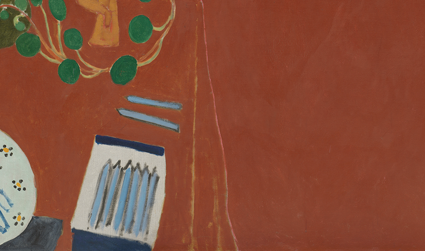
Detail of The Red Studio (1911).
In perhaps the work’s most evocative detail, Matisse makes a request—or even a dare: He has left two crayons out on the table right at the edge of the picture plane. He seems to beckon us: Would you be so bold as to enter the painting and pick them up?
“Matisse: The Red Studio” is on view at the Museum of Modern Art in New York through September 10.
