People
‘It’s a Blurred Boundary’: Top Interior Designer Kelly Wearstler on How She Blends Art and Design to Create Spaces You Want to Be In
The designer talks about the process of collaborating across disciplines.
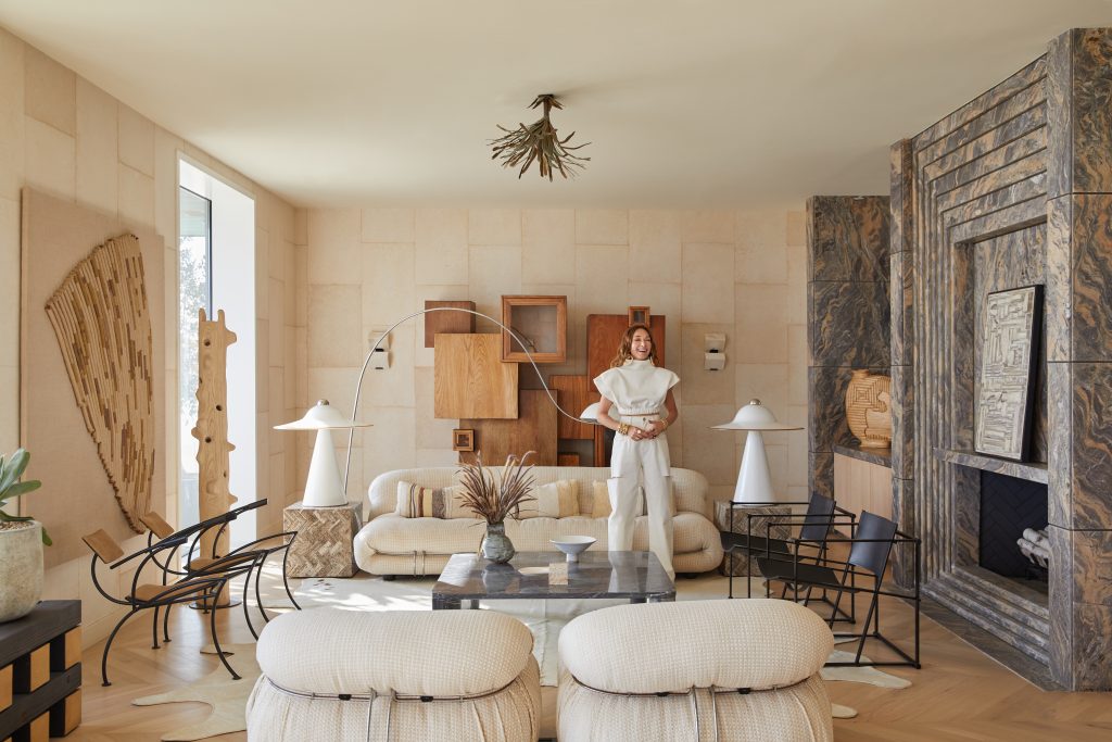
The designer talks about the process of collaborating across disciplines.

Christine Ajudua

Designer Kelly Wearstler is renowned for creating spaces that juxtapose forms, textures, colors, and cultural references, from hotels to homes to a cyber-garage for LeBron James’s all-electric Hummer EV in the Southern California desert. Functional yet artful and always fun, they are often products of cross-disciplinary collaboration. In short, Wearstler says, “I like to mix it up.”
In the past year and a half, as homes became workplaces and entire worlds, the designer’s kaleidoscopic approach has come to make a whole lot of sense. (Incidentally, in the first half of this year, decorative art sales at auction have gone up 207 percent over the equivalent period in 2020, which were themselves up 26 percent from 2019, according to the Artnet Price Database.)
Recently, Wearstler has been busier than ever, designing everything from a California-inspired paint collection with Farrow & Ball to the aforementioned virtual garage for LeBron (a collaboration with GMC), all while putting the final touches on her fourth Proper Hotel (it’s set to open next month in a ca.-1920 Downtown L.A. landmark, with site-specific installations commissioned from local artists). That’s even without mentioning the new collection of furnishings she designed, playfully sculpted from raw metal and stone, aptly titled “Transcendence.”
The other day, as she was making the trek from her home in Malibu to her West Hollywood studio via California’s Pacific Coast Highway, she graciously pulled over to take our call and talk about the increasingly intimate worlds of art and design.
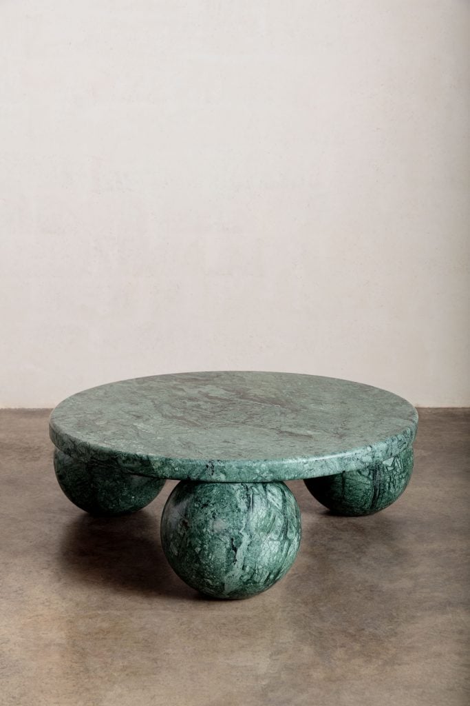
A stone Morro coffee table from Wearstler’s “Transcendence” collection. Courtesy of Kelly Wearstler Studio.
The design and art worlds are overlapping more and more, to an extent that design can be viewed as art in its own right. What do you make of this trend?
Art and design have been colliding and merging for forever. I was actually just in Greece and went to the Acropolis Museum and, you know, the dinnerware and the graphics and imagery there—I mean, it’s art. And that was in the ancient times.
If you look at pieces from, say, Ettore Sottsass—and I own several—there’s only so many of them out there in the world and they’re incredibly coveted; they are artworks in their own right.
If we design a chair, I look at it as art, because it’s incredibly carefully considered and it’s my creative outlet. But I don’t know what anyone else would call it.
Where do you draw the line?
As a designer, I have to create something that functions; I’m also thinking about how something would be experienced with its surroundings. Whereas maybe [for an artist], there’s a freedom to create something that just simply exists. To me, art can be an experience in itself.
Again, it’s a blurred boundary. I kind of look at everything as a sculpture; it’s also about the curation: how things are put together and how they interact.
For example, in my home, you walk in and there is this vestibule. There are two chairs—one’s marble, the other is this metal sculpture chair from the ‘80s. There’s a Louis Durot mirror and a sculpture from Soft Baroque. It’s kind of like an art installation, but functional.
There’s another area in my home that called for seating below an artwork [by Len Klikunas]. So I commissioned Misha Kahn to do a bench—it has these very organic-shaped ceramic pieces that kind of interlock, and the paint ombres. It’s really beautiful and fluid. I love him and his work.
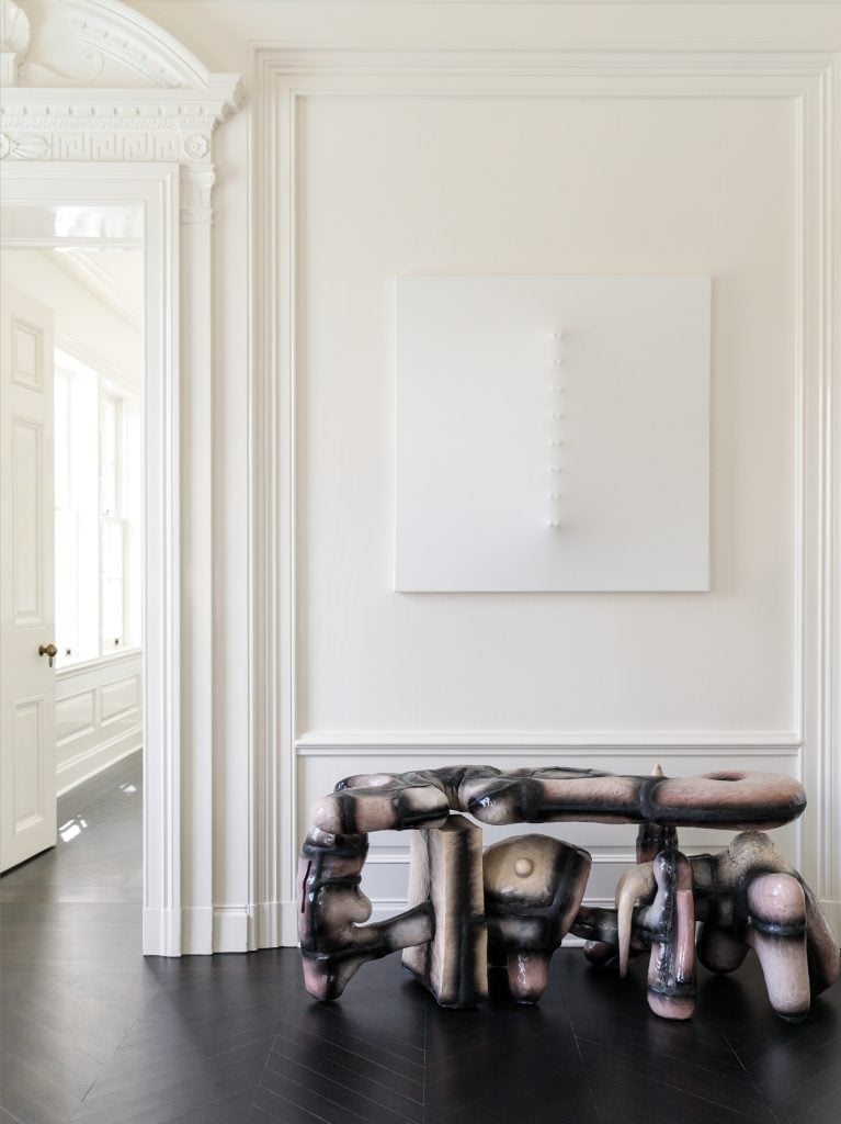
Wearstler commissioned a bench from the designer-sculptor Misha Kahn. Photo: The Ingalls.
In your view, what distinguishes great design from good design?
Good design you really don’t notice. Bad design, you do. But great design is super-inspirational—it makes you happy; it makes you want to continue to experience and enjoy it, whether it’s a product or a space; it makes you want to come back and stay.
That’s more important than ever, given how much we’ve all been forced to stay home—and often also work at home—during this last year and a half.
Well, the home is the most important place and a reflection of your personal style—that much has not changed. People are now just really putting in the time, the money, the consideration about how they live in it and what they interact with every day.
For example, we just commissioned a desk from Ross Hansen. He’s a landscape artist and designer with Volume Gallery in Chicago, and he does limited-run furniture pieces. The client collects art and wanted something that was literally a sculpture in the room, but that they could use. And so Ross came up with this very sculptural desk design that really both serves as art and satisfies a function, using this composite resin material that almost looks like marble.
You regularly bring artists into your design practice. Why is that?
The thing is, artists have their own point of view, and that’s something that I’m drawn to. Coming together and seeing how their minds work when we do something that they haven’t done before—it’s just incredible.
If you look at the commission we did with Ben Medansky [at the Proper Hotel that’s opening in Downtown L.A.], his medium is ceramic. It has a lot of dimension to it, and we commissioned him to design this really large, 70-foot wall of his tile installations for the swimming pool suite—which sounds odd, but the hotel used to be a historic YMCA and we had to leave a lot of the existing architectural features, so the suite literally has a swimming pool in it—like, a large one.
Ben and I met six to eight times, whether it was on site, or in my studio, or at his studio, and we did mock-ups and studied and really came together. I really liked that exploration: having a piece designed by this local artist that is one-of-a-kind and specifically for that space.
How do these collaborations come about?
Visiting artist studios is one of my favorite things to do. I was at Katie Stout’s studio in Brooklyn, and she had this hand-painted resin sample, literally on her floor. And I was like, “This is so amazing.” I was working on a client’s house—this client loves color, loves the Memphis period—and I asked Katie, “Can I commission you to do a piece of furniture with this as the inspiration?” So she made this cabinet with that composite material, and then added these hand-sculpted bronze handles and legs. This piece came out of that visit. It’s spectacular, it’s meaningful, and it was great working with her.
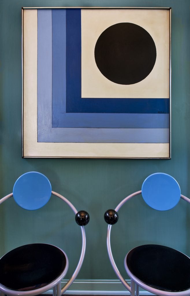
The Victor Vasarely piece at Wearstler’s house. Photo: Grey Crawford.
Which artist has been the most formative for you as a designer?
I would say Victor Vasarely. When I was in high school, I loved graphic design, and I was always super-intrigued by his work. I loved the three-dimensional quality—it’s probably why I ended up going from graphic design into architecture and interiors.
I have a piece of his that’s about 16-by-16—it has spheres that create this kind of pop art trompe l’oeil. I’ve had it for probably 20 years. It was in our master bedroom for a long time, and now it’s in a corridor off the entrance vestibule—in a nice, prominent place.
You’ve worked on projects with everyone from the urban gardener and fashion designer Ron Finley to the Very Gay Paint duo. What do you look for in a collaborator?
I am drawn to creatives who are somewhat subversive or challenge the status quo. That is what modernity is all about, and how we drive a conversation forward as a community. I’m naturally inspired by new voices—if we have the opportunity to collaborate, all the better! That’s where my learning process really starts.