Art & Exhibitions
Kevin McGarry Picks the Winners at the Venice Biennale’s Swiss, German, and British Pavilions
A couple of pavilions really shine this time around.

A couple of pavilions really shine this time around.
Kevin McGarry
 ShareShare This Article
Mediocrity is not rewarded in the Giardini. As could be expected, a couple of this year’s national pavilions shine, and the ones that don’t … they’ll probably be forgotten (if not deliberately purged from national memory banks).
Pamela Rosenkranz, for Switzerland, is one of the standouts, at once immersive and somehow subtle. The details begin with a muted mint paint applied to many parts of the pavilion’s façade, and then, once you’re within the courtyard, green light keyed to the same RGB code (which, in daylight, gives an odd effect).
This chromatic conditioning prepares viewers to encounter, inside, what is by far Rosenkranz’s largest work to date: the building’s entire interior is coated with PVC so it can hold a monumental swimming pool full of water tinted the color of Caucasian flesh (the exact opposite of the green). Baby flesh, to be specific, the synthesized scent of which is pumped into the room as one gazes at the surface of the milky sea.
To be yet more specific, the skin color the piece refers to is, according to Rosenkranz, meant to be an average of those found in classic Venetian paintings, so it’s site-specific. This is a great example of making a grand gesture that intervenes with a pavilion’s architecture in a way that is phenomenologically absorbing, versus hackneyed (see: French pavilion).

Hito Steyerl at the German pavilion, Venice Biennale.
Another super entry is Hito Steyerl, in a group show put on by Germany. Why a country, especially one with lots of capable artists to choose from, would elect not to mount a solo show is befuddling. Germany ends up feeling like one anyway, though, because everyone is so riveted to what is going on in the basement, which Steyerl has tricked out with neon blue gridding on the floors, walls, and ceilings to look like a set from that campy 1982 sci-fi classic, Tron.
The Cartesian interior design prepares viewers for a video essay about motion-capture technology—a sci-fi fantasy (slash documentary) about, among other, cyclically related things, a German investing company using a hadron collider to do day-trading faster than the speed of light; a subversive group that believes “all photons are created equal”; and an economy of indentured servitude spawned from motion, in which people’s captured movements are converted into analog sunlight.
It could have all added up to a dizzying overload of information, but, as always, Steyerl’s respect for the viewer (which in 2015 means expecting a mind that is rigorous as well as easily distracted) is ace. The piece is a high-energy riddle, and the illumination motif also extends to the sculptural elements of the theater: lawn chairs and the like are slung back, and the screen is tilted downward, so viewers are essentially sunbathing in an audiovisual glow. It’s so great when being fed theory and watching a longish video in a biennial is, rather than a punishment, an intellectual joy.
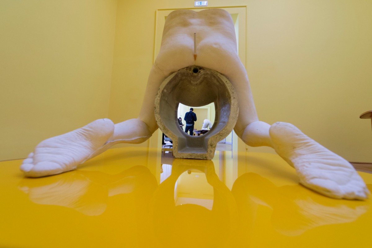
Saran Lucas at the British pavilion, Venice Biennale.
As for some good but not great pavilions, Sarah Lucas for Great Britain is a pleaser, with jazzy, goldenrod walls and cigarette butts stuffed where the sun don’t shine (that is, into private areas of concrete figures cast from the waist down). Minimalist white refrigeration devices and castings of Eames chairs introduce some markers of domesticity. And at the entrance there is a massive, sagging kind of anti-Koons sculpture whose yellow matches the walls. Nice but a bit safe and over-determined, kind of like an excellent gallery show.

Danh Vo with Danh Vo Special Edition Punta della Dogana 2015 at the Punta della Dogana, where Vo has curated “Slip of the Tongue.”
Dahn Vo for Denmark is much more restrained—spartan in fact, with some rooms containing only a small repurposed object—but also similarly pop in a weird way, fusing appropriated sculptural forms with domestic ones. A bottle of $300-plus tequila rests on a table and is also available for sale at the press desk (strange!). Instead of Lucas’ sunny monochrome, Vo has a vermillion accent wall.
The Golden Lion for most promise, and longest line, goes to Joan Jonas for the United States. Reactions are mixed, but I don’t think the show—a suite of five video installations themed on unembellished, somehow ominous subjects such as bees, fish, and mirrors—is exactly a career-topping achievement for such a luminary. It’s haunting, poetic, and true to the spirit of Jonas’ work, but it’s also a bit too quiet, and Venice is definitely a place where in most cases you need to shout to be heard.