Opinion
Are Museums Going the Way of the Sunday Funnies? Google Certainly Thinks So
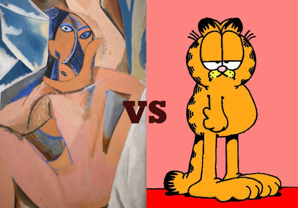
Interest is museums is declining, despite blockbuster shows.
Interest is museums is declining, despite blockbuster shows.

Ben Davis

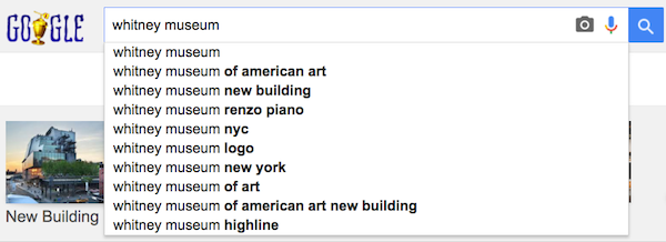
Google searches for the Whitney Museum; Google Trends “Topic” search bundles related queries to give a sense of overall interest in a subject
How important to the public is art, in the general attention economy of 2015?
The art world is a cozy subculture, and like subcultures everywhere it has a great belief in its own merit and values. Unlike other subcultures, though, it tends to confuse itself with Culture as such, making it somewhat difficult to get perspective on where it really sits in the world.
For instance, it is repeated often that art is having its moment, that it is having a big breakthrough to a broader public. But the National Endowment for the Arts tells us that the number of overall visitors to galleries and museums has been shrinking for quite some time, despite blockbuster shows and giant advertisement campaigns. One’s own immediate experience can be deceiving.
And so I turned to Google Trends, the handy-dandy tool that gives you a snapshot of where Internet appetites are going.
I plugged in the names of some of my favorite museums. And what I found, almost universally, is that according to Google, “Search Interest” in museums has steadily declined over the last decade.
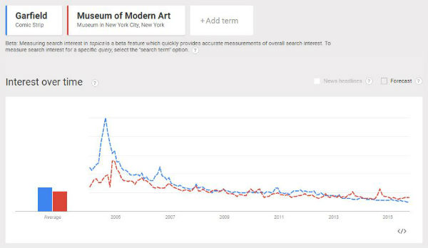
It appears, for instance, that interest in the Museum of Modern Art peaked way back in 2004, about the time that its new Manhattan building opened. As of 2015, after a gentle but steady decline, the topic “Museum of Modern Art” is running at something like a quarter of what it was a decade ago.

Simon Rogers.
Image: Courtesy simonrogers.net.
What does this mean? I called Simon Rogers, data editor at Google, to ask. He clarified that Google Trends measures how much importance a topic has as a proportion of the entire mass of Google searches at a given time, rather than the numerical quantity of searches. In theory, the raw number of searches for a topic could even increase, while their share of the whole declined.
The best way to read the data is as a measure of its share in the total economy of attention, as represented by Google searches.
“We get these numbers back, but we never get raw numbers. They are proportions,” Rogers explained. “To be honest they don’t mean much to me internally, so we always index them 1 to 100.”
Because of this, Rogers said the best way to use the tool is to make comparisons, to show relative importance. A Trends graph of interest in “Musical Theatre” gives a sense of fluctuation over time and some gradual fall off of an unknown amount; a Trends graph in “Musical Theatre” compared to “EDM” (Electronic Dance Music—ask the nearest teenager) illustrates that, while the former has waned and the latter has surged in popularity, the broad public still probably prefers Fiddler on the Roof to Deadmau5 by a wide margin.
So, I picked a point of comparison to measure the interest in museums against. Specifically, I picked the Sunday funnies.
Why funnies? Partly because comics are an accessible reference, but mainly because I found that the volume of interest in them—and indeed the decline of interest over time—mapped surprisingly well onto the Google Trends fate of various museums.
So, below, you have “Search Interest” in a handful of key art institutions, compared with the comic strip that best mirrors its weight in the group mind.
The Museum of Modern Art and Garfield

As mentioned above, MoMA has its big spike in interest around the time of its reopening in 2004, coincidentally exactly as Jim Davis’s Garfield received a fresh wave of attention of its own, based on the Bill Murray movie.
Interestingly enough, this comparison is the one example here where it makes a big difference whether you filter things by worldwide or merely national search interest: Garfield, it seems, gets much more of a share of its audience internationally than MoMA. Who would have thought that the lasagna-loving cat was the more cosmopolitan reference?
(During our conversation, Rogers used his own internal tool to average the Google search data for MoMA by year, and found the obvious: “2005 is the top,” he said. “Then the bottom years are ’12, ’15, and ’14. It has about half the size of the interest in the year that it reopened.”)
The graph comparing the two, below:
***
The Guggenheim and Calvin and Hobbes
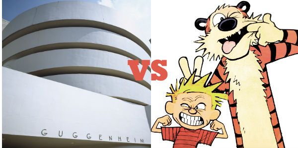
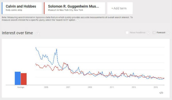
People were Googling the “Gugg” most back in August of 2006, fleetingly giving it ascendance over Bill Waterson’s beloved Calvin & Hobbes strip, which ceased official publication in 1995. (The graph’s December 2005 Calvin & Hobbes spike corresponds, I think, to the release of the Complete Calvin & Hobbes for the Christmas season).
The graph:
***
The Whitney Museum of American Art and The Far Side
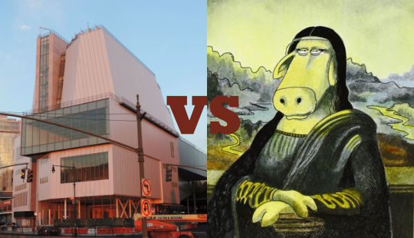
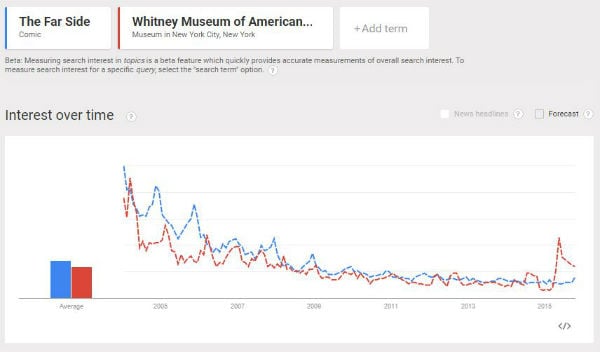
The Whitney’s bold new building in the Meatpacking District certainly got people wanting to know more, even if at the peak of the new interest it still only commanded half of the Google attention that it had back in March 2004. That is enough, however, to finally vault it above the trend line set by Gary Larson’s offbeat The Far Side, which, like Calvin & Hobbes, passed into eternity two decades before, in 1995.
Still, 2015 looks as if it will be only the fifth highest year in terms of overall interest, Rogers told me.
The graph:
***

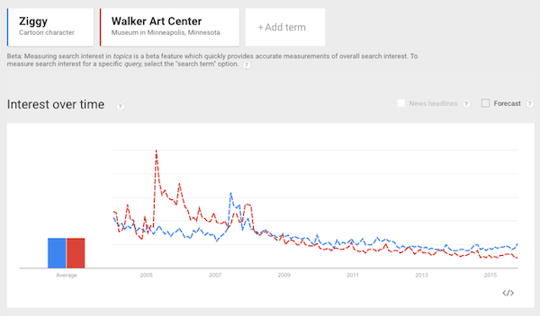
Both are dreamers. But for most of the decade, the Walker Art Center has enjoyed a commanding lead over Ziggy. However, by January 2010, in the wake of a long comedown from the opening of the Walker’s Herzog & De Meuron building in 2005, the hopeful little guy had closed the gap.
The graph:
***
Crystal Bridges Museum of American Art and Zits
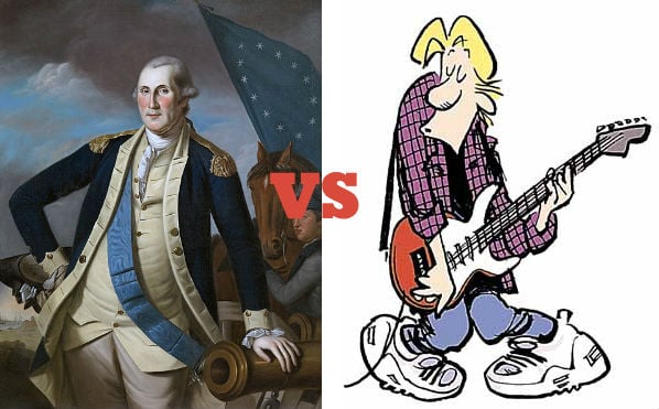
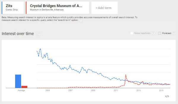
Alice Walton’s museum rocketed onto the national radar in late 2011 as a new go-to destination for art lovers in the Ozarks. When it did, people were briefly captivated enough to vault Crystal Bridges above the interest in Zits, the Jerry Scott/Jim Borgman comic about the foibles of adolescence. Interest then settled down to where it is now, about a third of what it had at its debut, and about at parity with the adventures of a certain syndicated rapscallion.
The graph:
Postscript on Museums vs. Comics
A final note from Google’s data journalist.
“What you will find is that Google in 2015 is very different Google to what it was in 2004,” Rogers said. “So when the Museum of Modern Art reopened [Google] was a very different size, even in terms of the countries where it was available. Also, there are always more searches year on year, and that also means that there’s more stuff in there and more things that people search for.”
Culture is getting more complex; you’d expect the public’s interests to grow more diverse and complex too. People simply use the Internet for more kinds of things now than 10 years ago.
Alternatively, it is always possible that Google Search itself has just become a less important avenue for people in the specific instance of finding info about museums, for whatever reason.
But not everything has lost share. “Fashion,” for instance, has steadily grown in interest, while “Art” has seemingly lost ground. But then again, so has “Science.”
The comparisons only show that, on some level, in the competition for the public’s attention, museums’ status in the Google-searching public’s mind looks a lot like that of those colorful things you remember from when you were a kid, that you found in the back of those other things, made of paper, where your parents used to read the news. Both in terms of relative volume and trajectory of interest.
That fact can mean a lot of things—but most of them probably aren’t that funny.
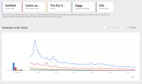
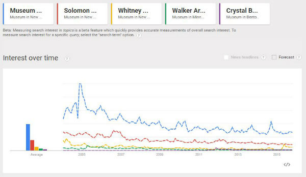
Below, for reference, is the comparison of all the museums mentioned here graphed against each other, for relative scale:
And, all of their cartoon doubles:
