Art & Exhibitions
Painter Laura Shechter Finds Beauty in NYC’s Graffiti Blight
The artist's paintings appear in multiple shows this summer.

The artist's paintings appear in multiple shows this summer.
Graham Fuller
 ShareShare This Article
Brooklyn-based Laura Shechter is a self-described “perceptualist” painter of New York cityscapes. In 1999, Shechter, who had built a reputation as a painter of vibrant still lifes with a subtle feminist component, experimentally replicated a photograph taken by her husband looking into the Gowanus Canal from the F train. Since then she has dedicated herself to rendering strictly non-touristic views of New York City’s boroughs in intricate tectonic detail. She has also extended her purview to the barrios of Lima.
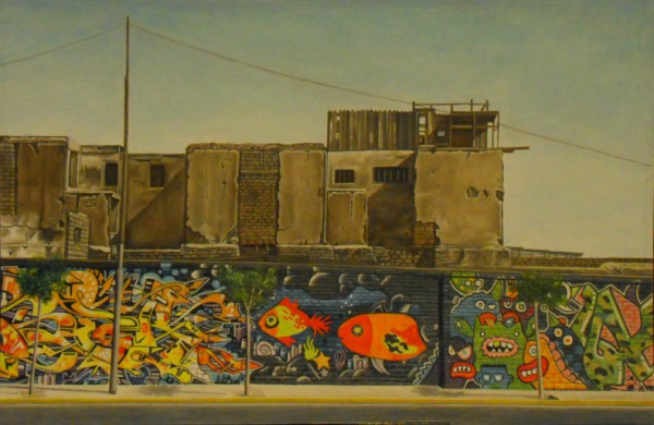
Laura Shechter, Graffiti, Lima, Peru (2014)
Although Shechter is primarily invested in solving the aesthetic conundrums each photo-based painting presents, each is coincidentally an act of memorialization and a social statement. The graffiti germane to her paintings preserves the dazzling (or sometimes indiscriminate) work of street artists that seldom survives urban renewal; it also re-inscribes their need to beautify their ‘hoods, desecrate them, or simply make their mark. Devoid of human figures, Shechter’s paintings burst with a rebellious energy that disrupts their surface serenity.
Two of these paintings are currently on display in Manhattan. D’Art is Shechter’s contribution to the “The Annual 2014” at the National Academy Museum (through September 14). East 165 St., Bronx is part of the “Between the Boroughs Group Cityscape Exhibit,” George Billis Gallery, 525 West 26th Street (through July 19). FSM Packing Corp, Bronx will be in “Industrial Beauty” at George Billis Gallery (July 22 through August 16).
Your stated goal is always to describe one moment of light. Did that “problem” become more complicated when you switched from still lifes to cityscapes?
The one moment of light in a cityscape is different. It often defines the form of a building: one side is dark and the other light. My earliest paintings were mostly vistas and panoramas. I was looking for cityscapes that had landscape space with alternating horizontal bands of light and dark. Lines of trees also help to establish landscape space.
Most of your cityscapes depict buildings and neighborhoods that are either blighted or being redeveloped. Rarely do you incorporate an iconic building. Do you disdain painting “postcard” New York City because it is clichéd?
Maybe a few years ago, I would have had more interest in that New York. My choices are based on aesthetics. It has nothing to do with any political or rational reasons. For me, the Manhattan skyline is a limited problem.
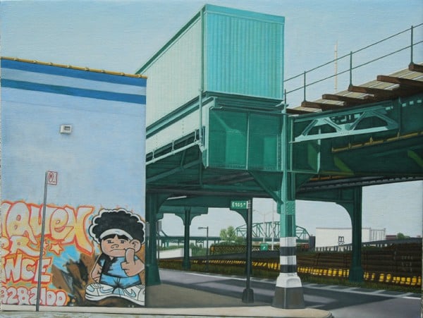
Laura Shechter, E 165th. St, Bronx (2013)
Do you think you’re attracted to cityscapes because your upbringing was urban?
I was raised in the projects in Brownsville and then Sheepshead Bay in Brooklyn. Both had ugly buildings, but I still liked them. They were mostly built in the 1920s—six-storey apartment houses, simple three-story buildings with one apartment per floor, empty lots, and the ever-present Ailanthus trees. From 1965 to 1973 I was a social worker who walked the streets of Williamsburg and Bushwick and so on. That’s maybe why I’m comfortable in blighted neighborhoods and pleased with the street art that beautifies them.
Do the buildings haphazardly arranged in your cityscapes have similar formal values to the artifacts in your still lifes?
I would say that the rhythms in my still lifes are the same as those in the cityscapes. It’s the same vocabulary.
Are those rhythms dictated by depth as much as height?
It has more to do with decorative elements, which in the cityscapes are windows, trees, water towers, and the play with the numbers of those elements. How they flutter across the surface. It’s like a musical arrangement that you might find in Bach.
To which the colors add tonal shadings.
If I had painted cityscapes in the 1920s, ’30s, or ’40s, everything would have been brown and black. It’s amazing what happened to New York City. Now you have turquoise buildings, green pipes, yellow building wraps, and graffiti. The graffiti relates to my still lifes’ use of decoration on cups, cloths, and wallpaper.
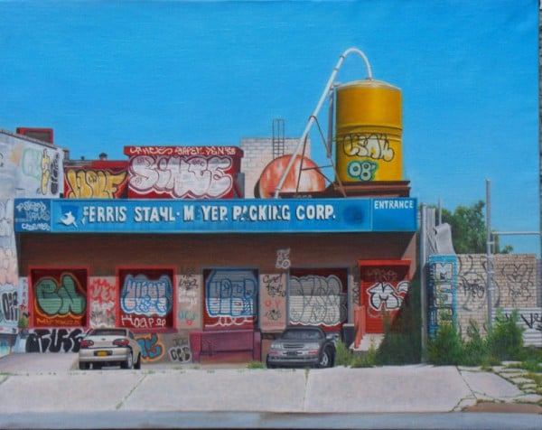
Laura Shechter, FSM Packing Corp, Bronx (2014)
Can you talk about your initial response to the scene you painted in FSM Packing Corp., Bronx?
I’d heard that this building was scheduled to be demolished. I had no idea the graffiti was going to be so complex and beautiful. I was drawn to it because of the tagging [hand-styled writing of an artist’s name], the yellow water tower, and the weeds breaking the cement. I’m more interested in random tagging than more organized and formal graffiti murals.
Do you have thoughts about a tag’s legibility or illegibility?
Sometimes you can read it and sometimes you can’t because of the extreme stylization. The taggers usually move the aerosol cans with their shoulders and lots of confidence. When I’m rendering their tags, I just marvel at their skill.