Galleries
The Top 10 Digital Artworks of 2014
From GIF characters to sex ed graphics, we suss out the year's best.
. Featuring work by Featuring work by v5mt.")
From GIF characters to sex ed graphics, we suss out the year's best.
Paddy Johnson
 ShareShare This Article
1. Lorna Mills, Ways of Something and Ungentrified
Lorna Mills has had such an extraordinary year, she could have easily taken over this entire end-of-year list. To save room for other talented artists, I’ll list only the two biggies: Ways of Something, her multi-episode BBC documentary remake of John Berger’s Ways of Seeing at Transfer Gallery; and her animated GIF installation Ungentrified at OCAD during Toronto’s 24-hour light festival Nuit Blanche. Both will surely become important to art historians of the future.
Let’s begin with Ways of Something, a remake of the canonical Berger documentary that explores the relationship between what we see and what we know. For this project, Mills invited 58 web-based artists to re-illustrate each minute of the series (30 in the first episode, 28 in the second). While subtitles remain the same as they did in the original video, everything else is fair game. The update is a euphoric cacophony of voices and visual interpretations ranging from video game and emoji animations to Photoshop tutorials. A high point, for me, was seeing an image from the Ways of Something screening inside the grand interior of the Czech Republic’s PAF. Nothing could be more stunning.
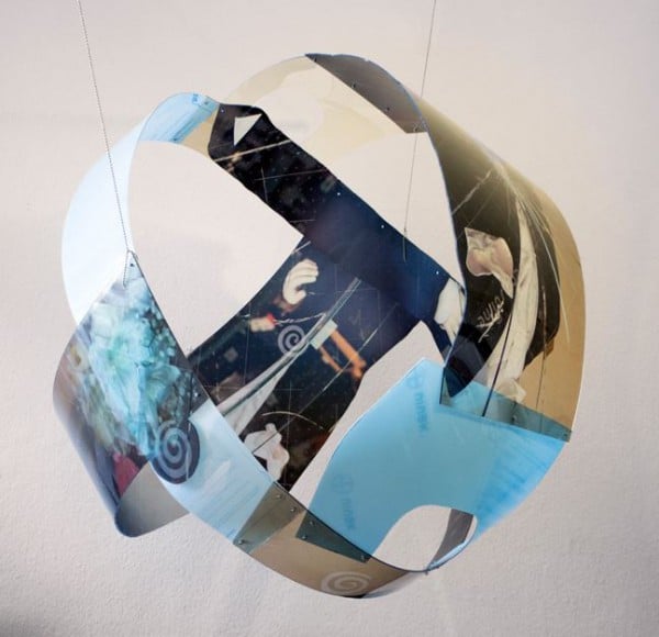
The only competition for Ways of Something would be Mills’s own installation, “Ungentrified” which filled sky high walls of OCAD’s Atrium space with projected GIFs cut out in clusters of hearts, and other jagged shapes. At the base of this wall, a stage of small CRT screens showed other GIFs in astonishingly sharp detail.
Images flew across the wall: flying chicks, a dog waddling on its back, and a car fire. Those were the safe ones. Others included a guy fucking a dog, a woman humping an inflatable pool toy, and a man running with a chicken over his penis. And people delighted in it all without any sense of shame. Hundreds of people poured into OCAD from the street having heard about the work—and once they reached the atrium, their voices joined a booming din. Everyone was talking about the work. For the above reasons, Ungentrified may be the best piece of public art I have ever seen.
Ryan McNamara, MEEM 4 Miami: A Story Ballet About The Internet. A Performa Commission. Presented by Art Basel Produced by Performa and Art Basel. © Art Basel
2. Ryan McNamara, MEEM 4 MIAMI: A Story Ballet About the Internet. Art Basel Miami
Though barely a lick of it was digital, the best performance of the year was Ryan McNamara’s “MEEM 4 Miami: A Story Ballet About the Internet.” McNamara’s hour-long ballet is an immersive performance defined by ever changing musical scores, a rainbow of light gels and fluorescent tubes, and dancers in wildly printed leotards. As these performers quickly colonized various areas within the Castle Beach Resort theater stagehands were busy carting viewers (via specialized chair lifts) to the different mini-performances around the theater. No two viewers had quite the same experience.
That, at least is the illusion. No matter where you are in the theater, a cohesive narrative emerges. After all, we all see the three lone dancers in spandex who begin the piece by walking in circles while slowed down electronic music and voices play overhead. It feels like an exploration. Closer to the end, we see a final monolith raised (a bench physically lifted) as if to symbolize a coming of age, and a musical grand finale scored to a cacophony of spoken names. Social media has arrived. As in life, many but not all, of the viewers are exposed to the icky sweaty dancer played by McNamara himself whose bumpy spandex attire and willingness to actually touch audience members casts him as a computer virus. Finally, the performers drop to the ground and the lights dim.
At the end of the performance, I was bewildered and disoriented, and only then thought to look for my friends. We’d been separated from the get-go, but the whole time I was wheeled around the theater, I hadn’t once felt alone.
Harm van den Dorpel, Assemblage (everything vs. anything) (2013). Courtesy Ullens Center for Contemporary Art
3. Art Post-Internet
Like many of us, I didn’t see Karen Archey and Robin Peckham’s exhibition in Bejing, “Art Post-Internet.” But I did read (and contribute to) the digital catalogue. For a show exploring art that is made with “an awareness of the network,” that’s probably enough. Seeing the show in the flesh can be approximated, and this show is assembled with the expectation that most won’t see it in person.
The catalogue exudes “Internet.” It’s a PDF filled with full-color images of the show, which itself is full of digital printing. And each PDF receives its own unique download number when you download it onto your computer, as well as a weather report for the day and place where it was downloaded—very On Kawara.
The show is the foundation Archey and Peckham use to define Post-Internet, a contentious term with slippery meaning. In their words, “In the context of artistic practice, the category of the Post-Internet describes an art object created with a consciousness of the networks within which it exists, from conception and production to dissemination and reception. As such, much of the work presented here employs the visual rhetoric of advertising, graphic design, stock imagery, corporate branding, visual merchandising, and commercial software tools.”
The catalogue didn’t close the pre-existing debate on the subject—if the endless Facebook threads and blog posts are any evidence, it simply shed more attention on the term. Ultimately, though, this looks like the definitive word on the subject. Archey and Peckham have offered up the clearest definition that exists to date, and that’s something worth celebrating (even if you hate the term Post-Internet).
4. Nicolas Sassoon, Opening Times Digital Residency
Close your tabs. Prepare your browsers. If you don’t, Nicolas Sassoon’s enormous browser-sized GIF will crash your applications.
Produced during an online residency funded by Opening Times, Pandora depicts a meticulously organized studio space complete with wall panels, a brick fireplace, and multiple LCD screens in a restrained palette of black, white, and blue. The GIF lives on the Opening Times website, and represents 3 months of work. Sassoon tells me the name of the work refers to small actions that have unforeseen and far-reaching consequences, and perhaps even to the “darkness of the Internet.” And indeed there is a kind of quiet dread to this piece, derived not only from its palette and name, but the studio itself—it is used, yet mysteriously empty.
Mike and Claire, “Characters” GIF series.
5. Mike and Claire Characters
A guy on roller skates in a pink hat busts a move. A dude-ly white rapper rolls his hands. Elvira and her cross-dressing friend get ready to go out. These are just a few of the archetype mashups played by art-making duo Mike and Claire in their “Characters” GIF series. I love these characters, but they will never love me back. Though the characters always seem aware of an audience, it always seems like that audience is someone other than you. Perhaps it’s for this reason, that it’s hard to imagine these GIFs functioning like memes. I like to show the GIFs to people but it’s obvious the world of these characters doesn’t extend much into ours. Online that kind of contained quality is rare—even a relief. More Characters please!
6. Rhizome Telethon
I nominate Rhizome Community Manager Zachary Kaplan to livestream himself staying up all night talking to artists several times a year. That’s exactly what he did for the Rhizome telethon last February, which was a cross between a freewheeling performance series and a fundraiser. Their goal was to hit $30,000 and they did so at the last minute, thanks to a donation from artist Tom Moody. Tension was high!
Art F City liveblogged the livestream—we watched Tom Moody read his comments on Rhizome, Alex McLean code music for an hour and Ann Hirsch unfold a reality show in real time. Rhizomers introduced each performance in the telethon garb of black and white suits. By the end, an exhausted Zachary Kaplan and curator Michael Conner had dog animations super-imposed on their faces. This was followed by a “Best of” montage created from episodes of Jerry Lee Lewis telethon.
7. Pratt Upload
This was a full day of panels convened to explore contemporary digital culture. It was mostly artists talking about digital art. Topics ranged from robot art-making and the network, to identity in the age of social media. It’s exhilarating to see that much attention cast on digital art-making. Of all the talks I attended, I especially liked hearing the words of performance artist Nate Hill. He spoke candidly about how his own occasional errors in judgment have taught people not to be afraid of their own ignorance. I liked this a lot because it reminded me very much of my own job. Learning in public can be very humbling, but the lessons always seem worth it.
8. Hhhoneyyy
Hhhoneyyy is a website with a single purpose: to take a user on a trip through a virtual software studio where space, roads, a car, and palm trees are constructed out of cubes and diamonds that flit together and fall apart. A cursor allows the viewer to navigate through the space, while cars and diamonds shatter and come together again. All of this happens to the tune of a bubbly electronic score by the band James Deen.
Hhhoneyyy is aesthetically and sonically pleasing, but for me that’s not the main appeal. This single serving site makes my top ten list because the tour offers an image of what digital art-making might look like without all the code. What gets made seems a little dude-friendly, but it’s compelling nonetheless.
9. Seedfeeder
This is an odd pick for an art list, since these sex illustrations aren’t necessarily art in the fine art sense of the word. They are Wikipedia images made by a semi-retired anonymous illustrator who goes by the moniker Seedfeeder, and they get a nod here, regardless, for their contribution to sex education on Wikipedia. When I was asked by Gawker to evaluate these images aesthetically for an article published on the site, I picked out Wiki POV Pornography as exceptional. It depicts a woman fellating a man as he films her with a camera. Overhead, in the background, we see what the camera captures: the woman looking up and the man’s veiny penis. As I told Gawker, “It’s the most complicated of the lot and does a good job monumentalizing the blow job.” In a nutshell, that’s why this artist makes the list.
10. Steven Soderbergh’s Extension 765
I decided Soderbergh’s website wasn’t art last week. But since it plays host to work I think is extraordinary, it gets a nod. Of everything, I choose to highlight “Raiders” once more. This video comes with a four-paragraph screed on how movement, timing, and shot-order move a viewer through a film, presented with a black-and-white version of the 1981-adventure flick Indiana Jones and the Raiders of the Lost Ark overlaid with the instrumental soundtrack from the The Social Network created by Trent Reznor and Atticus Ross. It’s a whole new movie, in which sound and staging alone move the film along. Incredible.