Art World
This Mysterious Vermeer Painting of a Woman in Blue Is a Dutch Golden Age Masterpiece—Here Are 3 Things You May Not Know About It
The haunting scene is famously enigmatic, but a closer look reveals some insightful and fascinating details.
The haunting scene is famously enigmatic, but a closer look reveals some insightful and fascinating details.

Katie White

Letter-writing and letter-reading have been favorite subjects of artists for centuries. Johannes Vermeer particularly favored the scene: of his minuscule oeuvre of some 35 paintings, six have epistolary themes, and each is filled with the quiet suspense that first earned him the sobriquet, “The Sphinx of Delft.”
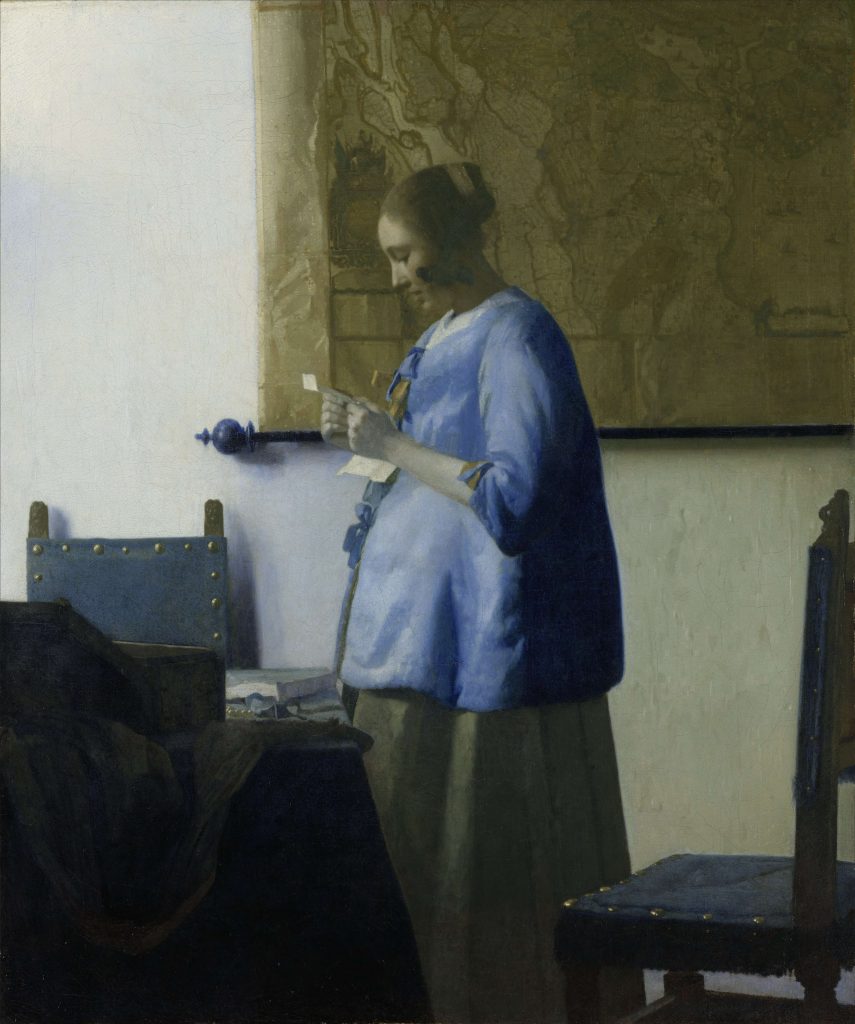
Of course, it is the mystery of Vermeer’s writers and readers that makes them so captivating. And in that sense, Woman in Blue Reading a Letter (1663–64) stands as an enigmatic pinnacle.
Here, a woman, dimmed by shadows, stands reading a letter, rapt by the words, which she pulls close to her body. She seems to have risen from her chair abruptly (her pearls still rest on the table). Her mouth is slightly agape. Her blue top is a beddejak, which is typically made of blue or white satin, and worn while in bed, giving the impression that perhaps she’s just woken up. An unseen window to the left casts soft light on her visage. We cannot see the contents of the letter and there are few clues as to its significance. The room is nearly bare.
Woman in Blue Reading a Letter, which is in the collection of the Rijksmuseum in Amsterdam, is regarded by scholars as Vermeer at the height of his compositional powers, but also as one of his most mysterious works. Those familiar with the picture are likely to know that discussion has often centered on whether or not the central figure happens to be pregnant. (The figure in Woman Holding a Balance from 1662–63 has been subject to the same debate.)
Despite her appearance—and in part because depictions of pregnancy were rare at the time—some have suggested that our lady in blue is simply wearing the fashions of the times: a voluminous housecoat with thick skirts worn underneath. But there’s more to wonder at in this splendid painting.
With the recently renewed popularity of letter-writing, we decided to take a closer look at the seemingly opaque Woman in Blue Reading a Letter. Here are three facts that may very well change the way you see it.
Given the popularity of Vermeer today, and the relatively few works attributed to the artist, almost every detail of his canvases has been subject to symbolic scrutiny and interpretation.
In this work, the large, muted wall map of Holland that occupies much of the upper right of the composition has elicited numerous interpretations. Some have suggested that it may allude to the author of a letter, perhaps a husband away on a journey, or an absent lover (the pearls on the table could allude to vanity).
But the map might have more practical implications.
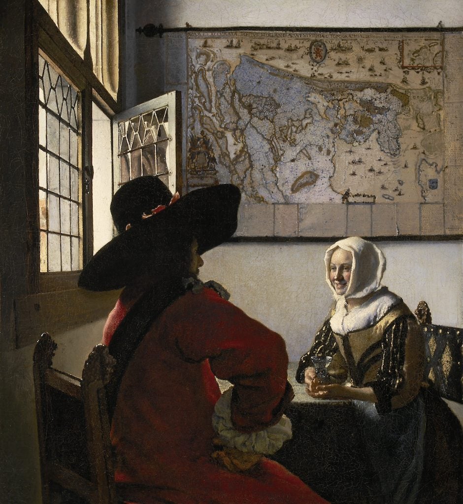
Johannes Vermeer, Officer and Laughing Girl (1657). Collection of the Frick Museum.
Decorative wall maps were a popular fixture of Dutch interiors during the 17th century, and most often, in paintings, they were included simply to add some compositional drama to otherwise empty walls. But Vermeer executed his maps with exquisite care and sensitivity: x-rays show that he even moved the map in this work a small bit to the balance the composition.
This same map appears in another of Vermeer’s works, the earlier Officer and Laughing Girl (1657). And it has since been identified as a real map, one designed by Balthasar Florisz van Berkenrode in 1620 and printed by Balthasar Jansz Blaeu. It’s very possible that the map was in Vermeer’s possession: he ran a shop from his home and the demand for maps at the time was extremely high.
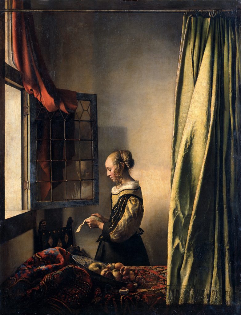
Johannes Vermeer, Girl Reading a Letter by an Open Window (1657–1659). Courtesy of Gemäldegalerie, Dresden.
What’s significant here is Vermeer’s decision to mute his tones so that the woman’s head and the map are nearly the same color. With its swirling, pulsing lines, the map seems to reflect her quickly racing thoughts and emotions, and emphasizes the interior experience of the figure.
Vermeer employed a similar strategy in the earlier and compositionally similar Girl Reading at an Open Window (1657–59). In that work, the reflection of the girl’s face in the windowpane seems to signal the interior thoughts floating through her mind.
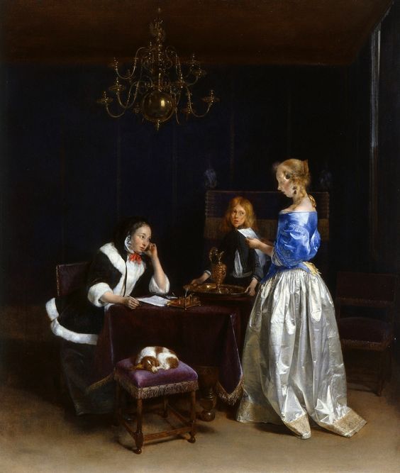
Gerrit ter Borch, The Letter (1660–62). Courtesy of the Royal Collection of Buckingham Palace
Though Vermeer’s paintings may look like snapshots taken from daily life, his compositions were anything but unplanned.
Importantly, Vermeer was not particularly adventurous with his subject matter. And in the case of his depictions of letter readers and writers, he relied quite heavily on precedent, often directly deriving passages from the works of his contemporaries.
For example, Vermeer borrowed heavily from his fellow Dutchman, the artist Gerard ter Borch (1617—1681), who was famed in his lifetime for his innovative genre scenes. In fact, it was Ter Borch who first painted the contemplative scenes of well-to-do young ladies lost in thought for which Vermeer is so today so famed.
“Without Ter Borch, there would be no Vermeer—that is clear,” notes Adriaan E. Waiboer, a Vermeer scholar who helped organize the 2017 traveling exhibition, “Vermeer and the Masters of Genre Painting.”
In the case of Woman in Blue Reading a Letter, Vermeer has plucked the central figure’s blue top and opened mouth from Ter Borch’s The Letter from a few years prior. But Vermeer was not alone in his liberal borrowing from the compositions of others: successful motifs were frequently synthesized into compositions by other artists. What interested 17th-century collectors was not necessarily who painted something first, so much as who painted something best.
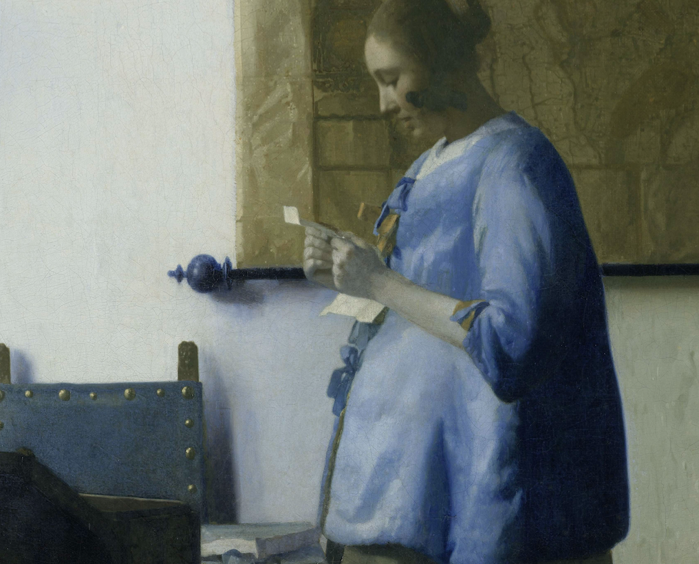
Detail of Vermeer’s Woman In Blue Reading a Letter.
Given Vermeer’s seemingly preternatural ability to depict the effects of light and perspective, some scholars believe that he worked with the aid of a camera obscura. While there are merits to suggestion, Vermeer’s process was more than one of mere transcription. His talent was for pointedly editing out details—and here he does just that.
Not only has he pared down the details of the scene to a minimum, but he has gone so far as to have consciously removed the woman’s shadow. Look closely, and you can see that both the chair against the wall and the rod holding the map cast their own shadows. But by removing the woman’s shadow, Vermeer creates an effect of atemporality, as if our central figure is suspended in limitless time, forever enthralled in her reading.
Vermeer doubles down on this effect through his concentration of a nearly phosphorescent blue, in an otherwise darkened composition, on the woman. The choice imbues the figure with a celestial, floating quality. Blue, importantly, was Vermeer’s favorite color, and it was incredibly expensive. Ground from lapis lazuli stones and imported from Afghanistan, blue was typically reserved for special occasions—and often was used explicitly for depictions of the holy Virgin Mary.