Books
Ever Noticed All the Mysterious Maps in Vermeer’s Paintings? Here’s What They Mean
A new book looks at the artist's painstakingly accurate depictions of maps.
. The Frick Collection.")
A new book looks at the artist's painstakingly accurate depictions of maps.
Rozemarijn Landsman
 ShareShare This Article
The following is an excerpt from the forthcoming book Vermeer’s Maps by Rozemarijn Landsman (The Frick Collection and DelMonico Books, DAP, October 11, 2022).
No other 17th-century Dutch painter devoted as much attention to the rendering of cartographic works as Vermeer. In six of his paintings, an identifiable map adorns the walls of a domestic space. Vermeer followed the maps’ contents and proportions scrupulously, depicting them with such care that their geography and cartouches, even the compass roses, vessels, and sea creatures, are recognizable. Some lettering is legible, and in the case of Young Woman with a Lute, the blank lines following the periods in the maps’ surrounding texts match what we know from the few surviving copies of the Map of Europe. To reproduce these features so precisely and translate the works on paper into paint, Vermeer would have had to study the maps very closely. But why? What was their appeal for the artist and his audience?
Interpreting the significance of the maps in Vermeer’s art is challenging as there are few clues beyond what is presented by the paintings themselves. Maps, moreover, are complex objects, open to interpretation. Consider Vermeer’s depiction of the map in Officer and Laughing Girl. To viewers of his time, this map may have been recognized as a reflection of the popularity of cartographic work as interior decoration and of the fact that, beginning in the 1620s, influential painters like Willem Buytewech had incorporated wall maps into their genre paintings. As Walter Liedtke illustrated, Vermeer’s composition with the flirtatious couple fits squarely within a body of work by several of his contemporaries: the silhouetted figure, for instance, suggests familiarity with The Procuress by Gerard van Honthorst. Likewise, the setting—the corner of a room with a window to the left—was a frequently employed scheme, as in, for example, the similarly dated Two Soldiers Playing Cards by Pieter de Hooch. The arrangement of the figures, as well as the broad-brimmed hat, recall Interior of a Tailor’s Shop by Quiringh van Brekelenkam. Vermeer operated within a network of Dutch painters who imitated and emulated each other’s compositions. From this point of view, by the late 1650s a map on the wall of an interior scene was nothing new; for some viewers, Vermeer’s skillfully painted maps may have been just that.
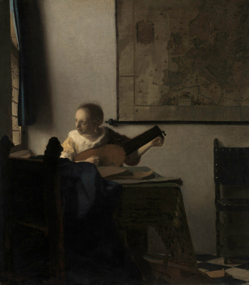
Johannes Vermeer, Woman with a Lute (ca. 1662-63). © The Metropolitan Museum of Art.
However, the extraordinary precision and attentiveness with which Vermeer depicted wall maps and the relative frequency with which he painted them signal something more. Already in the 19th century, Théophile Thoré-Bürger noted that Vermeer may have included the maps in his paintings not merely because of their decorative value but because of the artist’s supposed fascination with Asia. In the mid-20th century, Lawrence Gowing hypothesized a relationship between the map and the officer in the Frick painting, likening it to the recurring motif of a picture-within-a-picture. But it was not until James Welu’s groundbreaking studies in the 1970s that serious attention was given to the actual cartographic objects as they appear in Vermeer’s paintings. Welu identified each of the maps, matching them to the few extant examples, and reconsidered the iconography of the paintings in which they appear. The wall maps have since played a role in numerous moralizing and politicizing interpretations of Vermeer’s paintings, linking his protagonists to themes of love, war, and national identity. But, despite Welu’s identifications of the maps, the art-historical discussion of them has often been superficial. Many an interpretation is based on general ideas of 17th-century Dutch wall maps, rather than each map’s specificity or the subtleties in Vermeer’s rendition of them.
The maps’ characteristics would have been more easily recognizable to Vermeer and his contemporaries than they are to us today. The ubiquity of wall maps in the Netherlands by the 1650s did not detract from the variety of the processes of their making, their functions, their connotations, and their intended audiences. Viewers of Vermeer’s art, especially those who owned or were involved with maps, would have been well aware of such distinctions and, in all likelihood, capable of recognizing exactly which maps the artist depicted. But to what degree can we establish how much these factors played into the artist’s decision to reference the maps? As the following discussion demonstrates, he must have studied the objects extremely closely, which suggests that he had considerable access to them. Moreover, he likely enjoyed prolonged access to Van Berckenrode’s map through the family of his wife, Catharina Bolnes. What, then, are we to make of the interpretive value of the wall maps in Vermeer’s art? Was the artist motivated by personal or political reasons? Was he drawn to their material properties or intrigued by their fusion of art and science? The family’s ties to Van Berckenrode’s Map of Holland and West-Friesland offers a new light in which to appreciate Vermeer’s art. Although the question of the significance of the wall maps remains largely unresolved, ambiguity is inherent to the work of the Sphinx of Delft and arguably lends his paintings their enduring, powerful presence.
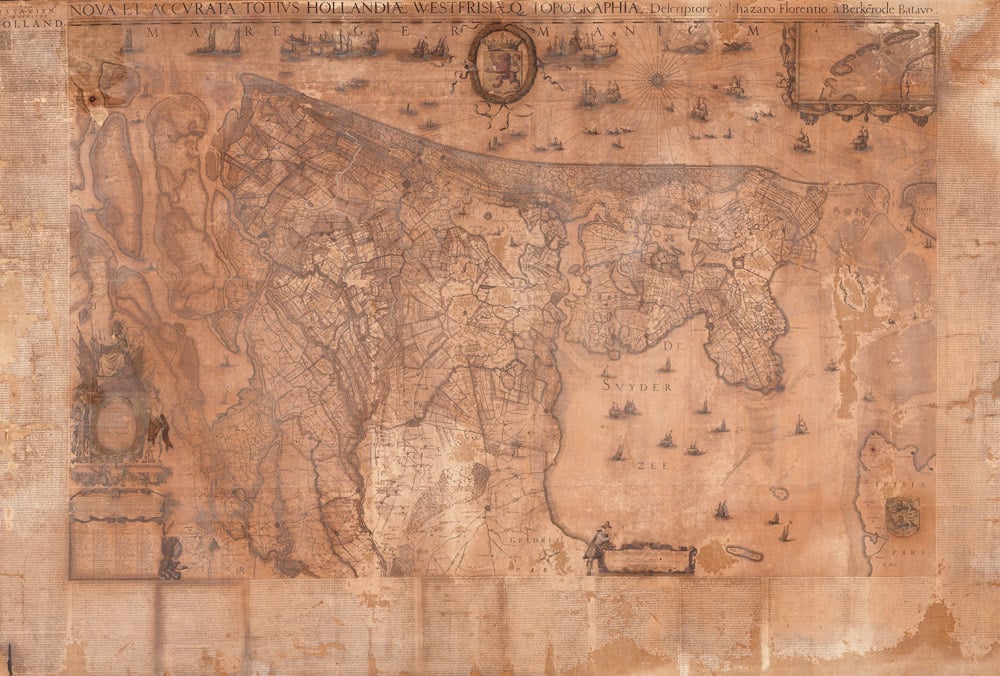
Balthasar Florisz van Berckenrode and Willem Jansz Blaeu, Map of Holland and West-Friesland (ca. 1621). Westfries Museum, Hoorn.
While each map rendition bears the hallmarks of the artist’s evolving style and his characteristic finesse, the variations in his technique and compositional choices indicate that his interest in the objects’ material and meaning was anything but static. Vermeer dated very few of his works, but his stylistic and thematic choices evince clear groupings within his oeuvre. Therefore, it can be claimed that the first time Vermeer painted a wall map was in Officer and Laughing Girl (ca. 1657).
The three renderings of the Van Berckenrode–Blaeu map, especially, are revealing, because of its recurrence in the artist’s oeuvre and because of the relatively rich documentation about the making of the map. In Officer and Laughing Girl, Vermeer explored the transformation of a monumental, printed cartographic work on paper into a painted counterpart. Vermeer’s emphasis of certain features may have corresponded to the coloring of the map’s prototype, and the overall whitish background is suggestive of a paper base. Beyond that, however, the artist’s painterly impression deviates in important ways from what we know about map coloring at the time. Especially notable are the bright and somewhat randomly dispersed highlights, catching the viewer’s eyes as they punctuate the ochres and blue. These are typical of Vermeer’s painting technique, not of mapmaking.
The blue appearance of the land in the map in Officer and Laughing Girl has often been noted, as it seems to contradict the cartographic practice of using blue to indicate water. Land was generally outlined with green, yellow, or pink. Did Vermeer intentionally deviate from the coloring of the original map, as Welu and others have wondered, or did some of his pigments simply fade over time? If Vermeer applied a transparent yellow lake—a notoriously fugitive pigment—over the blue, that area would have initially appeared green. However, much of the maze of bright blue arteries does, in fact, correspond to the locations of rivers and waterways on the actual map. Instead of a highly unlikely inversion of color undertaken by the artist, the object’s blue appearance appears to have been the result of an emphasis on the presence of water in the province, especially in Delfland, either by Vermeer or by the map’s colorist—an interesting and revealing choice, given the history and role of this map in relation to the district’s water management.
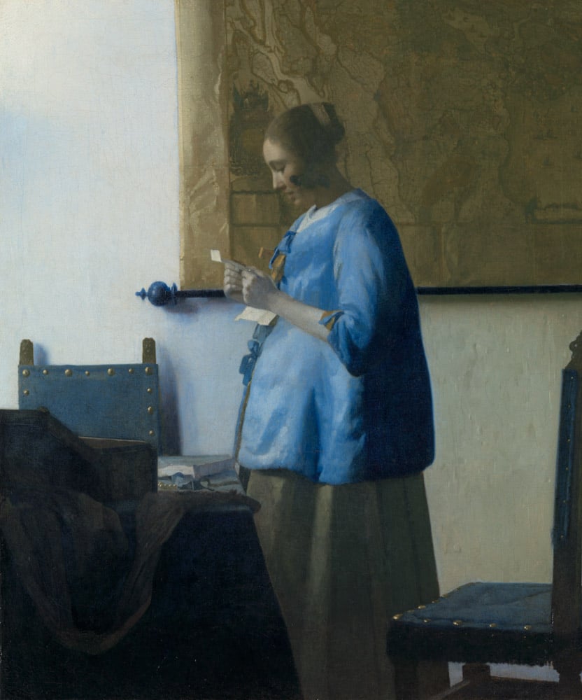
Johannes Vermeer, Woman in Blue Reading a Letter (ca. 1663). Rijksmuseum, Amsterdam.
Strikingly different is the appearance of the same map in Woman in Blue Reading a Letter. As Vermeer’s style evolved, so, too, did his treatment of the wall maps. Here, the map seems considerably larger than that in Officer and Laughing Girl—its large size supposedly prohibiting its being depicted in its entirety. Moreover, while the settings of the two paintings are comparable, the execution of each map differs. The placement of highlights is more deliberate in the later rendition, and there are fewer of them. Where they do appear, they are less bright and tend to blend with the underlying paint layers. The maps in both paintings adhere to the map’s geography, but the later rendition appears more cartographic. In Officer and Laughing Girl, the map’s physicality is indicated by peeling paper along the bottom text; in the later map, Vermeer focused on the effects of light on the crinkled and varnished paper surface. Similarly, and in line with the evolution of his style, he substituted the bright colors of the earlier rendition with a muted palette of grays and browns.
Vermeer’s disparate pigment choices for his first two renderings of Van Berckenrode’s map—and, later still, its third appearance in The Love Letter, where it is seen in semidarkness at a sharp angle in the foreground—raise questions about the original appearance of the cartographic prototype and, consequently, the extent to which Vermeer’s choices affected its depiction. The consistency with which he emphasized certain elements of the map in all three versions—waterways and certain borders, as well as polders—suggests that he based them on the same example, following its coloring closely, even if taking some liberties with specific pigments. It must have been for artistic reasons that the artist changed his palette. Nothing certain can be said about the coloring of Vermeer’s prototype, for little is known about the coloring practice in Willem Blaeu’s shop during the 1620s. Furthermore, of the two extant examples of this particular map, one is uncolored, and the other, which is in Hoorn, is in such deteriorated condition that most of its pigmentation has faded or discolored. The whitish delineation of Rijnland, however, together with traces of blue along the river Maas near Rotterdam and the brown delineations of areas especially in the south of Holland, suggest that this work was originally much more colorful than it is today. Still, its original appearance does not seem to have matched Vermeer’s renditions of the map.
The different ways in which Vermeer rendered the wall maps is also apparent when comparing his two depictions of maps of the Seventeen Provinces, one by Hondius in Woman with a Water Pitcher, the other by Visscher in The Art of Painting. The former, a relatively modest map, is recognizable but lacks the precision and delicacy of Vermeer’s other map renderings. The latter, on the other hand, represents the climax of his virtuosity and interest in the subject. Visscher’s large and prestigious wall map is visible in its full glory, and its materiality is conveyed with more conviction than anywhere else: different types of vertical creases can be discerned, some indicating a fold, others suggestive of air bubbles trapped between paper and canvas lining; the waviness of its surface conveys a material that is both stiff and flexible; and the folds converge toward center bottom, as if, just out of sight, a weight is pulling the map downward; the opaque red and blue of the cartouches simulates coloring with gouaches; the right and left edges of the map are, apparently, delineated by gold leaf separating the geographical content from the cityscapes. Vermeer’s decision to mix in costly ultramarine blue in the colder, shadowy parts of his paintings is noticeable in the series of cityscapes on the right, each of which is painted with such precision that they are identifiable. The restrained dispersal of specular highlights, subtly varying in size and color, not only enlivens the picture, suggesting the reflection of light as it bounces off the map’s surfaces, but seems to become a part of its geographical content. In this allegory, the wall map must perform an important task, as both Vermeer’s handling and positioning of it imply.
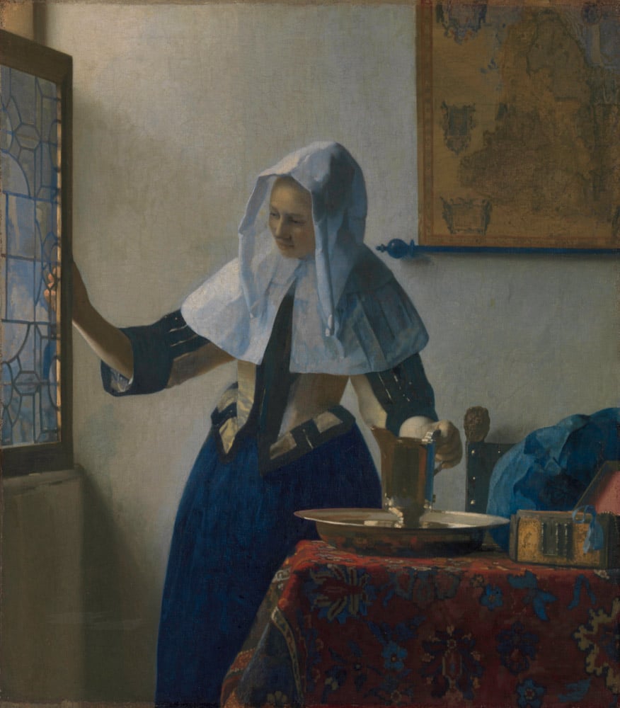
Johannes Vermeer, Woman with a Water Pitcher (ca. 1662). © The Metropolitan Museum of Art / Art Resource, NY.
The variations in color, size, and treatment of the wall maps reflect Vermeer’s overall stylistic development. The map renderings also exemplify how the artist balanced the detailed representation of objects with a sensitivity to how they enhanced the stylistic characteristics of his paintings, often by modulating their coloring and softening their contours. For example, Visscher’s figure of a fisherman, accompanying the cartouche in the bottom right corner of the map in The Art of Painting, is clearly delineated, but his features are blurred to such a degree that he is only identifiable when compared to the figure on the original map. Similarly, the maps’ treatment shows that Vermeer reconsidered compositional choices throughout the painting process, rearranging or eliminating parts of his works. As Arthur Wheelock first noted, the maps in both Woman in Blue Reading a Letter and Woman with a Water Pitcher were repositioned at a later stage. The Map of Holland and West-Friesland in the Rijksmuseum painting was moved slightly upward and to the left. In the Metropolitan Museum work, the Map of the Seventeen Provinces of the Netherlands was shifted quite a bit to the right. A different fate awaited the wall map that Vermeer initially conceived for Woman with a Pearl Necklace. Whereas the Berlin painting now appears with no map, neutron autoradiography shows that there had once been a detailed rendering of a map of the Seventeen Provinces on the rear wall. Vermeer painted it out completely—a remarkable move on his part, though not uncommon, as the recent discovery of a monumental tapestry underneath the upper paint layers of Mistress and Maid confirms.
We can only speculate about the method Vermeer employed to render large wall maps at a significantly smaller scale. Did he use a grid or a pantograph, as Wheelock proposes? Or perhaps an optical instrument? An optical aid such as a lens or camera obscura might help to explain certain aspects of Vermeer’s painting technique: his highlights, resembling what is known in optics as circles of confusion or blur circles; his attentiveness to the behavior of light; his apparent familiarity with contemporary color theory; and the geometry that underlies his compositions. A corollary of this discussion is the artist’s familiarity with not only wall maps but globes, sea charts, and measuring devices. Vermeer’s apparent interest in cartography is compatible with an interest in optical devices. Technology such as microscopes, telescopes, pantographs, and the camera obscura gained momentum around the mid-17th century. In Delft, Vermeer matured in a climate particularly open to the fusion of art and technology. The city was home to an active circle of scientific practitioners, including instrument-makers, natural philosophers, and painters. The painters Carel Fabritius and Leonaert Bramer—both of whom may have had a formative impact on Vermeer’s development—were masters at perspectival construction, as were such Delft-based architectural painters as Gerard Houckgeest and Emanuel de Witte. During Vermeer’s active years as a painter, the fields of the arts and sciences were inseparable.
While some maps, especially the one in The Art of Painting, were given pride of place, the sacrifice of the map in Woman with a Pearl Necklace signals that the artist did not deem all cartographic objects indispensable. They served both compositional and iconographic ends, and one could outweigh the other. By shuffling the maps around and manipulating their treatment, color, and size, Vermeer also shaped the iconography of his paintings. For example, his placement of Blaeu’s Map of Europe so that the Netherlands is at its center could be interpreted as a comment on the self-proclaimed supremacy of the Dutch in Europe and the world. Similarly, the repositioning of the map in Woman with a Water Pitcher—a map that was associated with the war leading to the formation of the Dutch Republic—insinuates that its cropping along the frontier between the Southern and Northern Netherlands was purposeful.
Excerpt from Vermeer’s Maps by Rozemarijn Landsman. Published by The Frick Collection and DelMonico Books, D.A.P., 2022.