Art & Exhibitions
Brian Boucher’s 10 Reasons to Be Excited About the New Whitney Museum
From Outsider artists to all-gender restrooms.
From Outsider artists to all-gender restrooms.

Brian Boucher

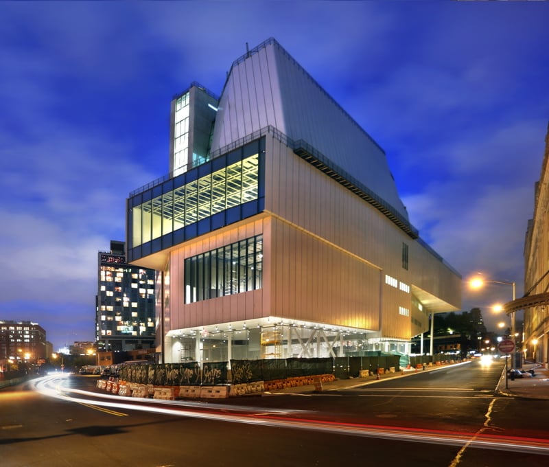
Renzo Piano’s Whitney Museum of American Art building, September 2014.
Photo: Ed Lederman.
The new home of the Whitney Museum of American Art, in all its 28,000 tons of glory (as architect Renzo Piano pointed out during the preview Thursday), opens to the public May 1 in Manhattan’s Meatpacking District (see Does the New Whitney Museum Herald a Golden Age for New York Institutions?).
artnet News joined the preview, along with hundreds of other members of the press. Our hot take? The new Whitney is a great success, with spacious, welcoming galleries and a lively opening show that packs in plenty of work without seeming crowded. Visitors had the opportunity to peek into the theater, classroom spaces, and a conservation lab that now measures 3,000 square feet, as opposed to about 400 square feet at the museum’s former Brutalist digs in the Breuer Building, according to Whitney Museum conservator Matthew Skopek, who giddily chatted with this reporter near works by Robert Gober and Mark Rothko on display there.
The museum is big. The opening show is big. To try to thoughtfully take in over 600 works by just over 400 artists in less than five hours (see Whitney Museum’s Inaugural Show in New Home Spans John Sloan to Yayoi Kusama and Jeff Koons and Whitney Announces the 407 Artists Included in Inaugural Permanent Collection Hang)? Forget it. Can you really digest the dozens of video artworks on display in the galleries and in their own theater spaces? Not a chance. (In the meantime, though, check out The Whitney’s Hidden Gems: 10 Masterworks Not to Miss in the New Building).
That said, here’s a highly subjective, incomplete first look at some of the ideas, artworks, and phenomena you have to look forward to on May 1 and after.
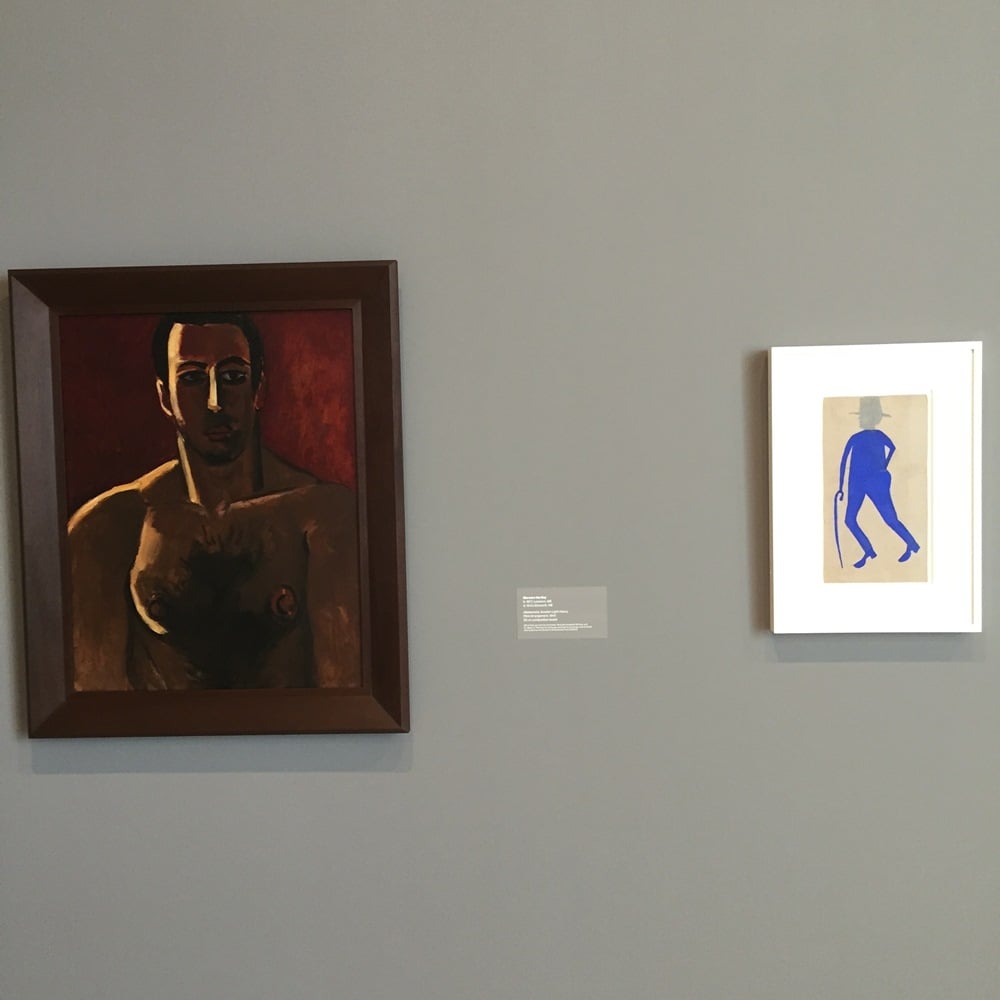
Bill Traylor and Marsden Hartley at the Whitney.
Photo: Brian Boucher.
1. A Spotlight on the Obscured
Throughout the galleries, the curators have taken evident pleasure in bringing obscure artists to light, and placing them in dialogue with canonical figures. On the top floor, with the earliest parts of the collection, stars like Stuart Davis, Marsden Hartley, and Georgia O’Keeffe are side-by-side with Japanese born photographer Toyo Miyatake, who stares at us out of a 1932 self-portrait, and Gerald K. Geerlings, in a cityscape dominated by a machine-age bridge.
Elsewhere, a painting by Bill Traylor, an untrained artist who was for years basically homeless and made art on discarded cardboard boxes, hangs between a Thomas Hart Benton and a Marsden Hartley, placing an “Outsider” at the same level as figures from Art History 101, and rightly so. Traylor is regularly a hit at the Outsider Art Fair, and the combination here reflects an increasingly porous boundary between insider and outsider, a salutary development.
2. A Keen Awareness of Protest and Dissent
Dissent, critique, and protest are as American as apple pie, and there’s a strong presentation of that strain of American art throughout the galleries. There’s an array of works related to lynching, with examples from celebrated artists like Philip Guston and obscure ones like the Russian-born Boris Gorelick, and from imports like the Mexican-born Gabriel Orozco and the Lithuanian-born Ben Shahn. An especially grisly, heart-rending example by Harry Steinberg is now burned into my brain.
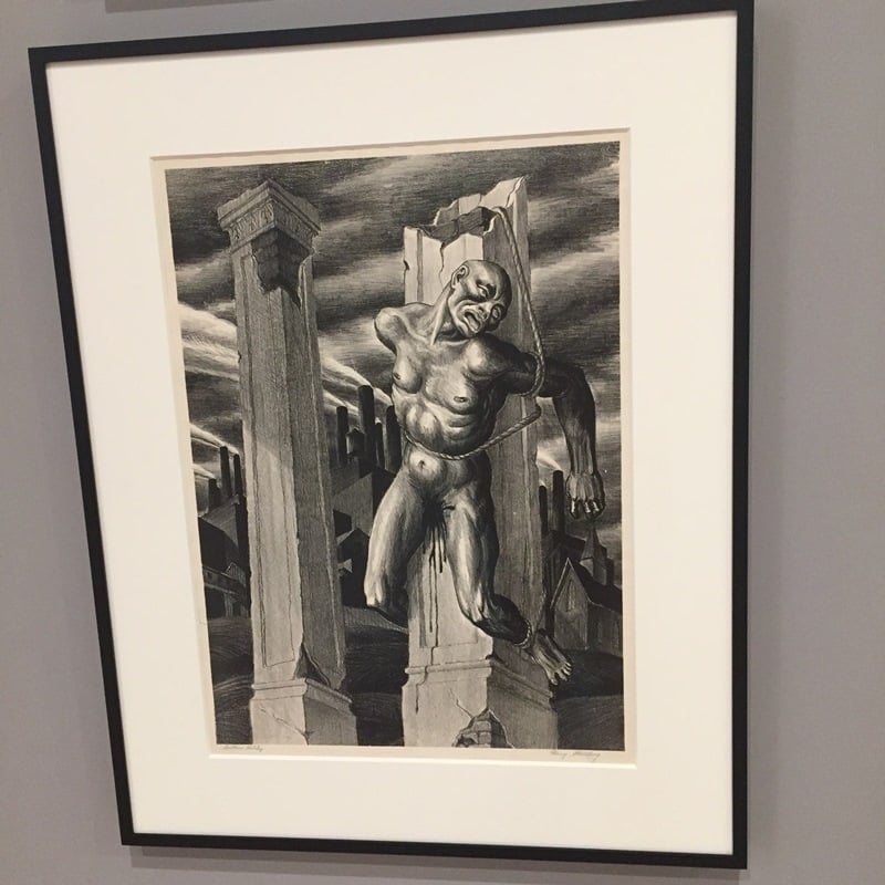
Harry Sternberg, Southern Holiday, 1935.
With police murdering black men one after another in a heartbreaking procession, these images are depressingly timely.
There’s also ample space devoted to Hans Haacke’s Shapolsky et al. Manhattan Real Estate Holdings, A Real-Time Social System, as of May 1, 1971, an incisive look at one slumlord family’s assets and a founding classic of Institutional Critique. Destined for a 1971 show at the Guggenheim, the work was rejected by director Thomas Messer, who famously dubbed it “an alien substance that has entered the art museum organism.” He was right, and the museum hasn’t been the same since.
Elsewhere, there are examples of artists we typically think of as apolitical taking a stand: Andy Warhol’s portrait of Richard Nixon is emblazoned with the words “Vote McGovern.” (“That looks like an Andy Warhol,” said a woman in the galleries today, “but I’m sure it’s not.”)
3. The Complexity of America
Notice all the “-born” formulations I’ve already been using? The exhibition puts an emphasis on the hybrid nature of Americanness. Except for the natives, everyone here comes from somewhere else, and that’s most of us. Chief curator Donna De Salvo emphasized the “inconvenient complexity” of American identity in her opening remarks today.
Critic Barbara Pollack generated lively discussion on Facebook recently by expressing embarrassment at the myopia of a museum of American art, but the criticism doesn’t stand up if you pay attention to the helpful labels here, which point out places of birth. Not every museum needs to be encyclopedic, and anyway American art is hardly a narrow category. As you trawl the galleries, what becomes very clear is more its sprawling multifariousness than any supposed narrowness. (Speaking of the natives, I can’t say I saw a lot of artworks by Native American artists on first view, but I’m open to being proven wrong.)
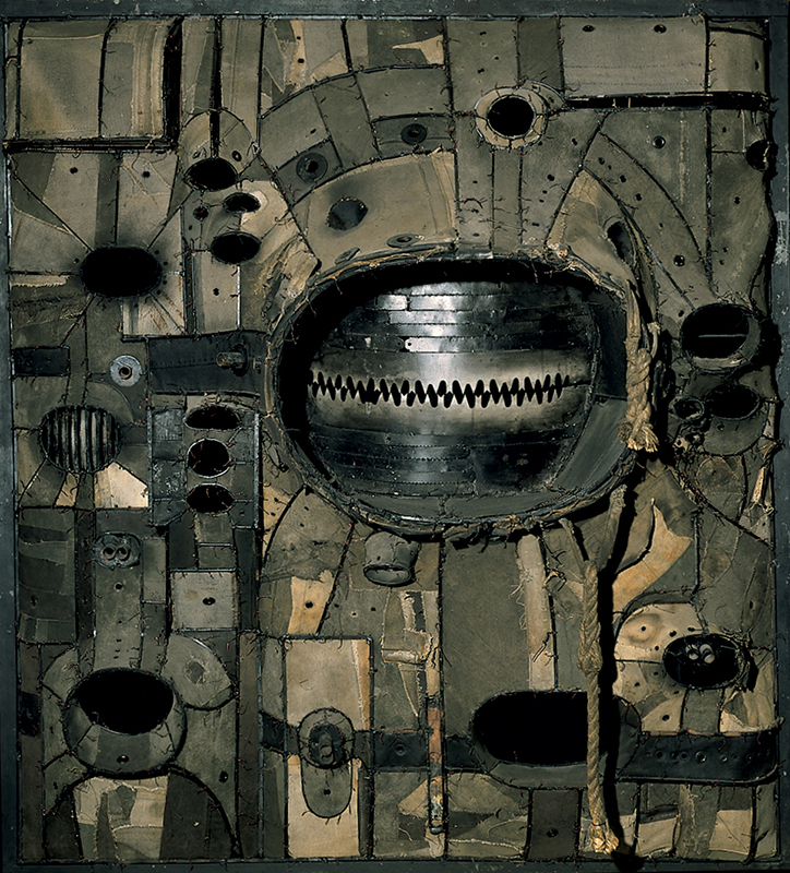
Lee Bontecou, Untitled, 1961, 1961. Welded steel, canvas, wire, and rope. Whitney Museum of American Art, New York. © Lee Bontecou
4. Women Front and Center
A certain Brooklyn blog ran a statistical analysis of the artists included in the opening exhibition, which found, no surprise, that there are a preponderance of white men represented. That reflects historical realities that have only recently begun to change. “Wouldn’t it have been nice if there were more women artists in the ’30s?” Whitney curator Chrissie Iles told artnet News in the galleries today when we brought up the stats.
But even in the gallery devoted to Abstract Expressionism, Lee Krasner, Joan Mitchell, and Hedda Sterne are prominent, Iles pointed out—Krasner’s 17-foot-wide canvas has pride of place and dwarfs a medium-size Pollock on the facing wall.
And director Adam Weinberg’s sweet first words when he took to the podium to address the press? “If only my mother could be here today.”
Some of my longtime favorites are the lady artists. If you don’t get a thrill from Eva Hesse’s dangling rope sculpture, if you don’t cower before Lee Bontecou’s menacing canvas-and-metal vagina dentata, then I don’t know what to say to you.
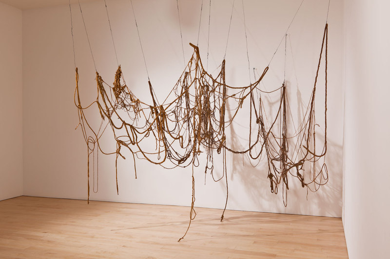
Eva Hesse, No title (1969-70), latex, rope, string, and wire. Whitney Museum of American Art, New York; purchase, with funds from Eli and Edythe L. Broad, the Mrs. Percy Uris Purchase Fund, and the Painting and Sculpture Committee. © Estate of Eva Hesse; courtesy Hauser & Wirth.
5. Echoes of Breuer
Renzo Piano’s building is, of course, to some degree in competition with the old Whitney building, the Brutalist icon designed by Marcel Breuer and opened in 1966. “The Breuer is fantastic,” Piano said today. “Everybody loved it. It was not easy to remain the Whitney.”
Certain features of Piano’s edifice call Breuer’s to mind. Step off the elevators on each floor and you’ll find yourself stepping directly into the galleries, as you did on Madison Avenue. The gridded structure in the ceiling, allowing flexible hanging of walls and lights, echoes the same distinctive feature in the Breuer building, if at a lower volume.
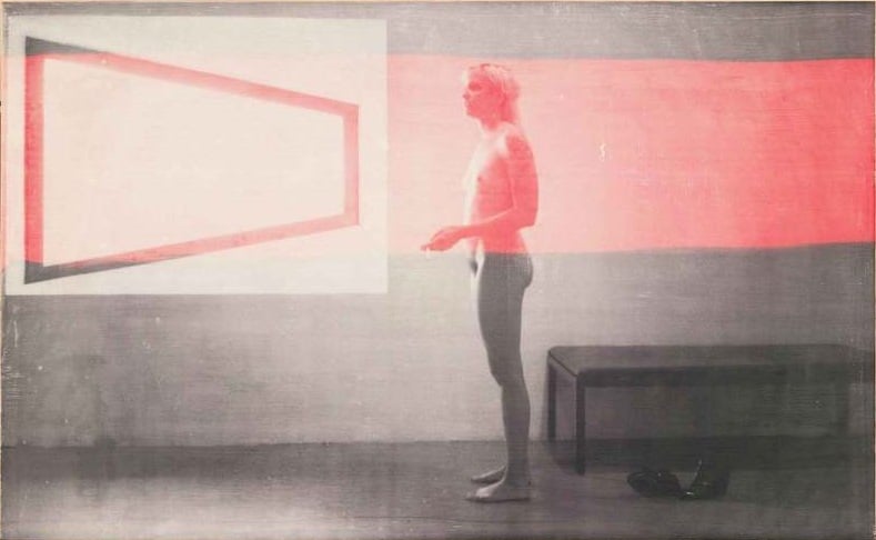
R. H. Quaytman, Distracting Distance, Chapter 16, 2010, screenprint and gesso on wood. Whitney Museum of American Art, New York; purchase, with funds from the Painting and Sculpture Committee 2010.54. © R. H. Quaytman
The echoes aren’t just in the architecture, either; I was pleased to see an R.H. Quaytman print showing fellow-artist K8 Hardy standing nude in a gallery at the old Whitney, with one of its trademark trapezoidal windows featured. The image evokes a similar standing nude by Edward Hopper, whose ambivalent American cityscapes are on view here too, and for me, are closely associated with their longtime home on the top floor of the Breuer.
6. Watch Out, the Future Is Coming, and It’ll Be Bigger
At the moment, the west-facing windows look out over the Hudson River, but even closer is an unsightly Sanitation Department facility, with gigantic, ugly sheds, tarmac, and rows of big trucks. Don’t get used to it, because that will all be going away soon to make way for a park.
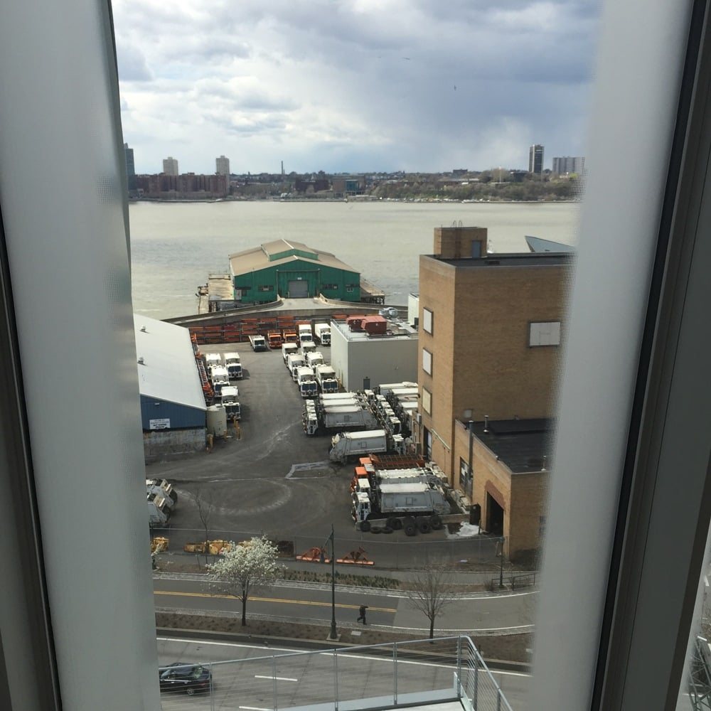
Sanitation Department facilities on the Hudson River will soon make way for a park.
Photo: Brian Boucher
Oh, and in case the 63,000 square feet of exhibition space (including terraces) aren’t enough, museum administrators pointed out to the press that some neighboring buildings are subject to leases that only go for another 10 years or so. By that time, too, the Metropolitan Museum of Art’s eight-year lease on the Breuer building will have expired (see Met Announces First Show in Whitney’s Breuer Building), and I’m betting we’ll see the Whitney take it back.
7. Robert Bechtle’s Deadpan Zen
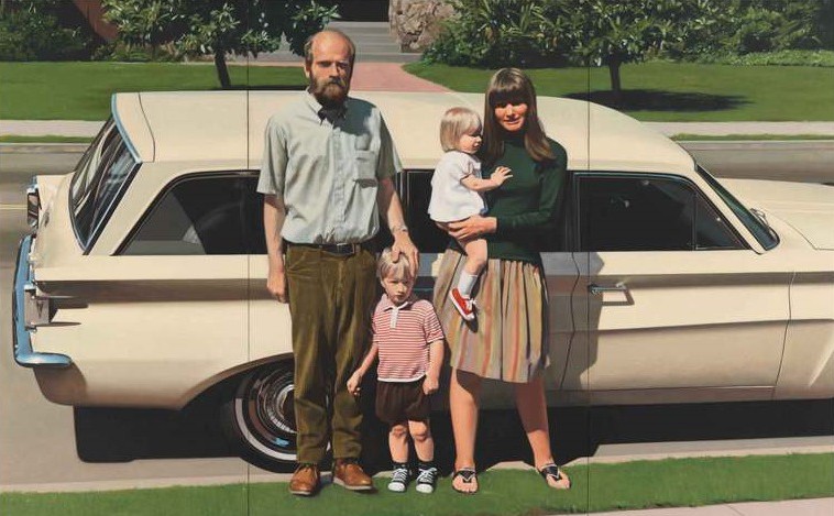
One of my personal favorites from the collection has always been San Francisco photorealist Robert Bechtle’s ’61 Pontiac (1968-69), which refers via its title to America’s car culture but seems to take frugal pride in a car already eight years old. The nuclear family in the nuclear age, a straight white couple with a towheaded pair of kids, a boy and a girl, the family (Bechtle’s own) couldn’t be more generic, you might say, but their particularity shines through.
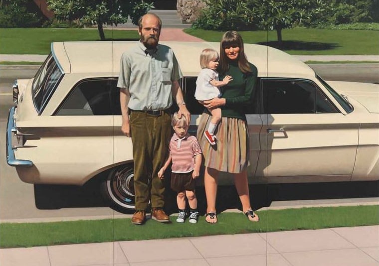
Robert Bechtle, ’61 Pontiac (1968-69). Oil on canvas. Whitney Museum of American Art, New York; purchase, with funds from the Richard and Dorothy Rodgers Fund 70.16. © Robert Bechtle.
Bechtle says he wasn’t being ironic; “I paint [these subjects] because they are part of what I know and as such I have an affection for them; I am interested in their commonness and in the challenge of making art from such ordinary fare.” A Zen-like wonder at the most humdrum reality has always made this flat, affectless painting glow for me.
8. Jeff Koons is Dead. Long Live Jeff Koons.
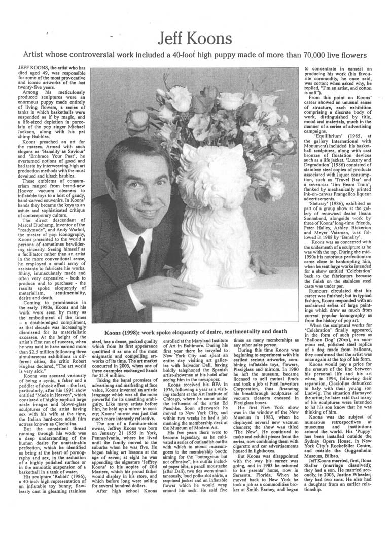
Adam McEwen, Untitled (Jeff), 2004.
The Whitney’s final show uptown was a blockbuster Jeff Koons retrospective (see Jeff Koons as the Art World’s Great White Hope). You saw it. I saw it. It was fascinating and disappointing, provocative and troubling, fun and tiring. There are a few Koons sculptures here, and I smiled to see an Adam McEwen print, Untitled (Jeff), from 2004, that imagines the New York Times obituary of the artist.
“Taking the banal promises of advertising and marketing at face value,” it reads, “Koons invented an artistic language which was all the more powerful for its unsettling ambiguity. Like many artists before, him, he held up a mirror to society; Koons’ mirror was just that much more intensely reflective.” Touché.
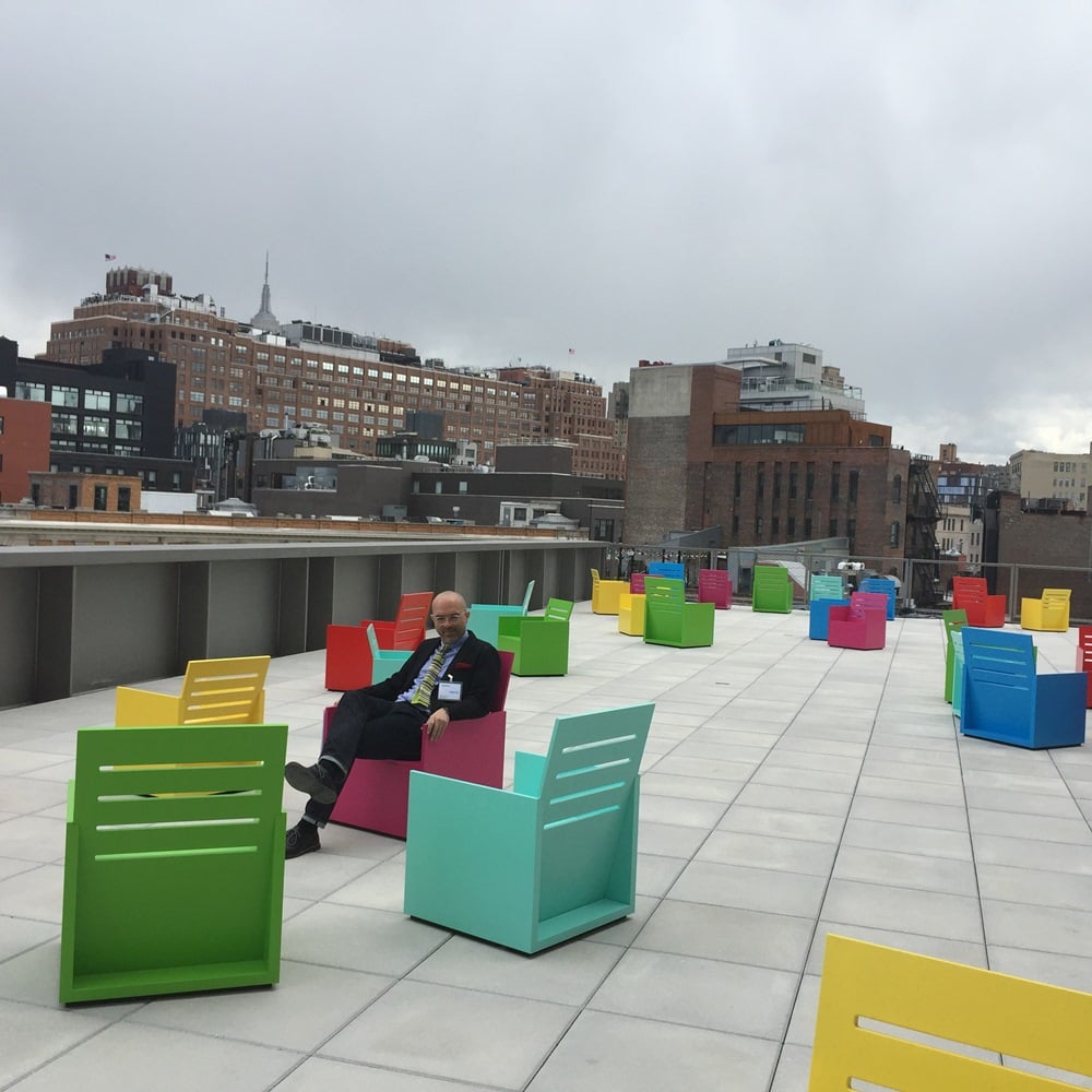
Chairs by Mary Heilmann.
9. Those Terraces
It was uncommonly cool and windy and gray during the preview, but those sculpture terraces are going to prove an asset, and even today, things were brightened up considerably by Mary Heilmann’s chair sculptures dotting one of them. Here’s yours truly taking a break from the long march through the galleries.
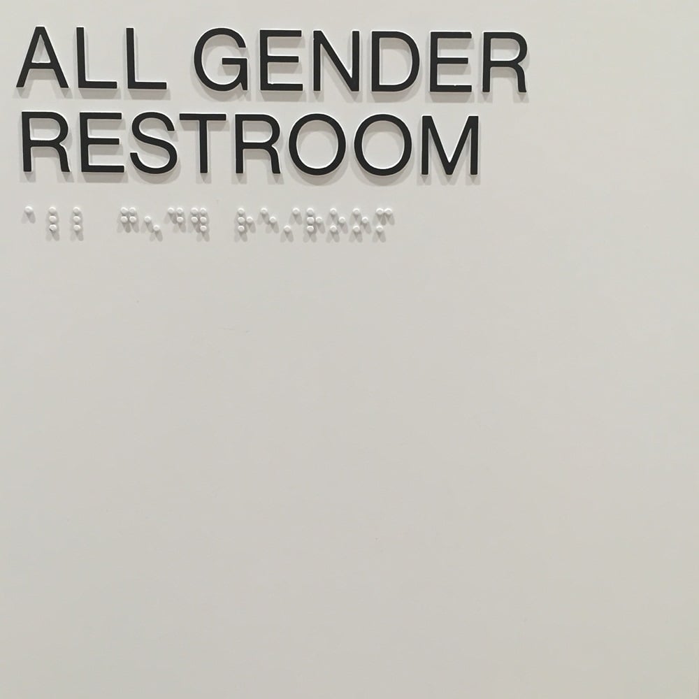
All-gender restrooms at the Whitney.
Photo: Brian Boucher.
10. A Nod to Inclusiveness, Throughout
All-gender restrooms. Enough said?