Opinion
David Ebony’s Top 10 New York Gallery Shows of 2016
David Ebony looks back at his favorite shows of the year.
David Ebony looks back at his favorite shows of the year.

David Ebony

1. Sigmar Polke at David Zwirner, May 7–June 25, 2016
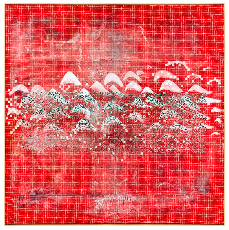
Like the Medieval alchemists that he studied and seemed to emulate, German artist Sigmar Polke (1941–2010) could transform raw materials like rags and resin into something extraordinary—arresting works of art with shimmering surfaces and mesmerizing imagery. The first solo exhibition of Polke’s work in New York since the Museum of Modern Art’s revelatory 2014 retrospective, “Eine Winterreise,” or “A Winter Trip,” focused on the paintings he created following his 1980–1981 journey around the world. Ensconced periodically in places like Thailand, Bali, and Tasmania, Polke would absorb in these exotic locales the indigenous visual culture, such as, for instance, a ritualistic use of color.
The results of his travel and research are large-scale luminous compositions on canvas, found fabric, and double-sided paintings on translucent polyester suspended by wires from the ceiling. The hallucinatory imagery Polke created ranges from landscapes, like palm forests and churning seascapes, to the wholly abstract. Among the many highlights of the show, organized by former Tate Modern director Vicente Todoli, were key works such as Magnetic Landscape (1982), with its abstracted network of schematically rendered rows of white-capped mountains against a checkered red ground. In the sprawling Lapland Journey II (1984), with its delicate layering of thin washes of gray, white, beige, and pale blue, punctuated with slashing black lines, Polke suggests an ethereal place, or a personalized cosmos.
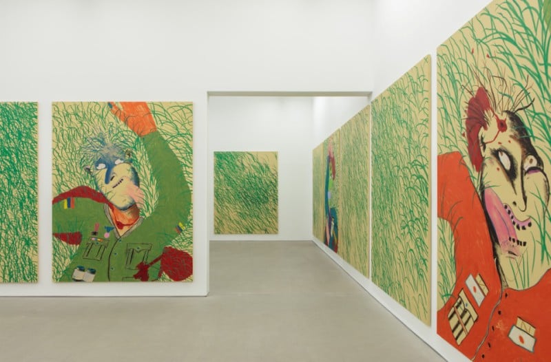
Installation view, Calvin Marcus, “Were Good Men,” at Clearing, 2016. Courtesy Clearing.
2. Calvin Marcus at Clearing, September 9–November 6, 2016
As was the case with Calvin Marcus’s previous show, “Green Calvin,” in 2015, his first in New York—presenting a series of life-size resin roaster chickens, each one plucked, painted green, with “self-portrait” facial features added, and attached to the center of a monochrome green canvas—I can’t seem to dislodge from my brain his most recent exhibition, “Were Good Men.” It was very different from the earlier show, but matched its mood and emphatic intensity.
The San Francisco-born, Los Angeles-based artist, age 28, this time presented a painterly tour de force. The many large, identically shaped vertical canvas panels that lined all the walls feature cartoonish male figures, feverishly rendered with gaudy oil stick colors, and set against a background of vibrant green grass. Some of the panels show only an empty field, each blade of grass executed with significant panache, reminiscent of Francis Bacon’s grassy 1952 Study of a Figure in a Landscape, from the Phillips Collection in Washington, DC.
Marcus’s figures, with purple, green, or orange faces, at first look rather comic, like some of the menacing characters in the Beatles’ animated feature Yellow Submarine. But on closer inspection, they indicate military types: generals and other officers. Uniformed and decorated with metals and other exaggerated symbols of authority, each figure has a bloody bullet hole in the head or neck. The grassy terrain suddenly appears as an ominous, violent killing field, a scene of execution or assassination. Employing a deceptively playful visual vocabulary, Marcus offered here an immersive allegory of political violence and intrigue.
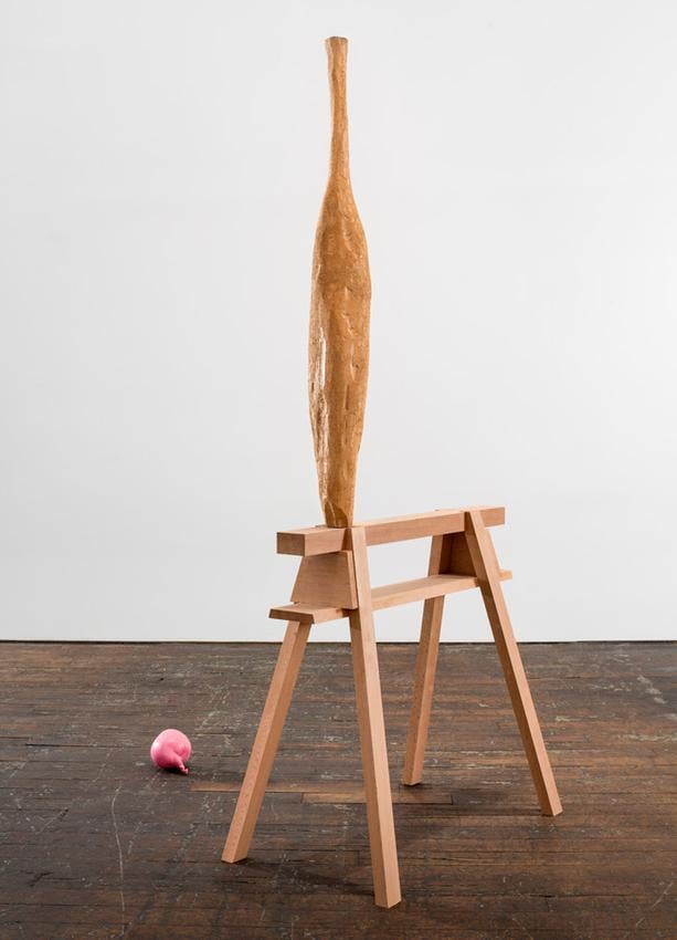
David Adamo, Untitled (Vessel and Balloon), 2014–2016. Courtesy Peter Freeman, Inc.
3. David Adamo at Peter Freeman, Inc., February 26–April 9, 2016
David Adamo makes carved wood sculptures that have a performative element, although not actually witnessed by an audience. He whittles down large blocks of wood, usually cedar, using various hand tools, preferring a small ax-like adze, the design of which can be traced to prehistoric times. The works’ rough surfaces often seem to have been attacked or gouged in a single feverish fit of creativity—a lone ritual one can imagine being enacted at night in a locked studio. Some of the wood blocks, though, appear more calmly sculpted into lithesome, sensuous shapes.
The 37-year-old, Rochester-born, Berlin-based artist also re-creates mundane objects, such as peanut M&Ms, Styrofoam peanuts, and partly deflated party balloons, in painted bronze, plaster, and aluminum, respectively. Examples of these, as well as his wood sculptures, were among the highlights of this brilliant and ambitious exhibition, featuring fourteen untitled pieces spanning the past four years.
One striking floor piece revisits Minimalism. Here, five large beams, each approximately six-and-a-half feet long, are placed at regular intervals in a neat row. The center part of each beam has been pared away with only a thin expanse of wood remaining, as if a Carl Andre work in cedar had been attacked by termites. Several tall, elegant, totemlike pieces recall certain Brancusi sculptures, including a graceful vase-like shape supported by a wood sawhorse. A savvy combination of wit, humor, and art-historical allusion permeated all of Adamo’s works in this show.
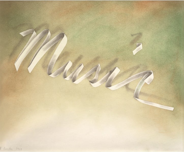
Ed Ruscha, Music, 1969. ©Ed Ruscha; Collection Thomas Gibson, England; Photo Courtesy Ed Ruscha Studio, Gagosian Gallery, and Edward Tyler Nahem Fine Art.
4. Ed Ruscha at Edward Tyler Nahem Fine Art, May 6–July 1, 2016
This museum-quality exhibition was the most comprehensive show yet of Ed Ruscha’s fabled “Ribbon Word” drawings. Included were some fifty text compositions from the late 1960s, and early ’70s, that are central to the Los Angeles-based Pop artist’s oeuvre. Over the years, they have proven to be influential and prescient as they heralded a new form of what British critic Kelly Grovier has termed “verbal vision.” Ruscha actually created 3-D paper models of words and letters that he would then draw, typically one word per composition, working in graphite and gunpowder, and eventually adding watercolor.
Subtle shading and dramatic foreshortening lend many of the pieces an architectonic feel, like imposing structures floating in space. Recurring words like “Sin” and “City” denote towering monuments, and suggest high walls and infinite spaces. Honk and Music evoke sounds, while Hollywood and Palm allude to the environs of Southern California.
Exhibition curator Dieter Buchhart indicated in the show’s catalogue—of which I was one of the editors—that in the Ribbon Word drawings, Ruscha alludes to signage and neon advertising in public spaces, the city streets, and also film and theater. Due to their fragile nature, particularly the pieces created with gunpowder, the Ribbon Word drawings are rarely shown in public individually, let alone in this depth and quantity.
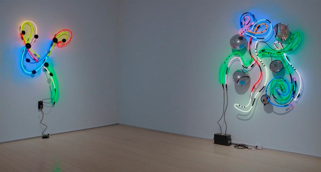
Installation view, “Keith Sonnier: Ebo River and Early Works,” showing (l-r), Dala and Ucua, both 2016.
Photo Kerry Ryan McFate, Courtesy Pace Gallery.
5. Keith Sonnier at Pace Gallery, November 26, 2016–January 21, 2017
The Louisiana-born New York artist Keith Sonnier, a pioneer of video, light sculptures, installations, and conceptual works of many varieties, is perhaps at his dazzling best working in neon. This show, “Ebo River and Early Works” features eleven large neon wall reliefs created this year. Also on view are five historical neon pieces (dating from 1968 to 1970), and two electronic works from his “Tesla” series of the mid 1990s, all of which offer helpful context and insight into Sonnier’s approach to the neon work, and its evolution within his work as a whole. The primary aspect of the neon medium that distinguishes it from other art forms is, of course, that the work emits light rather than reflects it.
Sonnier, however, keeps the medium’s novel properties in check by emphasizing drawing in space. Characteristic of new works such as Dala and Ucua are gracefully arcing networks of colorful lines, sometimes suggesting music notation or aerial views of highways, but always indicating a sense of rhythmic movement. In an interview with writer Richard Shiff for the exhibition catalogue, Sonnier likened the new work to a “kind of organism, work with a soul, an astral projection.” Some of the recent pieces incorporate mirror-like disks that reflect some of the surrounding neon light, and obscure some of it, too. These pieces in particular beckon viewers while keeping them at bay—a contradictory stance that seems almost human.
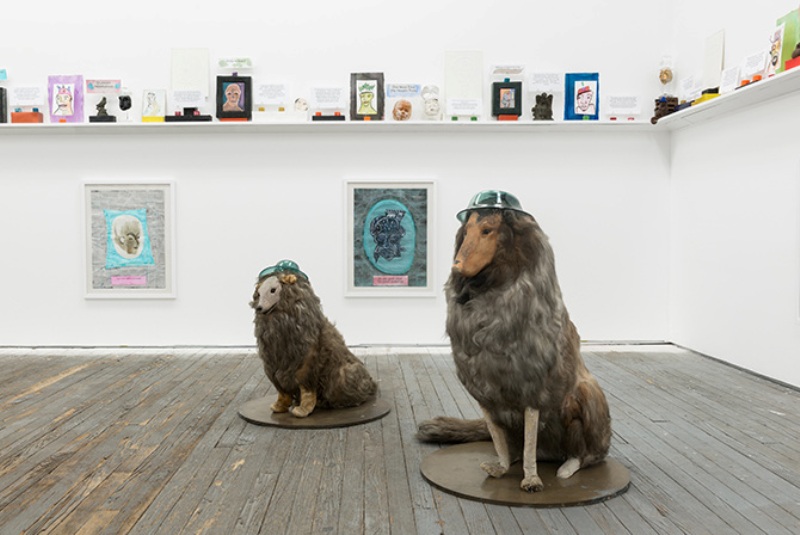
Installation view, Robin Winters, “Free-Standing Sentence,” 2016.
Photo Courtesy Present Company.
6. Robin Winters at Present Company, November 13, 2015–January 15, 2016
Perfectly suited to this trendy Bushwick gallery, which is a kind of converted loading-dock space, Robin Winters’s memorable text-driven installation Free Standing Sentence was an exploration of memory itself. Here, the California-born New York artist presented at eye-level a narrow shelf lining three walls that was loaded with a cacophonous variety of handmade and found sculptural objects, bits of handwritten and printed texts, and intimate vignettes that seemed to persistently convey a linear narrative. Two collie dog mannequins, wearing glass hats, sat upright on one side of the gallery like faithful sentinels, guarding and protecting the installation.
On the shelf, small heads in clay, plaster or glass, often donning the artist’s funky, hand-blown glass hats, periodically distributed along the way, seemed to represent the main protagonist—perhaps the artist himself. Cryptic text clues inserted into the mix—“Hundreds hiding from the law”; “Port of bad sandwiches”;“A quiet day,”, etc.—apparently allude to specific incidents, places and times. They kept the viewer engaged, hoping for a unifying story line that remained elusive. Filled with wit and humor, Free Standing Sentence is ultimately an absurdist epic, but Winters offered in this show a unique and provocative exploration of the interrelationship of visual language, text, and memory.
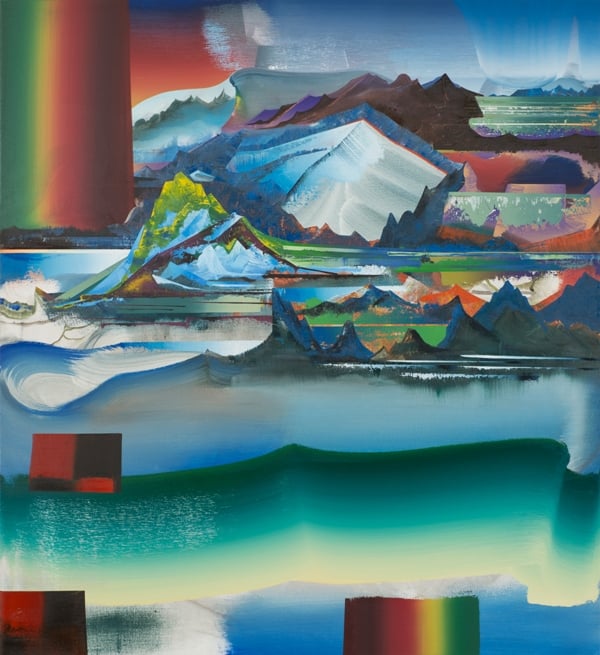
Elliott Green, Mammatus, 2015.
Photo Courtesy the artist and John Davis Gallery.
7. Elliott Green at John Davis Gallery, January 9–January 31, 2016
A hop, skip and a jump north of New York City, along the scenic Hudson River, this show, in the town of Hudson, offered more than a pleasant winter getaway in early 2016. The first exhibition in some years of Elliott Green’s recent paintings of infinite landscapes—or rather, mindscapes—was as visually stunning as it was intellectually rewarding. Characteristic of the new work, the large painting Mammatus shows what appears to be a vast mountain range, like the high Himalayas, with snowy peaks visible in the far distance, and icy rivers in the foreground.
Rather than depicting any real mountains, however, Green’s rocky vista seems emblematic of anything insurmountable or unapproachable. A surrealist touch in the painting, in terms of technique as well a imagery, corresponds to certain works by Max Ernst. In Green’s composition, a large, rainbow-colored horizontal band in the upper left, like a single bravura brushstroke, is a purely abstract device that breaks the illusion of the infinite landscape, reminding the viewer that this, after all, is just paint-on-canvas. It also underscores the fact that while the visual sensation of the painting may be appreciated by all viewers, the mental and physical challenges of its creation were the artist’s alone.
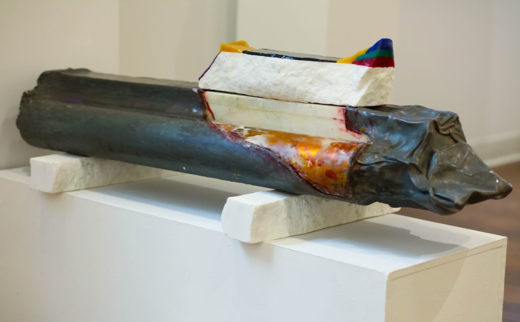
Pavel Kraus, Time Capsule,1992-2016.
Photo Thomas Wilson, Courtesy Project: ARTSpace.
8. Pavel Kraus at Project: ARTSpace December 7, 2016–January 7, 2017
The Czech-born, New York artist Pavel Kraus marks his 70th birthday with this handsome survey in an East Chelsea venue, featuring some twenty-four sculptures, and several major installations spanning 1976 to 2016. Kraus’s primary concerns are with process and materials. Throughout his career he experimented with novel combinations of marble, wax, resin, lead, and glass in large-scale abstract sculptures. And he favors encaustic techniques in his richly nuanced abstract paintings, such as a recent series on view titled Candies. Among the earliest works here are figurative pieces on reverse-painted Mylar panels from the early 1980s, including a series of neo-expressionist “self portraits.” In another group of Mylar works, with crisp, super-graphic designs, such as Blade (1980), a spare image of a safety razor blade, and the eponymous text piece, Made in America (1983), Kraus seems to have established his identity as an American artist.
Like many Czech artists and intellectuals of his generation, Kraus fled his homeland in 1969, at the end of the Prague Spring, and in the wake of the Russian invasion. He settled in Chicago, attended the School of the Art Institute of Chicago, and eventually made his way to New York. There is a sense of urgent displacement, deconstruction and reconstruction in many of Kraus’ works, including “Fresh Marbles,” a series of loosely assembled structures on pedestals, made of numerous small bars of white marble topped here and there with layers of colorful resin.
There is also a feeling of great expanses of time in the work, as in the series “Offerings/Redemption.” These bifurcated egg shapes of inlaid marble, which Kraus created in his studio in Rajasthan, India, appear as archaeological relics. Emblematic of the show, Time Capsule (1992–2016) consists of a large, vertical slab of white marble covered in lead and copper, which Kraus created in 1992, and “reactivated” recently by adding a white marble bar punctuated with a layering of colorful resin. Placed atop the main element, the addition could be regarded as either a rudimentary steering device or a futuristic time gauge.
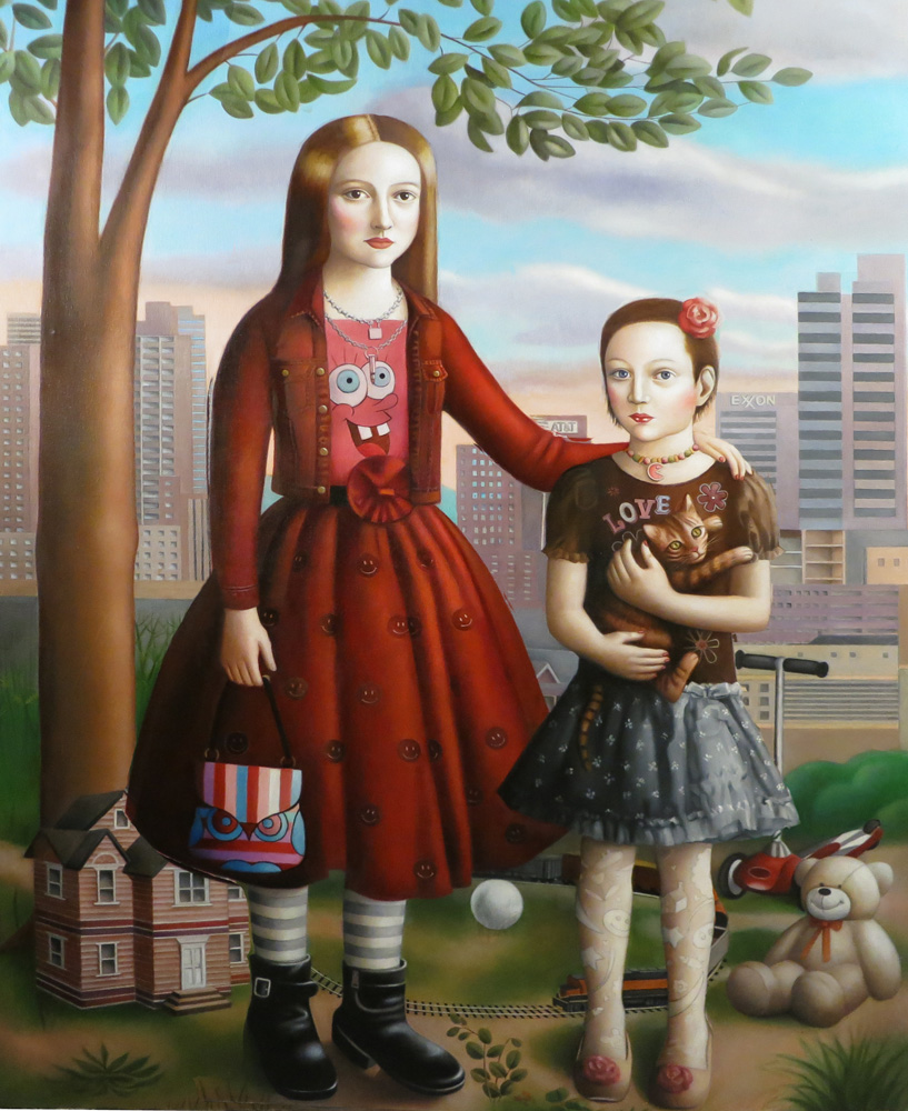
Amy Hill, Two Girls, 2016.
Photo Courtesy Front Room Gallery.
9. Amy Hill at Front Room Gallery, April 15–May 22
After a series of paintings inspired by Memling and Van Eyck, New York painter Amy Hill abandoned the Northern Renaissance for the moment, and turned to American folk art for inspiration. She uses her precisionist technique to conjure 18th and 19th-century self-taught masters like Ammi Phillips, Noah North, or Sheldon Park. Like those artists, her favorite subjects are children, and she brought a cohesive and stunning group of imaginary portraits of kids together in “Young and Innocent,” a show of fourteen recent works, for whose catalogue (full disclosure), I contributed a short essay. At first glance, the work appears to be authentic folk art painting. But Hill, commanding a great deal of technical prowess in order to arrive at her faux-naive style, has updated her children, who, on second look, are unmistakably of the 21st century.
With cell phones in hand, and toxic fume-spewing factories in the background, Hill’s kids grapple with the problems of modern urban living that are all too familiar to contemporary viewers. In Two Girls, the children pause in a city park with towering skyscrapers looming in the background. A quasi-surrealist image, Girl with Lego Dog shows a young girl, wearing a blue dress and a baseball cap, walking her improbable plastic pooch in a verdant landscape. Some kids sport tattoos and smoke cigarettes; and in Boy with Car, a young child lights matches while the burning rubber tires of his miniature racing car smolder in the background. Far from a sentimental or nostalgic view of childhood, Hill’s unique vision is definitely aimed toward an exhilarating, though uncertain, future.
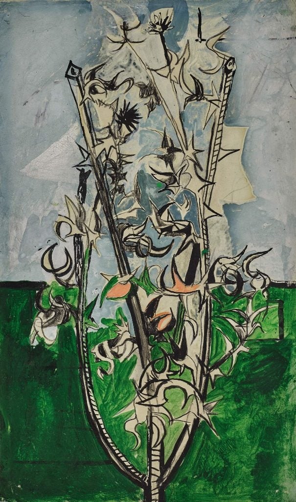
Graham Sutherland, Thorn Bush,c. 1947, from the David Bowie Collection.
Photo Courtesy Sotheby’s.
10. David Bowie Collection at Sotheby’s New York, September 26–September 29, 2016
Serious art critics are not supposed to cover auction houses, but in the days when I reported on them regularly for Art in America and elsewhere, I never minded the risk of reputation. For me, auction house preview exhibitions often offer incredible once-in-a-lifetime group shows, featuring unique displays, and juxtapositions of works, the likes of which will never be seen again. Such was the case with “Bowie/Collector,” which, despite the blatant commercial aims of the event, served as a kind of art-world tribute to the late musician/artist. The unforgettable presentation, on view in New York for just a few days, highlighted selections from Bowie’s about-to-be dispersed art collection of some 400 works.
In a year that marked the death of Prince and lesser-known music greats, including Pauline Oliveros, Bowie died on January 10, at age 69. He left behind a final music masterpiece, the album Blackstar, confirming his adventurous spirit and refined musical taste to the end. His erudite taste in art was legend, but the range and quality of his art acquisitions were unknown to the public until the Sotheby’s presentation. The collection, being sold by his heirs, brought more than $41 million at Sotheby’s London in November. Among the works were top-notch pieces by his contemporaries like Jean-Michel Basquiat, and Damien Hirst. But the most exciting works demonstrated the depth of Bowie’s interest in early- and mid-20th century British modernism, including unusual and brilliant examples by underappreciated artists such as Stanley Spencer, Peter Lanyon, Alan Davie, Graham Sutherland, and many others.
David Ebony is a contributing editor of Art in America and a longtime contributor to artnet.
Follow artnet News on Facebook.