Art & Exhibitions
9 Reasons Venice Is Unmissable During the Architecture Biennale
A floating school gets best in show honors.
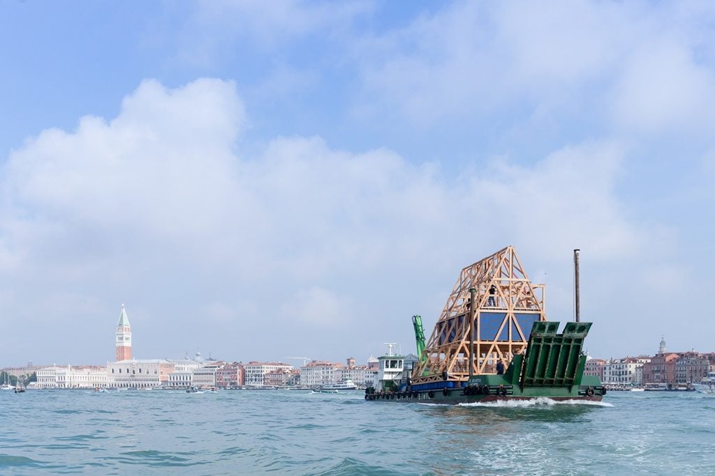
A floating school gets best in show honors.

Karen Wong

The optics were spot-on last weekend for the opening of the 2016 Venice Architecture Biennale, “Reporting From The Front.” During the preview days, artistic director (and this year’s Pritzker Prize winner) Alejandro Aravena wore casual jackets and shoes, as if to let us know that he is a man of the people, in keeping with the numerous projects in the exhibition that emphasize architecture for the 99 percent.
This year, Aravena issued a call to action for architects to take charge and make a difference in world affairs. The jury he led chose architects from regions that are often ignored at these Biennales to receive the top prizes. The Golden Lion for best exhibition went to Paraguayan firm Gabinete De Arquitectura; the Silver Lion was bestowed on Nigerian-born Kunlé Adeyemi/NLÉ; and the Lifetime Achievement Golden Lion went to Brazilian architect Paulo Mendes da Rocha.
So it rankled particularly when, for his first public event, he curated an all-males-over-50-years-old panel discussion on the topic of infrastructure. It’s hard to believe he could be that tone-deaf. Was a woman or an architect of a younger generation not skilled enough to speak? Oh, well. Two steps forward, one step back.
Thank goodness for the 63 national pavilions—where architects came out in force to illuminate what it really meant to be reporting from the front as they tackled refugee influxes or the impact of a financial crisis on a country’s unfinished building stock or how to design compact domestic dwellings.
Here are my favorite pavilions and my pick the best project of the Biennale, as well as two recommendations for shows outside the Biennale proper.
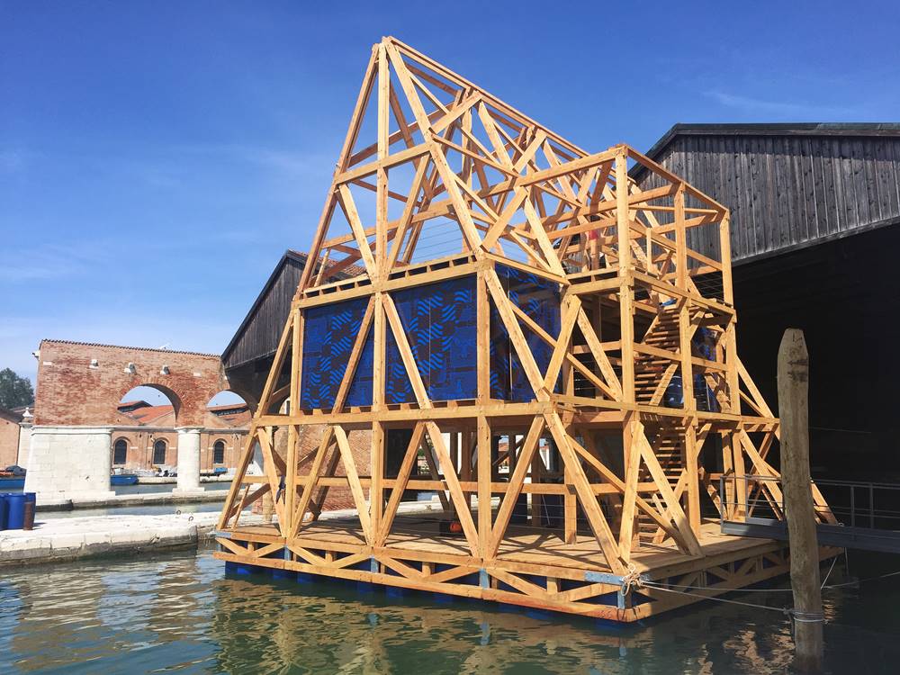
Kunlé Adeyemi and NLÉ, Makoko Floating School. Courtesy of Karen Wong.
1) Makoko Floating School
Beguiling images of the Makoko Floating School in Lagos, Nigeria, have been a ubiquitous presence on design blogs of late. But Lagos is not easy to get to, and here, Aravena has made it possible for the Biennale’s many visitors to explore this modest structure at first hand. He tapped Kunlé Adeyemi and his firm, NLÉ, to reconstruct the pavilion and dock it in the water basin of the Arsenale.
The quasi-pyramid forms three floors totaling 1,500 square feet that have been adapted as public space and as the venue for an exhibition, “Waterfront Atlas.” The second floor is enclosed with walls that are screen printed with the seven continents, pinned with postcards showing various existing aquatic projects. Blank cards, pencils, and pins sit on a table waiting for other architects to add to the map.
The exhilarating view from the top of the structure allows its wooden beams to frame the Venice skyline in new ways. One can easily imagine the structure serving various purposes, including, say, health care services, town hall meetings, or a community cafeteria.
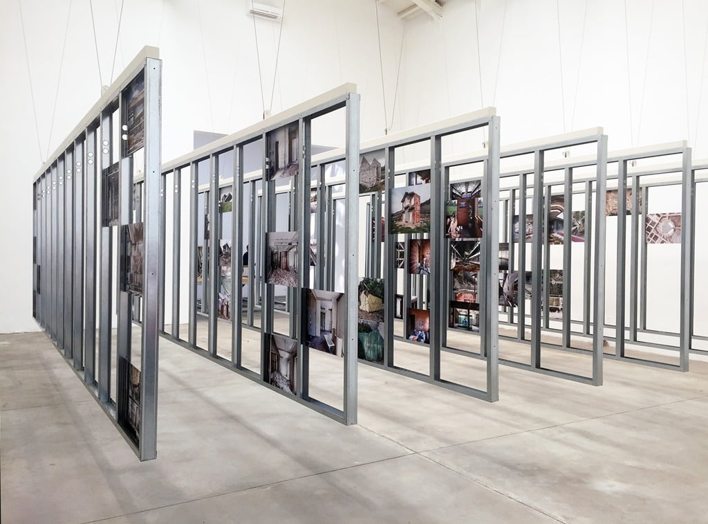
The Spanish pavilion. Photo by Karen Wong.
2) Spanish Pavilion
After the economic crisis of 2008, Spain’s unemployment rate has hovered between 20 and 26 percent, according to the National Statistics Institute (INE). The only other EU country with more people out of work is Greece.
In the good times, Spain green-lit a lot of construction, from new buildings to the rehabilitation of historic sites, which led to a number of poorly constructed or even abandoned buildings. The epidemic has provided an opportunity for architects to re-examine these spaces to design with economy and with rigor, to mend and resuscitate houses, convents, churches, office buildings, ports, swimming pools, factories, and cultural centers. These fifty-five projects are handsomely displayed on steel frames that double as walls and tables, symbolizing beauty in frugality.
3) Austrian Pavilion
Responding to the refugee crisis, architect and curator Elke Delugan-Meissl used the Biennale to assemble several teams to stage interventions in Vienna’s office buildings. She tasked Caramel Architekten to develop a temporary system, a tool kit dubbed “Home Made.” Using simple components of parasol, textile panels, and cable ties, shelter was created for 280 residents at a cost of just $70 per unit and taking only 50 minutes to assemble. EOOS, for its part, provided lodging for 600 asylum seekers who are living in a former customs training facility. They designed a collection of “Social Furniture” that not only created meeting and social spaces and kitchens but also an opportunity for clients to build furniture. Both the tool kit and the furniture are built with manuals that readily available online. Over five months, the projects were sensitively documented by photographer Paul Kanzler, and his take-away posters are available in the exhibition’s main hall.
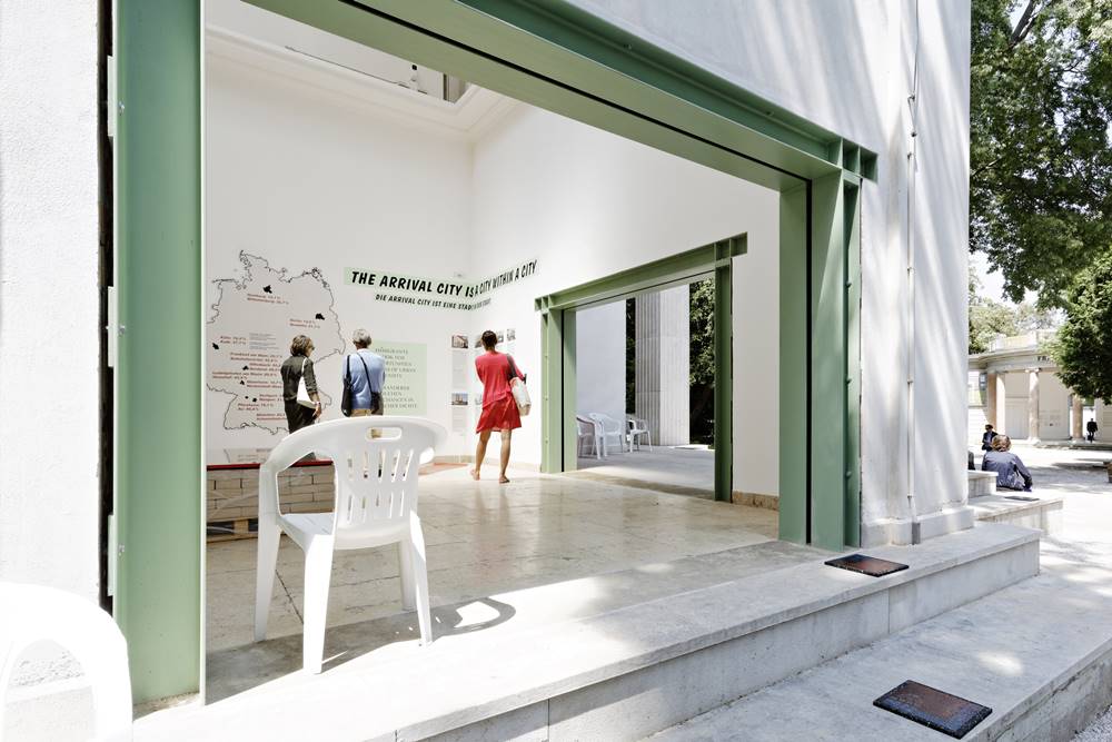
Interior of the German Pavilion. Courtesy of Kirsten Bucher.
4) German Pavilion
One look at the German Pavilion and you say to yourself, “It’s different. I like it.” Some 48 tons of bricks have been temporarily removed from this landmarked building, which was redesigned by architect Ernst Haiger in 1939 at the behest of Adolf Hitler. This created four openings that symbolize Germany’s openness, specifically to the more than one million refugees who were received there in 2015 alone.
The Deutsches Architekturmuseum (DAM), Frankfurt, in collaboration with Canadian author Doug Sanders, have developed a checklist of conditions necessary for the formation and manifestation of neighborhoods where immigrants can thrive as citizens and not guests. Sanders is the author of the book Arrival City: How the Largest Migration in History is Reshaping our World.
Part of their ongoing research is a database of successful refugee housing projects. It’s hard to know if any of this research will infiltrate public policy, but one is hopeful as this team continues to update “Making Heimat” (the latter word being German for “home”) in an upcoming exhibition to take place February 2017 at DAM.
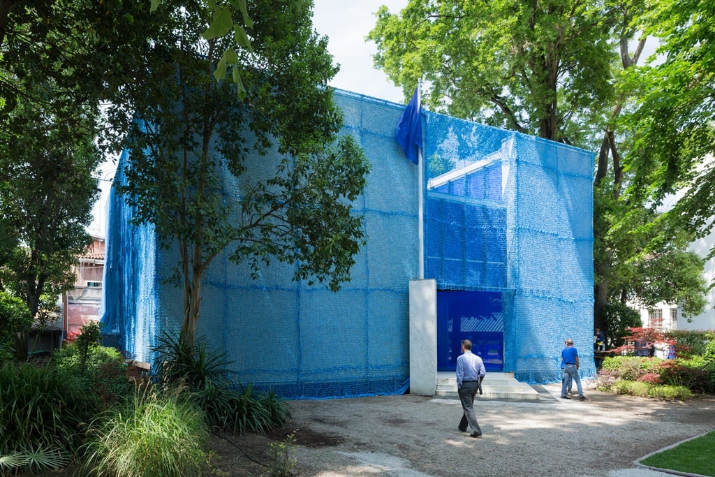
The Dutch pavilion. Photo Iwan Baan, courtesy Venice Architecture Biennale.
5) Dutch Pavilion
As visitors approach this pavilion, they are confronted by blue netting that wraps the exterior; as they enter, they’re bathed dramatically in blue light. The color is meant to represent the case study of a UN peacekeeping mission in Gao, Mali. The locals of that region are known as “blue men” for their indigo clothes; UN uniforms include a blue helmet.
It’s a design theme gone awry, but it doesn’t dilute the ambitious and provocative research by Malkit Shoshan, curator and founder of architecture think tank FAST. She proposes that hundreds of peacekeeping missions around the world are opportunities to create not only spaces for defense, diplomacy, and development, but also catalysts for engagement. The goal is to replace co-existence with shared existence and to evolve military power structures into a more humane experience.
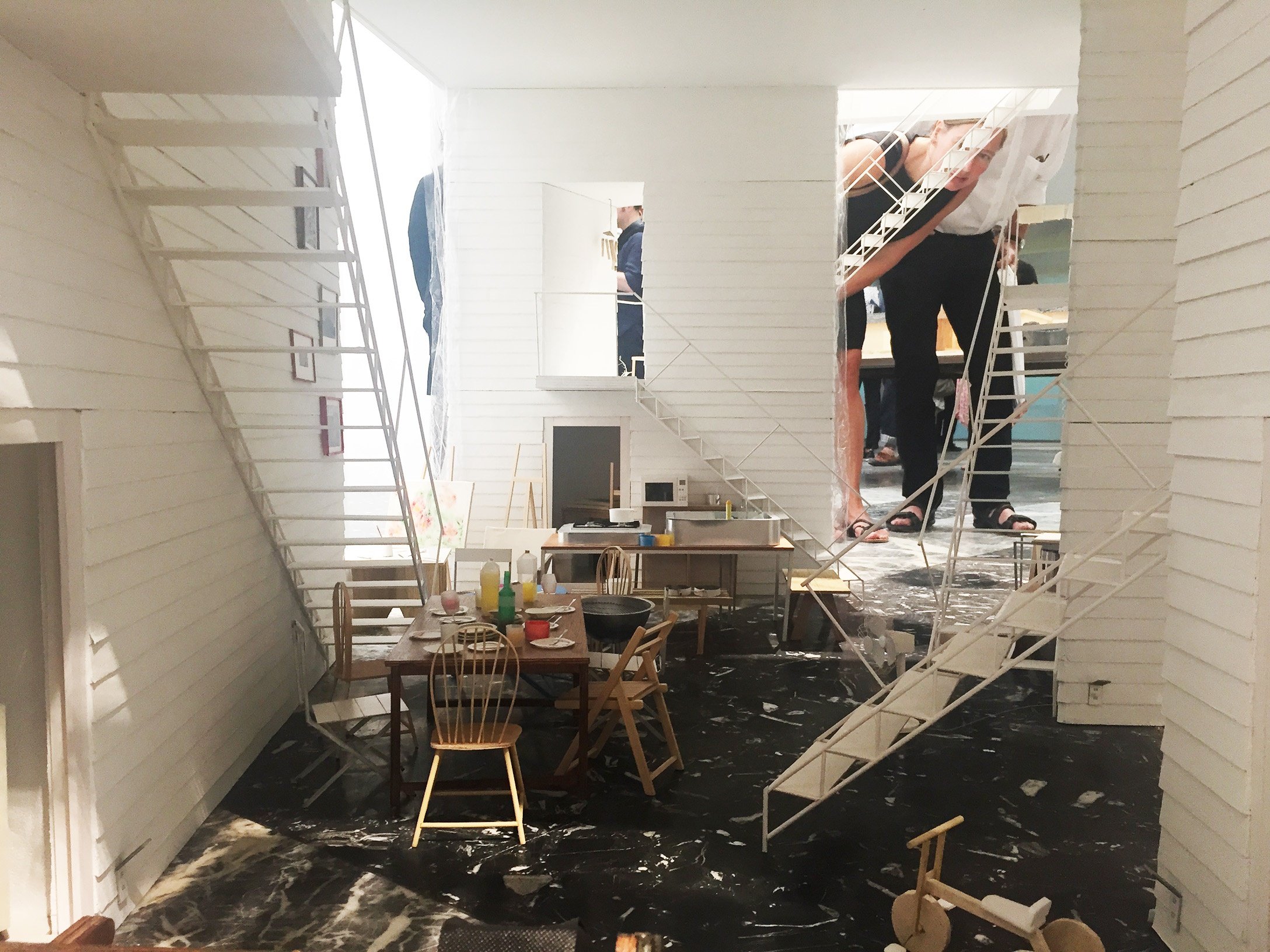
ON (Osamu Nishida and Erika Nakagawa), apartment complex model, at the Japanese pavilion. Photo Karen Wong.
6) Japan Pavilion
Japanese architects have always held a rarefied status. Generation after generation, they provide masterful examples of both public and private architecture. They excel in making small, efficient domestic spaces that double as visual haikus.
Curator Yoshiyuki Yamana brings together twelve exemplary dwellings from several firms from the last seven years, a time marked in Japan by increased unemployment among young people and decreased residential space. Hailing from primarily Tokyo and Yokohama, these young firms are redefining gap spaces—alleys, courtyards, plazas, verandas—in ways that can improve relationships with your neighbors.
My favorite is a 1,500-square-foot apartment complex by ON—partners Osamu Nishida and Erika Nakagawa. The project offers four units for artists atop a columned open space that functions as common living room and artists’ studios, and can double as exhibition/event space. As part of their Venice presentation, they are showing their 1/10 scale model, in which everything from sandals to laptops to plants is constructed out of paper. Think Thomas Demand, but cuter.
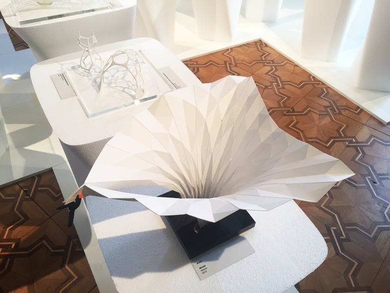
Zaha Hadid’s work on view. Courtesy of Karen Wong.
7) Zaha Hadid at Palazzo Franchetti
With the unexpected passing in March of British architect Zaha Hadid, her retrospective at the Palazzo Franchetti took on deeper significance. The expansive exhibition demonstrates a love for craft in her paintings, sculptural paper reliefs, and 3D-printed models. Long lines and hard curves dominate. Her aesthetic couldn’t be farther from the palace’s Venetian Gothic architecture, marked by complex parquet floors, brocaded fabric walls, marble staircases, and ornate blown-glass chandeliers. This visual tension lends a heightened intensity to Hadid’s biomorphic buildings.
People often call Hadid a diva. But in fact, she was an artist—a uncompromising, visionary, and innovative practitioner. Architecture is not art, but certainly this exhibition is a statement on the art of architecture.
8) Sigmar Polke at Palazzo Grassi
A few steps from Palazzo Franchetti is the François Pinault Foundation’s Palazzo Grassi, which is presenting a gorgeous show of ninety works by Sigmar Polke, who won the Golden Lion at the 1986 Venice Art Biennale. He is often referred to as an alchemist for his experimentation with chemicals and materials (arsenic, mica, resin, beeswax, snail mucus, to name a few), and his richly painted and complex surfaces are enhanced and framed beautifully by the neoclassical-inspired 18th- century interior. Helping to link the show to the current occasion, Polke’s father was an architect, and the exhibition design is handled deftly by fellow German architect Annabelle Selldorf.
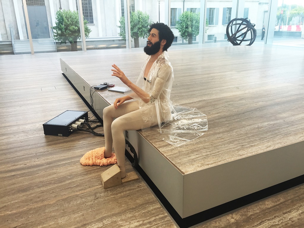
Goshka Macuga’s exhibition at the Prada Foundation. Photo Karen Wong.
9) Fondazione Prada, Milan
It’s a breezy two-and-a-half-hour train ride from Venice to Milan to see the Prada Foundation, one of OMA/Rem Koolhaas’s most engaging projects in recent years. It’s a campus of new and old buildings around an industrial courtyard. There are a number of seemingly over-the-top moves—the 24-karat gold leaf-covered townhouse, the gigantic slabs of terrazzo marble flooring, the stainless-steel mirrored panels—but everything is handled with a keen eye that evokes a quirky elegance. You could spend a whole day here (a meal at the much ballyhooed Wes Anderson-designed café is an Instagram must, if that’s your thing).
Currently on view is a tour de force of an exhibition by London-based Polish artist Goshka Macuga. The most affecting piece in To the Son of the Man Who Ate the Scroll is a creepily charming, hypnotic android who recites seminal excerpts of speeches on humanity, the passage of time, and mortality.
Her work is bookended by a knockout survey show by American artists Edward and Nancy Kienholz. This presentation culminates with Edward Kienholz’s infamous work Five Car Stud (1969-72). It’s a grotesque tableaux, set during the Civil Rights struggle era, of six white men savagely beating a black man for finding him drinking with a white woman. This violent and dark installation feels unfortunately timeless as, more than 40 years on, the United States currently grapples with racially tinged police brutality, the mass incarceration of African-American men, and the modern-day inheritor of the Civil Rights movement, Black Lives Matter.
“Reporting from the Front,” the 15th Venice Architecture Biennale, is on view through November 27.