People
Meet Illustrator Mona Chalabi, the Data Sleuth Making Poignant Visualizations About the Full Impact of Racism
The illustrator and data journalist opens up about her process.

The illustrator and data journalist opens up about her process.
Naomi Rea
 ShareShare This Article
Statistics are subjective. This much is clear to British data journalist Mona Chalabi, who has built a career highlighting neglected information through her data illustrations.
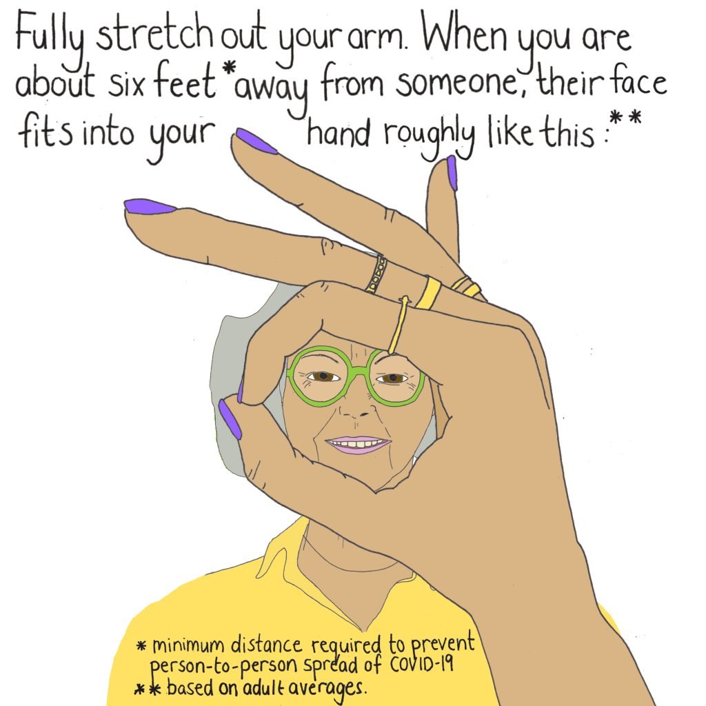
Chalabi, who has garnered attention in recent weeks with visualizations she has made about COVID-19 and in support of the Black Lives Matter movement, knows that when the public sees most data, that information is already often translated by a data analyst, whose job it is to pour through the raw numbers and pull out the stories they think are worth highlighting.
And she recognizes that everyone—even data storytellers—brings their own inherent biases to numbers.
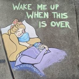
Courtesy Mona Chalabi.
“I think everyone approaches a dataset with their own lived experience,” she tells Artnet News from her apartment in Brooklyn, New York.
When looking at a given dataset from her perspective (Chalabi is of Iraqi descent), she finds herself naturally honing in on issues she is particularly interested in. If numbers convey a glaring gender pay gap, or an issue that can be tied to systemic racism, these usually end up shaping her interpretation of the data.
Chalabi found her way to journalism though looking at statistics while working for non-governmental organizations. She remembers becoming frustrated after looking at data on displaced peoples for the International Organization for Migration.
“The statistics were really important, but they were only being shared with a handful of experts,” Chalabi says. “And I just wanted to reach the broader public.”
So she decided to do a one-day course in data journalism, and eventually began illustrating her own analysis.
Skip a couple of career steps, and she is now data editor at the Guardian, as well as a TV and radio producer, writer, presenter, and illustrator whose work has been shown at several galleries, including the Tate, the Design Museum, and the House of Illustration.
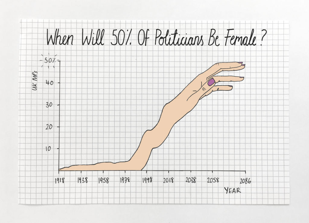
Her striking visualizations are highly memorable because they do not look like the staid charts and graphs typically associated with data science. Instead, she draws disembodied limbs and pointing fingers, and her images are tinged with humor and emotion.
It’s a calculated choice: Chalabi does not pretend to hold any kind of objective, perfect, or higher truth.
“Statistics are definitely subjective, and I think that part of the intention of merging [them with art] is to make that more explicit,” she says.
But before she chooses what story to tell, it is critical that she sources reliable numbers. Chalabi spends most of her time pouring over government-produced data sets, peer-reviewed studies, and official statistics.
“I don’t want to be doing anything that is contributing further to misinformation by pulling out resources that aren’t solid,” she says.
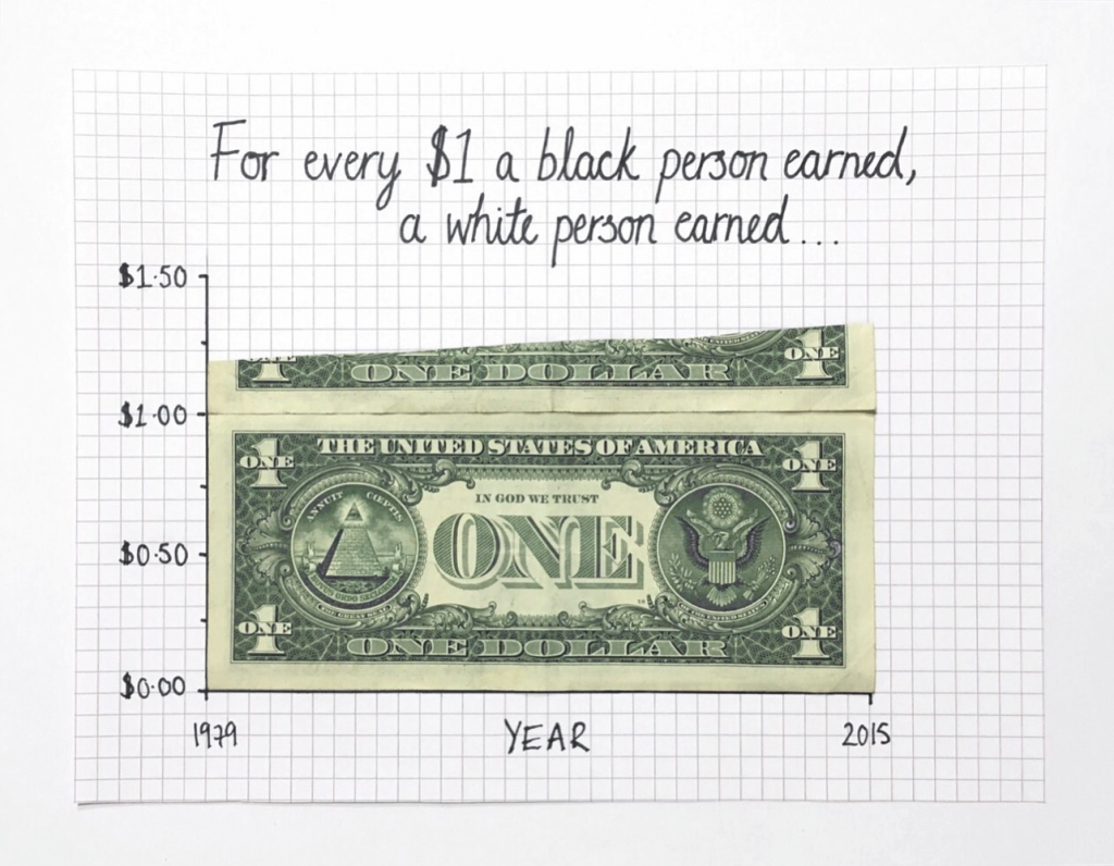
Courtesy Mona Chalabi.
Choosing what information to include in her illustrations is a complex process.
There are certain constants in approaching the numbers, and she often finds herself asking: Where are the outliers? What’s the average? How are different demographics involved?
She also has a special relationship with her audience online. “I am constantly [responding to] what people want me to cover,” she says.
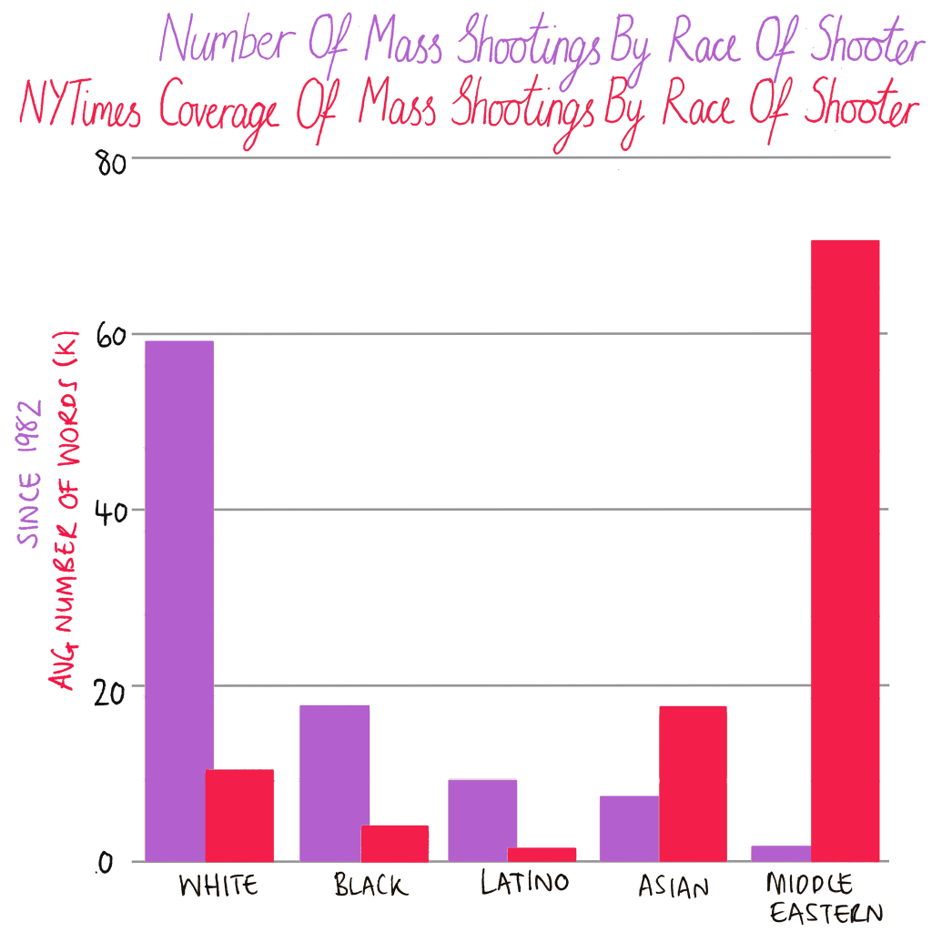
She pushes back against frequently cited data points that are used to justify the systematic oppression of Black people in the US.
Courtesy Mona Chalabi.
“Data can be manipulated to serve different purposes,” Chalabi explains, calling data on so-called Black-on-Black crime “a series of statistical tweaks to distract people with essentially a nonissue.”
Working as a solo operator (though she longs for a team of data-literate colleagues), Chalabi acknowledges that she doesn’t always get it right. Which is why she makes a point of communicating not only the information, but also its limitations.
“I’m constantly trying to convey the uncertainty of those numbers,” she says.
Courtesy Mona Chalabi.
Her social-media follower count has ticked up in recent months, which has brought with it a “scary” amount of pressure and scrutiny. But she is forging ahead.
“I think that one of the challenges of covering Covid is that we still know so little,” Chalabi says, explaining that she feels a stronger need to couch her visualizations in uncertainty because they could be shaping people’s behavior.
The stakes are high, she says, when the numbers could have “literal life or death consequences.”