Art World
MoMA’s First Phase Expansion Is Mostly Cosmetic, but Hints at a Promising Future
The expansion includes a cell phone charging station and a new bookstore.
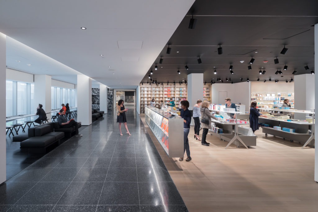
The expansion includes a cell phone charging station and a new bookstore.

Julia Halperin

Revamping a museum in the middle of midtown Manhattan is a little bit like reorganizing a closet inside a cramped apartment. Where you might hang shoe racks over the door and add space-saving hangers, architects consolidate mechanical equipment and build staircases with razor-thin banisters.
This kind of surgical architecture is the guiding force behind the subtle first phase of the Museum of Modern Art (MoMA)’s $450 million renovation and expansion, which debuted today. Design studio Diller Scofidio + Renfro and architecture firm Gensler have come together to design the project.
When it opens fully in 2019, the expansion will increase the museum’s gallery space by 30 percent, including new flexible spaces dedicated to contemporary design, performance, and film. Public space will also grow by 25 percent, thanks to several new lounges and bookstores (as well as a cell phone charging station, which no 21st-century museum seems to be able to do without).
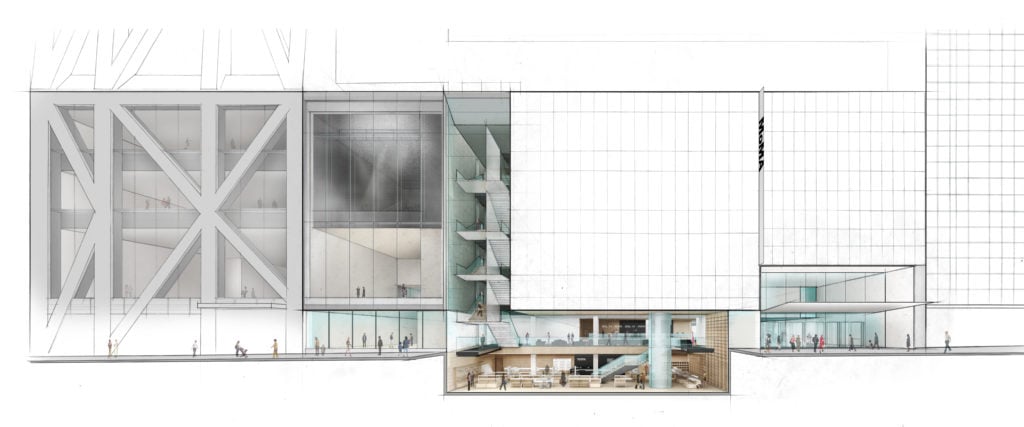
Elevation of The Museum of Modern Art on 53 Street with cutaway view below street level. © 2017 Diller Scofidio + Renfro.
Because the project will open in phases and largely exists within a predefined footprint (the main addition comes from MoMA’s annex of the former American Folk Art Museum building), it is nowhere near as flashy as the downtown Whitney Museum of American Art, which opened in 2015, or as sprawling as the Tate Modern extension, which opened last year.
But curators say that the initiative involves a reassessment of the way the museum presents its collection. Alongside many of its peer institutions, MoMA is striving to break out of regimented silos and instead show works from various media—drawing, painting, photography, sculpture—alongside one another.
“I think we would have done it anyway, but [the expansion] gives us the chance to really start from scratch,” says Christophe Cherix, the museum’s curator of drawings and prints.
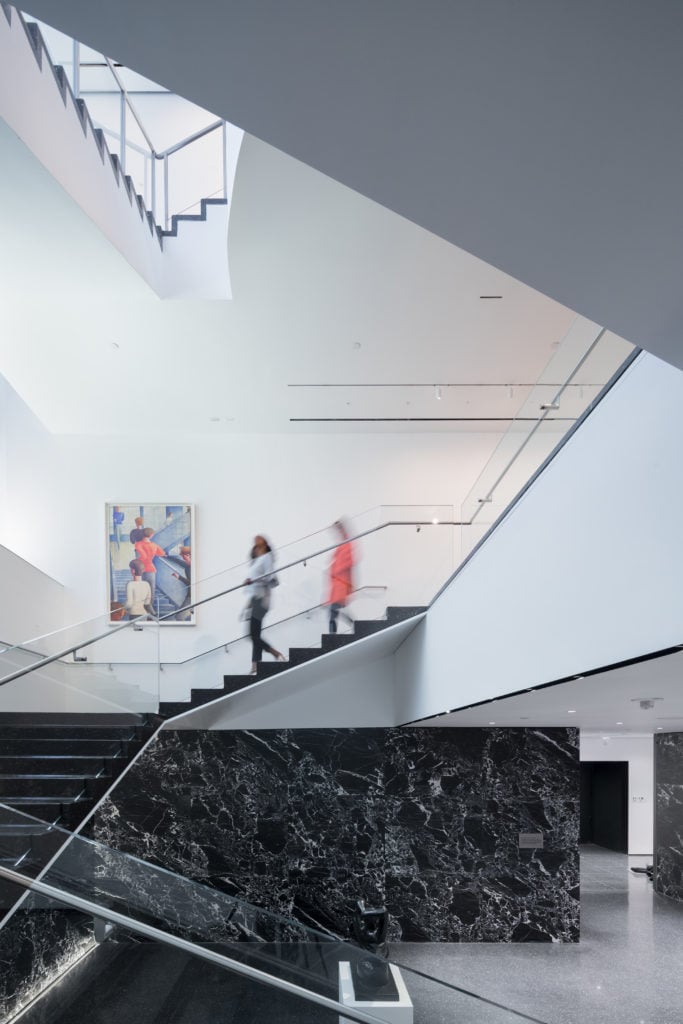
View of the restored Bauhaus staircase, with Oskar Schlemmer’s Bauhaus Stairway (1932). Photo by Iwan Baan.
During the launch of the first phase today, the museum’s director, Glenn Lowry, and architect Liz Diller admitted that some elements are so inconspicuous that they are almost invisible. “An awful lot of what was achieved in phase one is this kind of microsurgery that you never get to see,” Lowry said. “But it makes the public spaces so much better.”
On the second floor, the architects have replaced a gallery with a bookstore and charging station with a garden view. The third floor is dominated by 15,000 square feet of refurbished gallery space and a bit more seating looking out over the garden. (The museum could not immediately confirm how the combined square footage on these floors compares to its previous layout.)
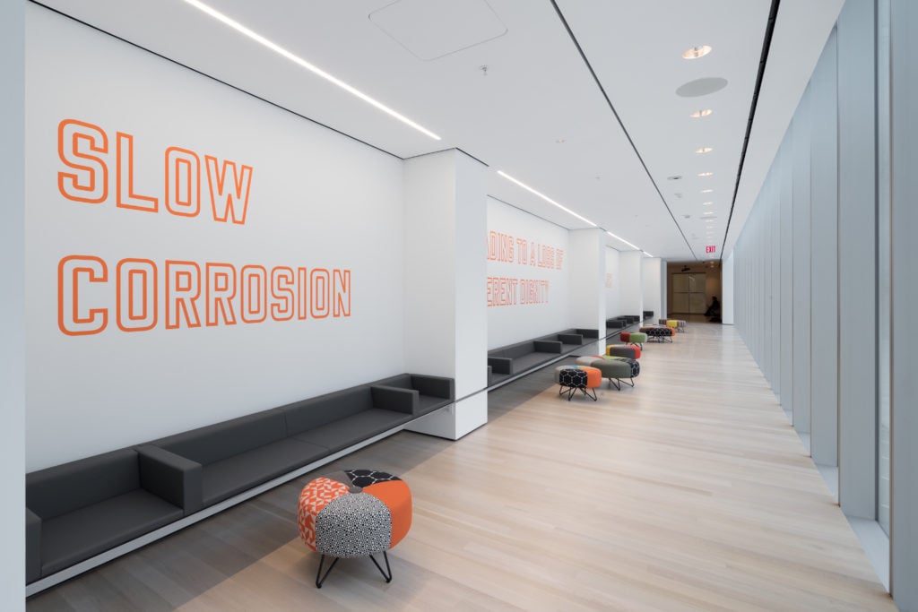
View of The Louise Reinhardt Smith Gallery, including Lawrence Weiner’s SLOW CORROSION LEADING TO A LOSS OF INHERENT DIGNITY OF THE OBJECT AT HAND (1985). Photo by Iwan Baan.
On the third floor, a newly installed work by Lawrence Weiner, which has never been shown before, could be read as a wink to those who make it a hobby to criticize the museum’s architectural plans. In bright block letters, it reads: “Slow corrosion leading to a loss of inherent dignity of the object at hand.”
On June 4, the main lobby entrance will close to accommodate new construction; the museum will have only one entrance, on 54th Street, until October, when the 53rd Street entrance reopens.
After that, the architects will progress westward to tackle the more flashy elements of the expansion, including a remodeled lobby and a new 2,000-square-foot “Project Room” gallery that is the heir to the ill-fated “Art Bay.” (The Art Bay, a flexible performance and exhibition space that was perhaps the most high-profile component of the original renovation plan, was jettisoned last year.)
The Project Room is “slightly different but has the same ethos,” Diller told artnet News. The space is roughly the same size, she notes, but will be divided into two galleries: one devoted to contemporary design and the other to artists’ projects. It maintains the same flexibility as its progenitor, she says, but does not open directly onto the street. Like the rest of the first floor of the museum, it will be free to enter without a ticket.
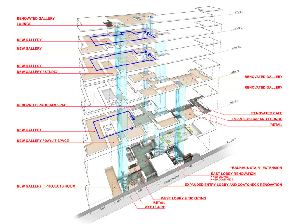
Stacked plans highlighting the new and renovated spaces at The Museum of Modern Art. © 2017 Diller Scofidio + Renfro.
As MoMA remains in flux over the next two years, curators are taking the opportunity to reconsider business as usual. In 2019, the fully expanded museum will dedicate its entire building to its permanent collection. Chrisophe Cherix says this plan is part of a larger strategy to treat collection presentations more like temporary exhibitions than static displays.
“We have more space to go deeper into the collection, so paradoxically, we’ll show less, and we’ll have to change it more,” he says. “If we can do it for the Russian avant-garde,” he notes, referring to the museum’s recent exhibition timed to the centenary of the Russian Revolution and drawn entirely from its collection, “then we can do it for Bauhaus, and many others…. For me, what’s exciting is not 2019, but what will happen after.”