Art World
Here Are the 8 Absolute Worst Works of Art We Saw in 2019, as Chosen by the Artnet News Staff
We encountered some flubs this year, from Picasso's ridiculous ceramics to Christoph Büchel's awful boat.
We encountered some flubs this year, from Picasso's ridiculous ceramics to Christoph Büchel's awful boat.

Artnet News

Sometimes we come across an artwork so profound, so thrilling, so completely beautiful that it lingers fondly in the mind for years to come. Other times, we look at something and think, “Whoa… that stinks.” Like, big time. Here are some of those 2019 duds, as chosen by our writers and editors.
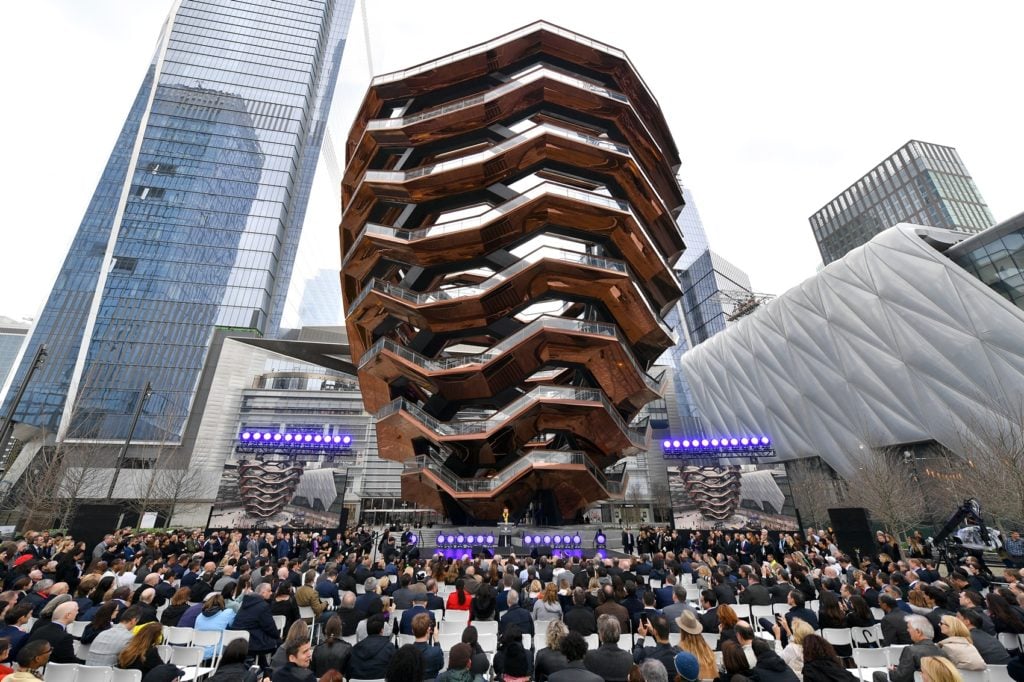
Designer Thomas Heatherwick speaks onstage at Hudson Yards on March 15, 2019, in New York City. Photo by Dia Dipasupil/Getty Images for Related.
While this has been stated over and over all year long, it’s worth typing it out again: Vessel, the stairway to nowhere at the dystopian fake-Oz of Hudson Yards, is the most visually repugnant public structure to be inflicted on Manhattan in its history. Each time I see it I’m gobsmacked anew by how mindbogglingly stupid the thing is. I fear that several generations of Thomas Heatherwick’s child-aged progeny, who should be (mostly) spared blame for this, will be brutally mocked by future bullies who realize that their schoolmate’s zero-talent hack of an ancestor gave this great city such an eyesore. As for us here now, we’ll spend the rest of our lives trying to avoid any sight of it.
—Nate Freeman
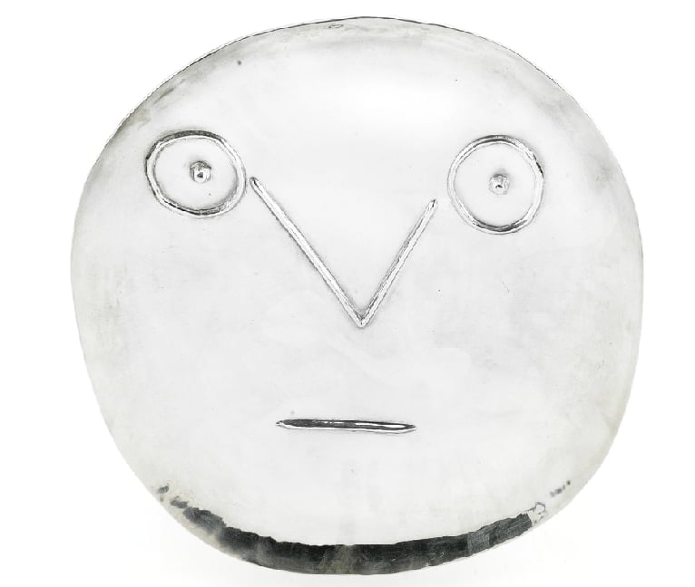
Pablo Picasso, Visage Geometrique aux Traits (1956). Photo by Flickr user cea +.
Offsetting a number of genuinely compelling works on view at the Museu Picasso this January was a gallery centered on a large vitrine full of the artist’s ceramic plates, each one featuring some variation on… an enormous smiley face. Sun smileys! Painted smileys! Embossed smileys! All displayed solemnly under glass inside an ornate Gothic interior alongside a dedicated security guard as if they were the pinnacle of artistic achievement.
Reader, I laughed so hard that all the photos I tried to take at the time were too blurry to use. To me, the only real value in these pieces is as cautionary tales. They are vivid reminders that even the most colossal talents can churn out ridiculous dreck, and it’s on all of us to look past the creator’s reputation and call it like it is.
—Tim Schneider
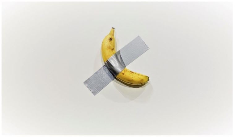
Maurizio Cattelan’s Comedian, at Art Basel Miami Beach. Photo by Sarah Cascone.
Don’t get me wrong, I am a big fan of Cattelan’s work and can appreciate art that embodies humor and irony. My issue with the banana isn’t with what the artist did—he was clearly trying to make a statement about the art world’s consumerist nature—but with the collector who gained only a certificate of authenticity and bragging rights to a pop-cultural meme. $120,000 seems like a high price to pay for something that you will not be able to look at with love and pride in your home, or have as an investment piece in your collection. For the sheer silliness of the situation, I find this to be the worst artwork of the year.
—Neha Jambhekar
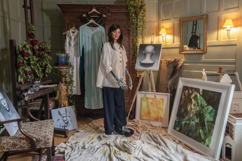
Ai-Da with Her Paintings. Photo by Victor Frankowski.
I didn’t have to think for too long about this one. Back in the summer, as part of my adventures on the art and technology beat, I traveled out to Oxford University to meet “the world’s first ultra-realistic humanoid Ai artist,” Ai-Da. Now, I already called this thing out as a scam, so perhaps I’m beating the dead horse (twice, I guess, as it was never alive to begin with), but it annoyed me so much I figured I’d come back for round two.
In essence, this is a robot that makes constellation-like line drawings based on images translated from cameras in its eyes, which is charming enough. The issue I took with the whole thing was not with the artwork per se, as much as it was with the whole package that it was sold in. The robot was gussied up in a paint-smeared smock, and given long dark locks and a pair of luscious lips in an effort to seduce us into overlooking the fact that it is not actually the autonomous creator it claims to be on the tin. The wheeler-dealer behind the curtain even had the audacity to defend making this sexy outer-casing because, he reckons, the art world needs more female voices. Ahem.
And to add insult to misogynistic injury, he was not just selling the robot’s line drawings, but also abstract painted interpretations of them done by an actual human female artist, which were credited to Ai-Da. Enough said.
—Naomi Rea
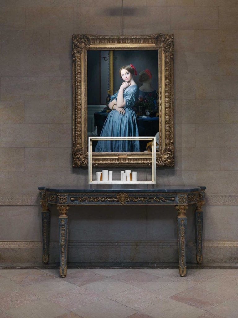
Installation view of Edmund de Waal “Elective Affinities” at The Frick. Image courtesy of the Frick.
I admit I didn’t know much about the artist at the time that the Frick—one of my favorite places to visit in all of New York City—announced this show. De Waal, a renowned ceramicist, would present a temporary installation of site-specific sculptural works made of porcelain, steel, gold, marble, and glass to be displayed throughout the museum’s main galleries alongside works from the permanent collection. I was further intrigued when my colleague raved about de Waal’s bestselling book, The Hare with Amber Eyes, a memoir in which he delves into his family’s intriguing history via objects. When I arrived at the Frick and asked where the installation was, I was given a map that marked locations of de Waal’s installations throughout the museum.
I guess disappointment played a huge role here: When I did find the all-too-easy to overlook installations, I first questioned if they were, in fact, what I was supposed to be looking at, and then wondered how on earth the ceramic vessels of varying heights and sizes represented a “response” to the Frick’s collection. When artwork requires an explanation of the explanation, I tend to tune out. The visit was not a total loss though, I still enjoyed seeing the collection, as always, and also the stunning Edouard Manet paintings on temporary loan from the Norton Simon Museum. And oh yeah, The Hare With Amber Eyes is still one I’m going to read when I get the chance.
—Eileen Kinsella
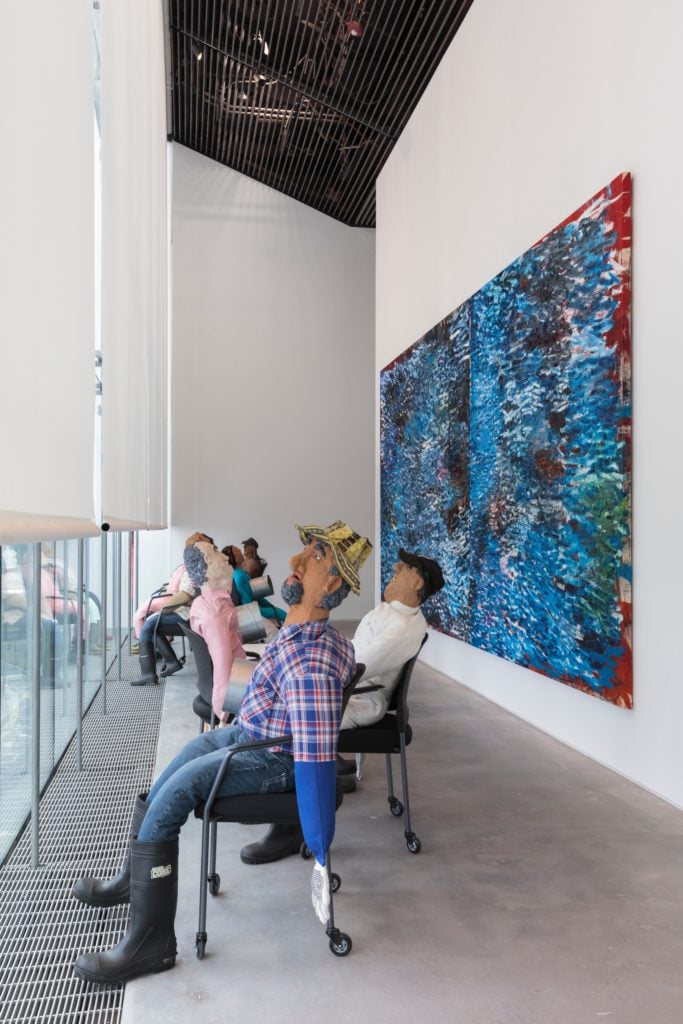
Installation view of “Oscar Murillo: Collision/Coalition” at the Shed.
My brain must filter out most everything I’d like to forget in my sleep because I had to do a deep dive through my cell phone photos to conjure up some displeasure. In the end, I chose Oscar Murillo’s commission for “Collision/Coalition” at the Shed this summer, which paired his works with commissions by Tony Cokes, along with a video work by Yanina Valdivieso and Vanessa Bergonzoli. I don’t particularly dislike Murillo’s work, but the whole exhibition seemed like a missed opportunity, with the cavernous space eating up the art and a flatlining logic of display that reminded me of why talented curators are so essential. In all honesty, I might just have it out for the Shed. In a wider net of culture, the worst thing I saw all year was also there—the abominable play Norma Jeane Baker of Troy, starring Ben Whishaw and Renée Fleming, which was so ungodly pretentious and incomprehensible that I’d still like to be reimbursed for it, despite the tickets being free. Fool me once, shame on the Shed. Fool me twice, it gets added to this list.
—Katie White

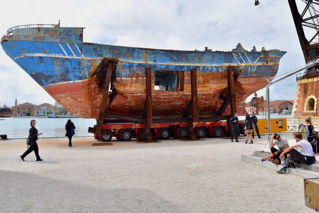
Christoph Büchel’s controvesial Barca Nostra is towed into place in the Arsenale for the Venice Biennale. Photo by Luca Zanon Awakening/Getty Images.
Christoph Büchel installed a migrant boat as a part of Ralph Rugoff’s Venice Biennale. With no signage (apparently, the artist did not want any context to immediately surround the boat), the ship became easy prey for hurried visitors to stop and take pictures. Are they to blame? No one could readily know that Büchel’s Barca Nostra (Our Boat) was the one that sank in the Mediterranean in 2015, killing up to 1,100 migrants fleeing north Africa. It lacked critical context, which did not strengthen its ability to be “art,” as Büchel implies. Instead, it instrumentalized suffering. Once word traveled about the boat’s history, people’s horror, again on social media, was co-opted into the “meaning” of the project. What violent irony. It’s important to push boundaries and to productively offend, but this is not that, this is a grossly irresponsible gesture that was not done with appropriate intelligence or empathy—and I am saying that to the curator and the artist.
–Kate Brown
I know it may be a cop out to double up, but Barca Nostra was so far and away the worst work of art I saw last year that it seemed unfair to target anything else just because Kate beat me to it. I use the term “saw” lightly—I passed it, sure, but the way the boat was positioned on the canal, just outside a cafe and alongside other boats docked for deliveries, it was nearly impossible to give it the solemn respect it deserved. Bringing what is, essentially, a mass grave—the boat where more than 1,000 migrants died in the Mediterranean in 2015—to the Venice Biennale is almost impossibly callous, even for an artist like Christoph Büchel, who lives to provoke. But to do so without any context, label, or other notation is what made the work truly irresponsible. Whether the artist intended to or not, he used the pain and death of migrants to make a point about the art world and its callousness, without even giving passersby the context necessary to behave as they should have. I would object to anyone who says what Büchel made isn’t art, or that he did not have the right to create it. But I question the wisdom of taking a symbol of one of the biggest tragedies and injustices of our era and dropping it into an art exhibition. Everybody involved is poorer for it.
—Julia Halperin
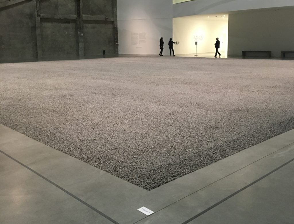
Ai Weiwei, Sunflower Seeds (2010) installed at the Marciano Art Foundation in 2019. Photo by Javier Pes.
The politically engaged Chinese artist seemed to have gone Hollywood at the now shuttered Marciano Art Foundation. Every work was supersized but the reasons why seemed superficial. When Ai first installed millions of porcelain sunflower seeds in Tate Modern’s Turbine Hall in 2010, it felt like an important statement about the human cost of China’s Communist Party’s embrace of capitalism. But then small but expensive heaps of seeds cropped up at fairs. It took the seeds a long way from the 1,600 mainly female workers who toiled for two years to make them by hand in China. The large-scale iteration of Sunflower Seeds in the now defunct Marciano Art Foundation’s most cavernous space further devalued the spectacle. Now we know more about the Marciano brothers’ dubious record as museum employers, Ai’s overblown show seems a missed opportunity. Never apologize, as the artist is fond of saying, but a show of solidarity with the institution’s low-paid workers would have been truly impressive.
—Javier Pes