Every Monday morning, artnet News brings you The Gray Market. The column decodes important stories from the previous week—and offers unparalleled insight into the inner workings of the art industry in the process.
This week, after plunging headlong into the fair frenzy, I needed to circle back to the big picture…
TREND SETTING?
When reading press coverage about art fairs, it’s useful to remember that we journalists have an enduring mandate to search every one of them for Something Big—some shift in the market, some industry-defining activity, some window into the collective consciousness that makes each of these major (or even mid-major) events more meaningful than just another trade show.
At the same time, hunting for significant developments in these environments feels (to me, at least) like trying to parse those flashes of motion that show up in my peripheral vision when I haven’t slept in too long: Is what I’m seeing real, or is overstimulation just making my brain misfire?
This is not to say that it’s impossible to deadeye valuable truths at a fair. Other, better journalists at artnet News and elsewhere consistently do good work on this front. But the sheer volume of information to process, the professional need to produce SOMETHING worth reading, and the ever-looming threat of a deadline combine to make confirmation bias the devil dancing on all our shoulders.
The danger is that, instead of reporting on the boring reality of business (largely) as usual at any given fair, we get tempted into conjuring a moderately compelling headline under pressure, then seeking out just enough supporting quotes to reinforce what we’ve already decided to think. For an extreme visualization of the problem—one that is equal parts absurd and insidious—peep this gang of photographers “covering” an otherwise peaceful protest by isolating a single flaming trash can.
I’m telling you all of the above because I had to chainsaw my way through the process this week. My assignment was to hit the Armory Show, Independent, and NADA in the span of 24 hours. Aside from doing a few top-booth picks, I was supposed to look out for trends. Business trends, specifically. How are exhibitors changing or refining their booth strategies? What noteworthy shifts in collector demographics or behavior are we seeing signs of? In which ways are the fairs warping the business on a more nuanced operational level?
So I went. I observed. I interviewed. And what I heard back in nearly every case was the soft whisk of tumbleweeds rolling across a desert mesa. This response from one Armory Show gallerist summed up almost all the others: a blank stare, followed by the bewildered declaration, “It’s an art fair.”
Dear reader, I gave up on the trends.
Instead, I pivoted to the future. Rather than address themes that have (maybe) already reached some small consensus among exhibitors, I was able to find two isolated instances where galleries made innovative moves in response to the global art-fair gauntlet.
I don’t know whether they’re the first flickers of light on a larger cutting edge swinging our way, or lone torches held by pioneers who will travel solo to the end of time. But either way, I believe they each tell us something meaningful about where the industry is.

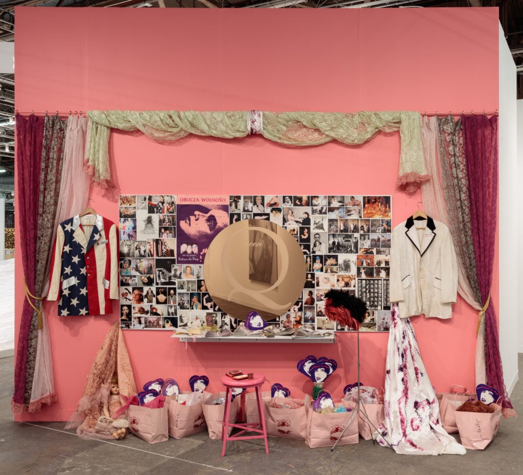
Hunter Reynolds’s Patina du Prey’s Queen Mirror Vanity (1989), at the 2018 Armory Show. Courtesy of P.P.O.W.
BREAKING AWAY
When I toured through P.P.O.W.’s booth at the Armory Show, all I intended to do was find out a little more about its curatorial concept. The presentation felt to me like one of the strongest and most cohesive in the fair, despite the fact that it included work by a relatively wide range of the gallery’s artists. But in talking to Trey Hollis, P.P.O.W.’s art fair director, I found out that the booth emerged in part from a pronounced shift in programming.
Hollis explained that the gallery decided this past fall that, “for the next two years, at least,” it would devote its main exhibition space in Chelsea to solo shows only. “Art fairs are the right context for group exhibitions,” Hollis said. “In strategizing about balancing our art fair presentations and gallery exhibitions, it just felt natural to use our home base for monographic exhibitions and, save for the ADAA Art Show, use the fair for curated group presentations.”
He explained that this stance comes with a few caveats. For one, P.P.O.W. expanded to a second permanent space last year. According to Hollis, the new location—on the sixth floor of the same building as the gallery’s West 22nd Street headquarters—is one “that we use for works by gallery artists, so it’s always a bit of a ‘group exhibition’ there.” Nor is the moratorium on multi-artist gallery shows “an inviolable rule.”
Until a reversal arrives, though, the new policy makes last summer’s “Visual Notes for an Upside-Down World,” curated by Jack McGrath, the last group show P.P.O.W. will stage until at least late 2019, specifically because of the influence of fairs. (Hollis clarified that McGrath’s exhibition “was a great success, and our decision was not a reaction to or re-evaluation of that exhibition.”)
There is a legitimate argument to be made for this strategy. As Hollis said, “Our booths are market-driven insofar as we use fairs to promote our exhibition program.” In other words, since the trade shows are where you meet the majority of your prospective clients, why not make every booth a manifesto?
The key is that you still need to create a captivating moment or two within this broader construct. Hollis explained that P.P.O.W. had conceived two “pillars of the booth” for this year’s Armory: Hunter Reynolds’s Patina du Prey’s Queen Mirror Vanity, a color and intrigue-saturated re-presentation of a 1989 performance/installation that vogued hard at every visitor passing through the main aisle; and David Wojnarowicz’s Untitled (One Day This Kid) (1990–91/2018), a quietly devastating, wall-filling print set reissued by the estate this year.
With that structure in place, the gallery could build out the rest of the booth with select works by mainstays like Betty Tompkins and more recent additions like Ramiro Gomez and Robin F. Williams (who, FYI, is not the late comic behind Mrs. Doubtfire, as I heard one VIP fair-goer wonder).
Is this presentation strategy the right one for every gallery, especially those further down the commercial hierarchy from P.P.O.W.? Not necessarily. P.P.O.W.’s program is more unified than most, centered as it is on socially conscious art and politically minded themes. Without such a firm spine in place, a broad-spectrum booth could collapse into a gelatinous mess.
Unless, of course, you’re a high-end or mega-gallery, in which case your brand equity allows you to turn every fair booth into a buffet. (Any other takers on adopting the term “boothffet”?) If you’re a buyer with the resources in place and socioeconomic capital on your mind, skipping these booths would be about as likely as some dude going to a swinger’s party strictly for the pretzels.
Again, “It’s an art fair.”
Until, that is, some savvy radical transforms it into something altogether different.

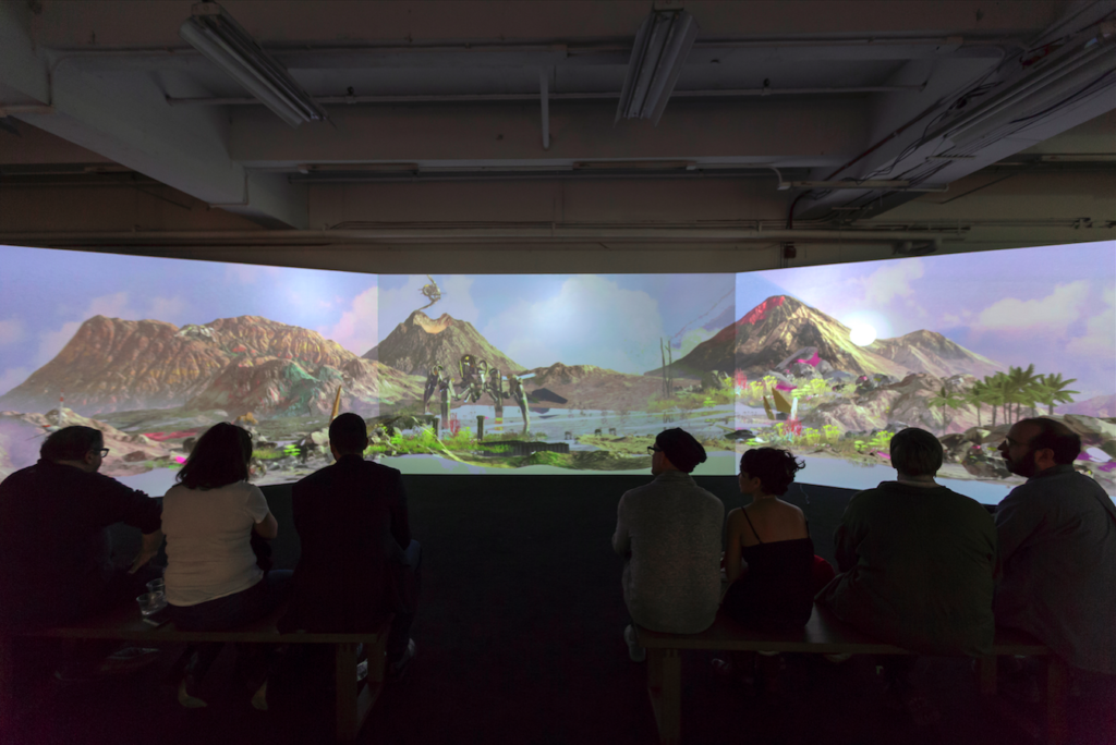
Theo Trian’s Seamless, installation view, TRANSFER Download at NADA New York, 2018. Courtesy of TRANSFER.
SO YOU WANT A REVOLUTION
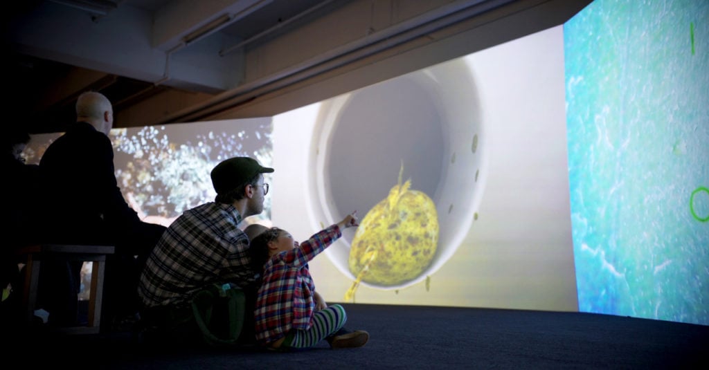
It took me until NADA, the last stop in my fair triptych, to find anything that felt far more disruptive. An expansive mezzanine space at Skylight Clarkson North hosted the Brooklyn gallery TRANSFER and its ever-shifting, all-digital exhibition, the TRANSFER Download. The basic physical apparatus isn’t unfamiliar: projectors, audio equipment, and three projection screens. But the fuller concept, the underlying software, and—most of all—its fundamental contrast to the standard art-fair booth represents a forward leap in how to engage the 21st century art market.
Kelani Nichole, TRANSFER’s founder and director, describes the apparatus as “a fluid format for exhibiting variable media artworks” including virtual reality, augmented reality, experimental 3D pieces, and more. Digital artists either create new works or customize existing works specifically for presentation as a three-channel video installation.
Sometimes these conversions involve relatively modest labor. Other times the shift can be substantial. For instance, if the original piece is, say, an interactive virtual-reality experience, the artist has to rethink and reformat it so that it plays as a passive video with a set run time. This may not be quite as extreme as asking an analog artist to turn a performance piece into a painting for your fair booth, but it’s significantly more involved than asking them to re-send you a Word doc as a PDF.
Nichole sometimes calls TRANSFER Download a “curatorial playlist”—one set up on custom software that creates a “hyperlinked display” allowing her to jump to specific pieces in the sequence at will for viewers. Each new iteration also “responds to its location and context.” This means no two Downloads are the same.
Instead, Nichole works with artists to assemble and arrange a new lineup of works every time out. So if you saw a previous Download at the Minnesota Street Project in San Francisco (where the setup was developed), the Haus der elektronischen Künste in Basel, or the Chronus Art Center in Shanghai, they were all different than the Download on view at the 2018 edition of NADA New York.
In this instance, Nichole curated the presentation in response to author/animator/artist Alan Warburton’s Goodbye Uncanny Valley, a video essay grappling with what could happen—and is already happening—now that digital graphics and artificial intelligence enable us to manufacture images indistinguishable from reality. (“The uncanny valley” is a term for what Warburton succinctly described as “that strange place where things are almost real, but not quite”—a no-man’s land that bedeviled experts striving for verisimilitude in CGI, robotics, and other next-generation fields for decades, as I unpacked in a three-part essay for Kill Screen on digital graphics and painterly modernism in 2014.)
Obviously, staging a nomadic exhibition isn’t a novel concept in itself. Gallerists, dealers, and curators have been mounting pop-up shows for almost as long as the art trade has existed.
Still, there’s a substantial difference between the TRANSFER Download and a hotel room exhibition stocked with a few paintings that a dealer stowed away in a Samsonite suitcase. The latter is an admirable yet ad-hoc workaround that asks a certain degree of forgiveness from viewers for the imperfect environmental conditions. The TRANSFER Download is a large-scale multi-sensory exhibition in which the works on view have been tailored for presentation in this exact format, insuring no loss of fidelity and no requests for lenience.
Nichole doesn’t even need a suitcase for the artwork. Instead, it fits on nothing more than a portable hard drive. True, she normally has the projectors and audio equipment shipped in for installation, but in a doomsday scenario, she can rent these at her destination. In fact, NADA became proof of concept on this point. The flash blizzard that pasted New York on Wednesday prevented the carrier from delivering TRANSFER’s sponsored audio-visual equipment to the venue on installation day, forcing her to scramble for local replacements. After working overtime on sourcing and technical setup with her time-based media specialists, Small Data Industries and Hellions (plus the cooperation of NADA staff), Nichole managed, and the show went on.
Although TRANSFER’s space at NADA was teeming with other mesmerized visitors during my time on site, the works included in this iteration of the TRANSFER Download wouldn’t necessarily resonate with everyone. It was as hard for me to imagine the painting-focused power players of the market diving into them as it would be to imagine the same elites diving into the churning mosh pit at a Black Flag concert.
But the project’s cyberpunk mentality and boundary-pushing aesthetics are, on some level, exactly the point. Art and art-market history show, over and over again, that true avant-garde movements earned that title precisely because their revolutionary concepts repelled the patrons content to simply keep buying and selling the status quo. To most established collectors, embracing the really new thing is, and has always been, scarier than finding a knife stabbed into their door with their own name scrawled on the blade. Progress is so much easier to recognize when it’s safely in the rear-view mirror.
What makes contemporary art “contemporary” shouldn’t just be its creation in the present. It should be its meaningful engagement with the messy, frightening, difficult issues impacting life in its era. I don’t think such work necessarily has to be digital yet. But it does have to wrestle with who we are and where we’re headed, using whatever media best communicates the message, tradition and challenges be damned.
The rest is just retail. And this year’s Armory Week made both sides of that equation abundantly clear.
That’s all for this edition. ‘Til next time, remember: We don’t call it “the cutting edge” because it’s a safe place to stand.
