How do you create the right setting to show—and sell—some of the most important works of art in the world in a mundane building like a convention center? This is the main question the Dutch architect and designer Tom Postma has to ask himself. An artist turned art fair designer, Postma is the man who creates the look and feel of TEFAF in both Maastricht and New York, and Art Basel’s editions in Hong Kong and Miami.
Whereas most architects work on projects that they hope will stand for decades, Postma’s niche is the ephemeral: Many of his designs are built-up and taken down all within a month. Based in Amsterdam, he is also a go-to designer for many art museums, including the city’s Rijksmuseum and the Kunstmuseum in Basel, to name a few.
Perhaps that is why cut flowers are the perfect metaphor for his art fair design practice, which he includes almost like a signature throughout many of his designs. Like the fairs, they only last a few days, which is exactly why they are so enticing.
Ahead of TEFAF 2018, which opens in Maastricht today, March 8, artnet News spoke to Postma about the creative challenges of creating a mega art fair and what the future holds now that there are hundreds of them around the world, all competing for many of the same collectors and galleries.
You are in the middle of erecting TEFAF’s 2018 edition, which opens to the public on Friday. How is it going this year?
It’s going very well. It’s a very big fair and the whole build-out is very high-end. We will manage to get it done before the opening. That is always the big challenge, of course. With fairs, there are only two weeks to do everything. It’s an empty hall and then two hundred trucks arrive one day with the materials to build it up, and then there is the actual execution. But it’s going well.
How did you begin designing fairs?
I’m an artist originally. I had my gallery, my commissions, and I was in these kinds of fairs. I did monumental sculptures. Slowly over time, I moved towards more architectural projects and making large and monumental sculptures for buildings and squares. At a certain moment, I decided to follow my heart, which was telling me that I am more an architect-designer than an autonomous artist. I decided that about 20 years ago and I made the switch to architecture and art-related design. It’s the world that I know, which is why people asked me. As I am an artist, I know what art means.
Secondly, I was looking for aesthetically mature clients who understand good architecture. I have done projects for certain high-end fashion shops, for example, but I hated it because it’s totally money-driven and the aesthetics were second place.
I’m also just an art lover. My most beautiful moments are always when it’s nighttime and I walk through Art Basel or TEFAF and look at all the art.

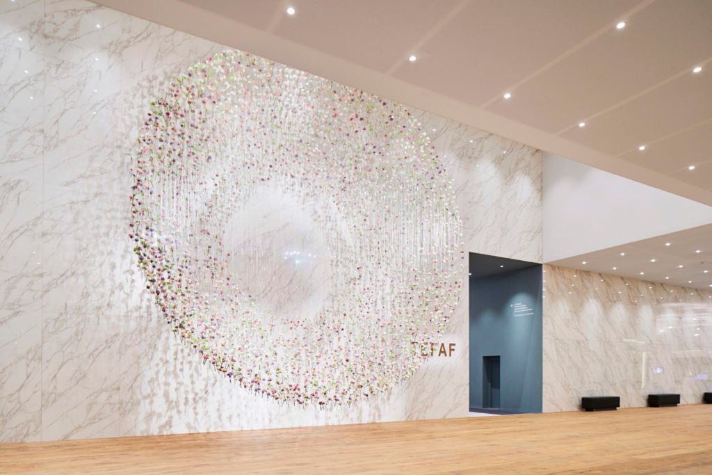
Entrance of TEFAF Maastricht 2017. Courtesy Tom Postma Design. Photo by Mark Niedermann.
What are the most important design considerations for a successful fair?
I really think it takes a particular point of architectural view to create an art fair. The most important element to consider is that art-fair architecture is all about the art and not the architecture. The question is rather how to present art in the most optimal way. Create a good design for an art fair, exhibition or gallery is never an architectural ego trip. Each design results from the starting point that the architecture should never compete with the art—it’s always about giving the floor to art.
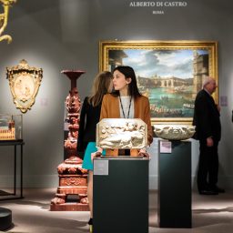
As an art fair is a collection of many galleries—here at TEFAF there are 285, which is enormous—there has to be certain organizational structures. Building a fair is like building a city, with boulevards, squares, gallery blocks, entrances, different restaurants and cafés and so on. Therefore, the floor plan is one of the most important elements. An art fair should have a natural and pleasant visitor flow, with a clear beginning and end. Here and there you need a break in the grid, such as a square or a café, where people can rest and have a tranquil moment to reflect.
You need a good balance and nice atmosphere, except in the places where there is no art, like the entrance or the collectors’ lounges. We create a complete world with a city plan, and we also consider how the lighting should be and how the corridors should look, and what kind of flowers there are. You need fresh air and fresh feeling.
The biggest challenge is how to bring the people also to the far corners of the fair. You must create attractive lines so that people unconsciously are brought to the end of the fair where further exhibitors are, and walking the way that you want them to walk. That’s the the most challenging and intriguing.

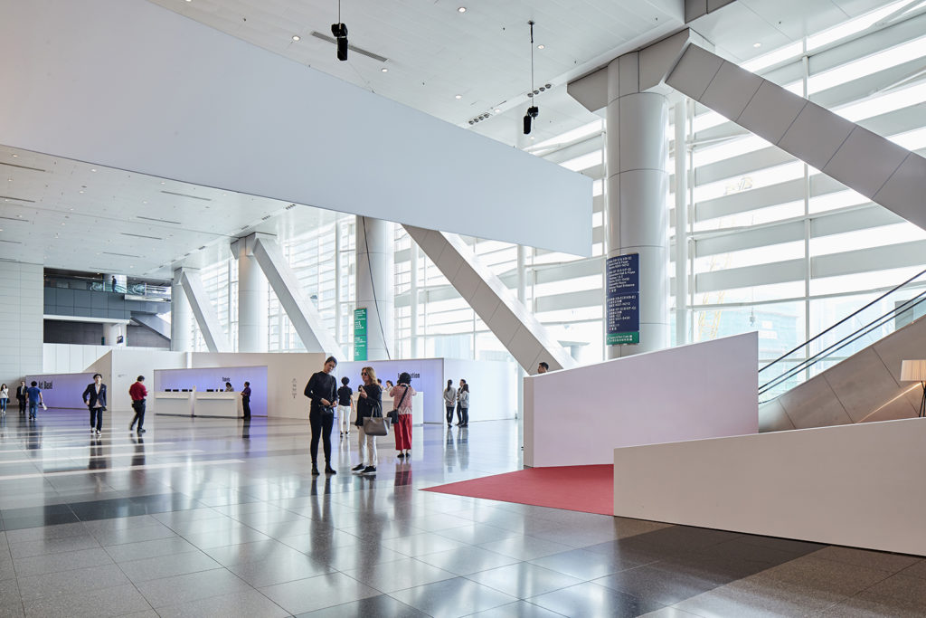
Public entrance and VIP welcome area Art Basel in Hong Kong, 2017. Courtesy Tom Postma Design. Photo by Mark Niedermann.
You also need a strong entrance where people come in and are able to have a transition moment into this “art city”. Here, I like to create a powerful moment without art, where people can understand that they are now somewhere special.
There has been a lot of debate about the future of fairs, and some are skeptical of how many art fairs there are and whether they mainly benefit the mega-galleries. What do you think will happen to fairs in the future?
My job is to create and I am not a political person. I keep far from that, but I have, of course, my own opinion. It is important to continue to innovate fairs and to look at the market personally. You have to think beyond the commercial aspects. To make an art fair attractive, you must bring in young people, young galleries, and young initiatives. Don’t put them in the back, but put them in front. That may shock certain collectors or clients, but in the end that’s the only way I think you can create a young and enthusiastic public. Sometimes, in my personal opinion, I find things can be too conservative. In the end, my job is to make it nice, but sometimes I miss that a bit.
I’m working for the biggest art fairs and they know what they are doing, so I don’t interfere in that. They ask my opinion, but I am the designer. I can make the fair good-looking and contemporary, but the political aspects are not my job.
In past at TEFAF, you have created memorable installations from suspended cut flowers. How are you following that up or reinterpreting it this year?
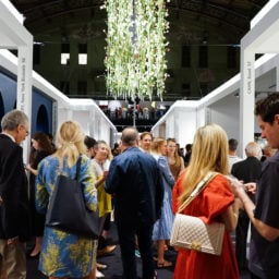
This year should be even more spectacular. We turned the whole situation around to create darkness and a synergy between dark and light. Picture a dark, carved out wall creating a grand niche with flowers that seem to awake by the gentle dripping of fresh water. The three fair passages in the entrance hall are framed by light walls while the cloud-shaped flowers in the niche and column appear to drift.
How do different cultures and cityscapes play into art fair design? I am wondering about the way you approach a fair like Art Basel in Hong Kong, as opposed to Art Basel in Miami Beach.
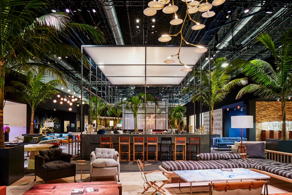
It’s a very good question. The essence is that you understand where you are. If you bring Art Basel to Hong Kong, you should try to understand what the culture is and the building where it takes place. It’s always totally different worlds, and you have to translate one world into another. Hong Kong, for example is a bustling city with all kinds of layers of crowded lanes. It’s a very energetic city. Those elements are a starting point for the way we think about designing the fair. If you look at Miami, it’s totally different. It’s relaxed and warm. It’s a garden city and in the fair you will see that sort of atmosphere. You can never copy Basel in Hong Kong. All these cultural differences that you see in the different places where we do these fairs, you must understand them and develop them. This takes a year at least to do. Fairs like Basel and TEFAF understand that, and I think that’s why they’re successful.

Collectors Lounge Art Basel in Miami Beach, 2017. Courtesy Tom Postma Design. Photo by Mark Niedermann.
TEFAF New York Spring opens its second edition this May. What kinds of challenges do you face bringing the TEFAF brand and experience to a former drill hall in Manhattan?
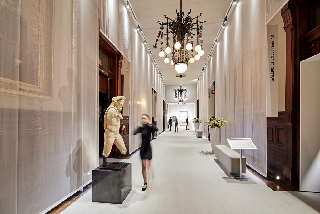
The brief we were given was simple: Create something that people have never seen before in the Armory building. But the building is a place that many people who relate to art have been. They’re used it and know this beautiful, but dark building. How do you make that unforgettable? Well, it’s a beautiful classic building in the bustling center of New York with a lot of heritage and beautiful rooms and a large hall. The physicality of the building is beautiful, but it is dark and gloomy. I wanted to make something where people would feel, at the same time, the respect of the beauty of the building and the history of the Armory and, on the other hand, something that would allow them to really understand that they are at an art fair with modern art and classic art, all in the context of a modern fair.
We had to respect the building, otherwise we could not use the period rooms. In general, we could not even touch the building, not with one single nail. It’s very unique that way. So we created a second skin. You have these historic paintings of generals on horses in the corridors and we created a translucent, voile skin in front of them. You could still see them through it, but when you walked through this corridor, you were still within another world of TEFAF. Plus, it’s a self-suspending structure for light and it turned a dark place into a lighter place without disrespecting the history.
To bring the quality of TEFAF to the drill hall at the Armory, one thing I decided to do was to introduce a totally new floor, which was never done before. A good floor is the basis of everything else. We also included flower decorations that are not opposing but rather adding to the atmosphere, and they do not compete with the art.
What are the common mistakes that you have noticed in smaller fairs?
I think the most important thing that they underestimate is to create a good floor plan. You must understand where the visitor moves, what their psychology is, and what they see and feel when they arrive. I call art fairs “cities”. How do you people walk? What are their view lines, and what is their rhythm? How can you create moments? How do you place booths without too much hierarchy between them?
All these questions are some of the most important aspects that I would always tell young designers to think about. If you really delve into all of that, it’s complex. It looks easy, but it isn’t. The top fairs understand this more and more.
It’s a big process, because you have to deal with boards and committees, but they have to go through this process. Most designers and architects think [the floor plan] will be the easiest part, but it isn’t.

TEFAF New York Spring 2017. Courtesy Tom Postma Design. Photo by Mark Niedermann.
How does social media or the digitalization of art sales and change the way in which you approach fair design?
It’s all part of it. All these elements need to be considered, as they all influence each other. Our team is are not just designers. We have artists, product designers, a tech team and graphic designers to build a complete story, a complete world. All these elements need to be integrated before you even start putting something on paper. As I said, it’s a city. If you design a city in the desert, say in Dubai, you can see how it goes wrong, if you don’t plan it well. Art fairs are not unlike this.
Do you ever buy art yourself at fairs?
I have a collection, but I’m an architect, so I never have a real budget. If you want to have a real collection, you do something else.
But I live in the art world and I have many artist friends. I have an emotional collection from them. I tend to buy one piece a year from one of the art fairs that I do, but it’s never a big thing. My collection is nice though, and I have too much actually. It’s a bit of a problem. But it’s a part of what I do. It’s my world and I am surrounded by it.

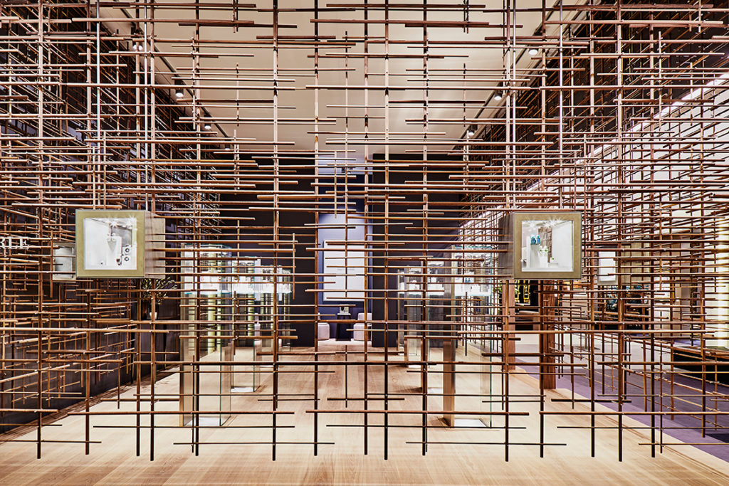
Red Dot Award winning booth design for jewellery house Hemmerle at TEFAF Maastricht, 2016. Courtesy Tom Postma Design. Photo by Mark Niedermann.
