Opinion
Help, I’m Lost in a Mega Exhibition! Why It’s Time to Rethink Art Shows That Are Too Big to Fail
In big biennials and sprawling shows much of the art is overlooked—and anxiety about missing something becomes rampant.

In big biennials and sprawling shows much of the art is overlooked—and anxiety about missing something becomes rampant.

Hettie Judah

How much art can the human mind realistically absorb from a mega exhibition? I’m not talking here about mere retrospectives or major surveys—mainstays of the Mets, MoMAs, and Tates, of Academies (royal or otherwise), and galleries (national or state)—which are shows that you can slowly drink in over a satisfying three- or four-hour visit.
I’m thinking instead of the bannered biennials, triennials, quinquennials, decennials, and the outsized, multi-institutional exhibitions that have evolved in their wake. Art jamborees so sprawling they induce panic; cultural omnium gatherums so capacious that the metaphorical elephant in the room becomes the fact that an actual elephant in the room would look neither out of place nor poorly quartered.
A litmus test to whether the exhibition you’re wandering through is too large? The demeanor with which friends and colleagues approach one another and ask whether they’ve “Seen anything good?” If they hang on each reply with crazed attentiveness, assume they’re desperate for a navigational tool by which to chart a route, and they are panicking that they’ve overlooked a defining cultural way-marker.
Many hours into the maelstrom of mixed art, the question “Seen anything good?” terrifies. I’m a slow looker, an even slower thinker. It takes me time to mentally sift the profound, powerful, innovative, and resonant from the merely beautiful, surprising, novel, and knee-jerk. I came to see it as a terrible failing that I can’t take in more art, faster, and swiftly generate a firm opinion about it. Perhaps I need to upgrade to Cyborg Critic status—with improved memory, faster processing power, and a rapid hot-take generator.
I am slowly coming to realize that my sluggishness is perhaps less a shortcoming than an honest response. Writing in ArtReview, Martin Herbert described this year’s documenta as “overwhelming but not in a good way.” This was not flippant: Herbert’s review was a deftly structured criticism of an exhibition that “determinedly chases cultural capital for its makers via darkly symphonic epicness and default handwringing,” generating a kind of closed, obscure, and unwelcoming system. “As for the viewers?” concluded Herbert: “They can get lost.”

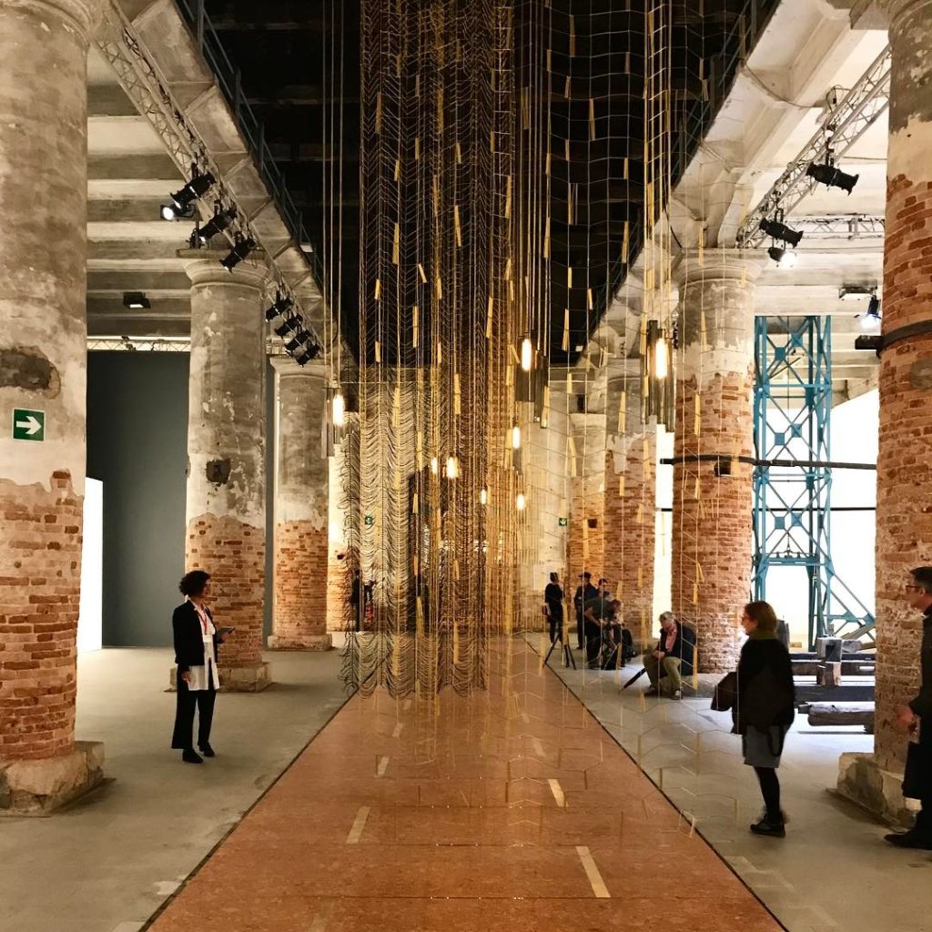
Installation view of Leonor Antunes’s …then we raised the terrain so that I could see out. (2017) in the Arsenale at the Venice Biennale. Photo: © Photo: Haupt & Binder.
And the viewers do get lost in such shows—if not physically, then certainly psychologically. The term “museum fatigue” was first notably deployed by Benjamin Ives Gilman in 1916. Writing in The Scientific Monthly, Gilman presented a series of photographs taken at the Museum of Fine Arts in Boston demonstrating the contortions to which a visitor had to submit themselves to view exhibits and their labels. A mustachioed gent is pictured bending over vast glass cases, crouching to examine artifacts on low shelves and venturing a deep squat to read the label on a statue.
In 2009, Steve Bitgood, a professor emeritus at Jacksonville State University in Alabama, and a leading figure in the field of visitor studies, published a critical overview of research into museum fatigue in the intervening century. Rather than the physical exertions described by Gilman, Bitgood detailed an updated understanding of museum fatigue that took in a menu of interrelated phenomena. These included tiredness (physical and mental); satiation from exposure to a succession of similar objects; stress; information overload; the pressure of objects or exhibits being placed in competition with one another; the possibility of limited cognitive capacity; and the decisions visitors make to balance the “value” of their visit against the exerted “cost” demanded of them.
The art world is quite familiar with the research paper Spending Time on Art (2001) charting the time museum-goers spent looking at individual works of art. Its authors Jeffrey and Lisa Smith took a sample of 150 visitors looking at six significant works at the Metropolitan Museum of Art in New York: the mean viewing time was 27.2 seconds, with a median time of 17.0 seconds.
What remains unseen in the reports on Spending Time on Art, but which became apparent in many of the studies cited by Bitgood, is the fall-off of attention as visitors proceed through a museum or exhibition. In crude terms, there is a tendency for visitors to favor works in the opening sections with more time, then a plateauing of attention, and subsequent “exit gradient” effect (a point in an exhibition at which visitors become “more attracted to the exit than to the paintings.”)
Bitgood’s own research has suggested tactics in exhibition design that can help keep visitors engaged and attentive, among them short and stimulating texts, varied and engaging displays, logical through-routes, well designed and easy to use visitor guides and interactive elements, and care taken to prevent exhibits entering into noisy competition for attention.
Yet this kind of carefully titivated visitor experience feels quite foreign to the on-the-ground reality of outsize exhibitions, and much art is overlooked or given scant attention as a result. Which then begs the question: Who do these mega exhibitions serve, if not their visitors or artists?

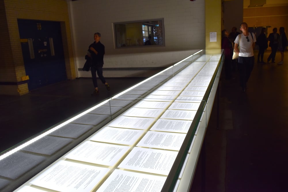
Máret Ánne Sara’s Pile o’ Sapmi (2017), a display containing excerpts and conclusions of the first and second trial of Jovsset Ante Iverse Sara versus the Norwegian Ministry of Agriculture and Food, at documenta 14, Kassel. Image: Ben Davis.
The exhibition in which extended wall texts combine to book-like length suggests a show that serves its own catalogue. One in which the video works would consume many days in the viewing hints at a show directed at an audience already familiar with the art, but who might be impressed by the fresh context of its presentation. An exhibition in which artwork vies with artwork for attention suggests that meaningful engagement with individual works is considered secondary to another, grander, purpose. An exhibition so crammed with new and overlooked artists that few make an impression suggests curatorial virtue signaling. Overlarge exhibitions do not suggest immense knowledge—they suggest an unwillingness to make choices.
Of course, there have been historically important mega shows—the Baltic Exhibition held in Malmö 1914 featured a staggering 3,500 artworks, for example—but they were comparatively rare occurrences, and reports from the time suggest that local visitors paid repeat visits rather than bingeing the whole thing in a fraught 48 hours.
As ever more mega museum spaces open—the Louvre Abu Dhabi being a notable recent addition with a temporary exhibition space the size of a football field—it feels as though the benchmark for the size of exhibitions is increasingly being taken from major biennales and art fairs. A New Year’s resolution, art curators: Edit.